Standout Features:
- Color-coded logo variations
- Sharp, distinct layout
- A blend of mechanical and traditional themes
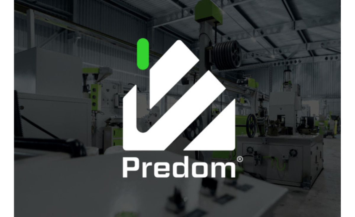
Predom makes it to our best rebranding examples with a stunning and sharp brand rework by Balahibo Graphic Studio.
The brand needed a new visual appeal after merging with another company. And the agency gave it a modern, stable, and trustworthy appearance through this rebranding campaign.
And the new logo is just that – it feels like a contemporary mixture of mechanical and traditional themes. The cozy “homey” atmosphere feels safe and conventional, whereas the signature-like symbol that strikes through it provides a more modern appeal.
This logo is color-coded, making it easily adaptable to different needs. The layout is sharp and straightforward, with only the “chimney smoke” and the typeface below the emblem colored in red, blue, or yellow, each indicating the industry it represents.
This fashionable new look retains some similarity to the old one, making it easily recognizable for the existing customers, yet it is modern and exquisite enough to attract new ones.

