Team Behind the Design
Logo Design Analysis
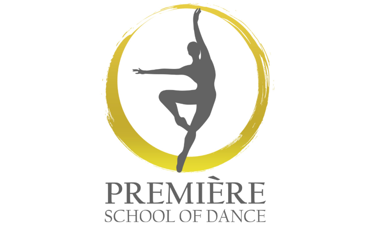
When I review a professional services logo, I look for a harmonious blend of structure and expressiveness.
The Première School of Dance identity is a great example of this principle.
- Concept: I think the gray dancer silhouette is a strong choice because it instantly communicates the art form while keeping the focus on elegance and grace.
- Typography: The serif wordmark grounds the design in tradition. The lighter descriptor beneath it adds clarity without overshadowing the main title.
- Color Palette: Gold paired with gray is a sophisticated choice. It suggests a feeling of achievement. This combination remains approachable for students and their families.
- Symbolism: The golden brushstroke circle frames the dancer with a feeling of energy. This symbol of unity mirrors the school’s mission of nurturing growth.
What Brands & Agencies Can Learn from Première School of Dance
This logo offers a strong blueprint for any brand that needs to balance artistic expression with professionalism.
1. Use a Silhouette to Convey an Idea
A detailed illustration can sometimes be too specific. A simple silhouette, however, can represent a universal idea like grace or aspiration. This allows viewers to project themselves onto the mark.
2. Create Hierarchy with Font Weight
You can establish a clear information hierarchy in your logotype by using a bold, heavy font for the main name and a lighter weight for the descriptor.
3. Pair Colors for a Dual Message
A single color sends one message. A thoughtful color pairing, like a celebratory gold with a professional gray, can communicate two distinct brand attributes at once.
About DesignRush Featured Designs
At DesignRush, we review hundreds of agency projects every month. The featured works stand out for their originality, execution, and ability to capture brand identity.
The strongest examples advance to become Monthly Design Awards winners, gaining industry recognition.
Explore standout logo design projects and beyond:
- Best Logo Designs
- Best Website Designs
- Best App Designs
- Best Print Designs
- Best Packaging Designs
- Best Video Designs
For a full list of design agencies and related services, see our Agency Directory.

-preview.jpg)