_45cba6acf28b-desktop.jpg)
Team Behind the Design
Logo Design Analysis
In professional services logo design, clarity often carries the brand.
In evaluating designs, I focus on how well it communicates structure, pace, and trust in a single glance. Inboxio’s identity leans into that expectation with a symbol that feels dynamic yet dependable.
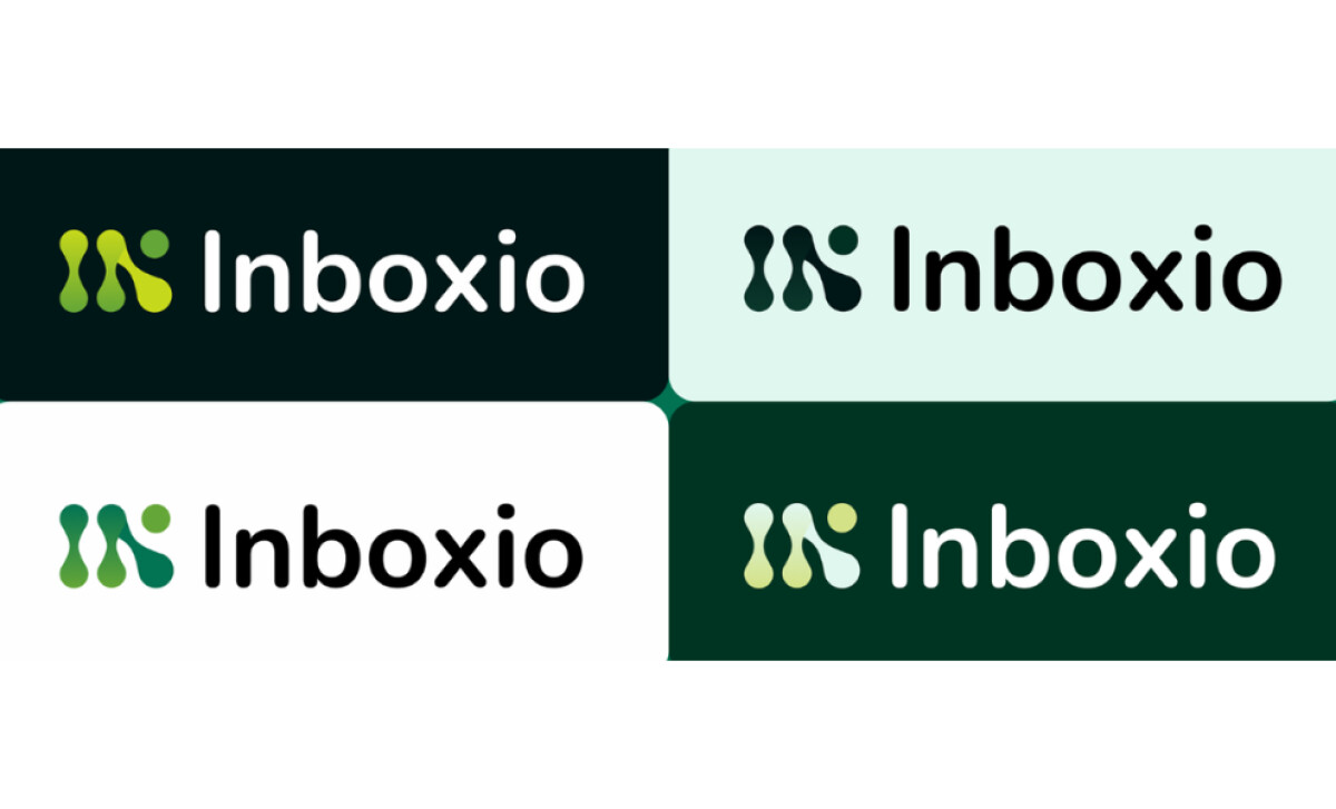
- Concept: I see a mark built from organic, modular shapes that suggest movement and connection. The flowing forms create a sense of progress, which fits well with a brand focused on retention and long-term growth.
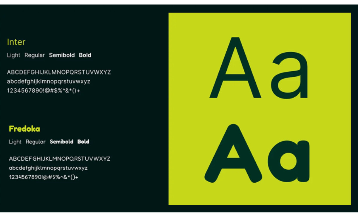
- Typography: The rounded, approachable letterforms pair naturally with the symbol. The type feels modern and confident without being overly technical, which helps balance professionalism with accessibility.
- Scalability: The logo maintains its clarity across dark and light backgrounds, as well as in compact layouts. The simplified forms hold up at small sizes, which is essential for digital platforms and internal communication materials.
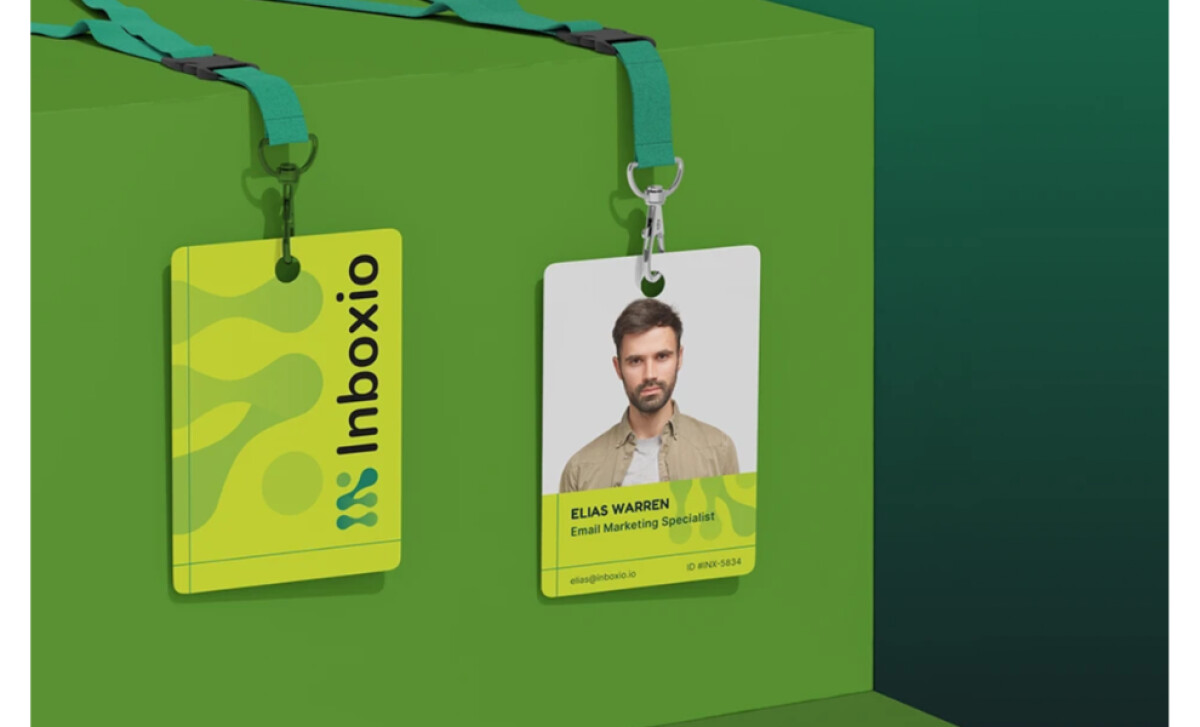
- Applications: The system extends smoothly into color, tone, and UI elements. The bright greens and deep teal tones produce a confident atmosphere, while the typographic hierarchy keeps materials clean and structured across badges, dashboards, and marketing pieces.
What Brands and Agencies Can Learn from Inboxio
The Inboxio identity shows how a professional services brand can communicate momentum and clarity through simple forms and a steady visual system.
1. Use Modular Shapes to Signal Progress
The flowing symbol creates a sense of movement and continuity. This kind of visual rhythm helps communicate long-term growth in a way that feels natural and intuitive.
2. Pair Approachable Typography with a Confident Mark
The rounded letterforms soften the geometry of the symbol, creating a balanced tone that supports both professionalism and friendliness. This makes the brand feel reliable without becoming overly corporate.
3. Build a System That Scales Across Touchpoints
The clean shapes and straightforward color palette stay clear in every application. From dashboards to marketing pieces, the identity maintains structure and readability, which is essential for a services brand built on trust and consistency.
About DesignRush Featured Designs
At DesignRush, we review hundreds of agency projects each month to uncover standout work in branding, digital, and visual design. The featured designs represent some of the most compelling executions, standing out for clarity, creativity, and technical precision.
Top-performing projects often advance to our Monthly Design Awards, gaining wider industry recognition.
See more creative projects across categories:
- Best Logo Designs
- Best Website Designs
- Best App Designs
- Best Print Designs
- Best Packaging Designs
- Best Video Designs
For a full list of design agencies and related services, visit our Agency Directory.