Standout Features:
- Symbolic stick figure layout
- Sleek sans-serif fonts
- Versatile design
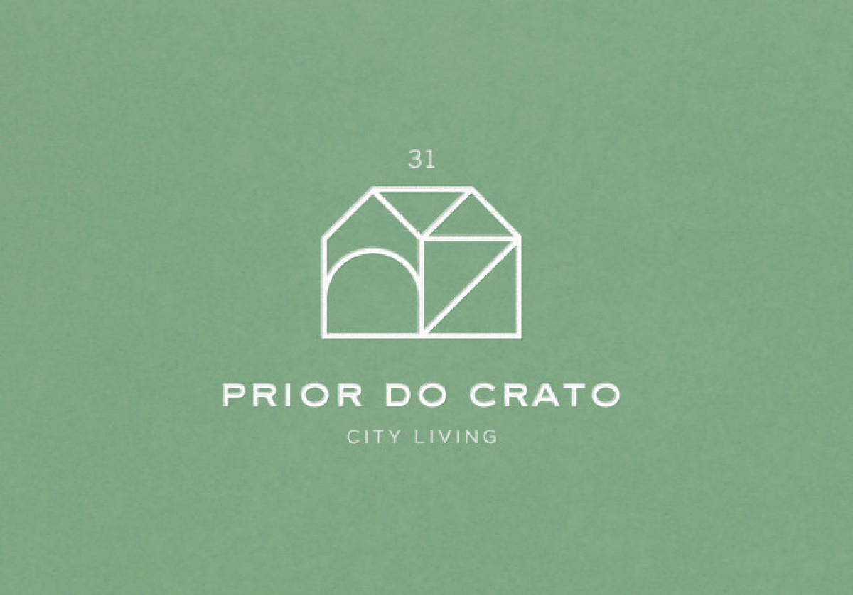
This next-best business logo design features a stick figure of a house. It's a simple design with symbolic meanings behind every line.
Design agency Musa WorkLab used shapes and lines to symbolize various housing types the company offers. It conveys that whatever type you need, Prior de Crato 31 has got you covered.
The agency also used gray and white, so the logo wouldn't clash with other visual elements when placed on websites and print designs. Its thin sans-serif typeface looks sleek, sophisticated, and calming.
Get a chance to become the next Design Award winner.
SUBMIT YOUR DESIGN