
Blue Apron Logo: From Apron Icon To Standalone Wordmark
What To Know
- Frank Collective built Blue Apron's best-known identity in August 2013: a compact wordmark paired with a blue apron icon that salutes chefs who wore blue aprons while learning to cook. It replaced a 2012 mark that packed the name inside an apron silhouette.
- That 2013 mark ran in a deep blue (hex #313565; CMYK 52, 47, 0, 60) set in a customized Signika Bold.
- Siegel+Gale later stretched the system for Blue Apron's wine line, simplifying the mark into a name-free illustration and adding a custom icon set.
- That wine identity won Silver for Packaging at the Creativity International Awards and Bronze for Best Use of Packaging at Transform Awards North America.
- The current logo, from a 2025 refresh by Associates by Design, is the "Blue Apron" wordmark on its own, without the apron icon. Its navy reads as hex #25275D (CMYK 60, 58, 0, 64).
For years, the Blue Apron logo packed a whole philosophy into one small blue shape. It saluted every cook who ever tied on an apron to learn the craft, and it helped turn a scrappy meal-kit startup into a name you already know. Here's how that little icon grew into a full brand system, and where the logo stands today.
The promise is simple. You skip the recipe hunt and the grocery run, and a box of fresh ingredients lands at your door ready to cook. The mark on that box tells you the story before you pick up a knife, and it earns its place among the best logo designs out there.
What The Blue Apron Logo Really Means
The name pays homage to chefs who wore blue aprons while learning their craft. Frank Collective turned that story into a bold, simple icon that reads at any size. You see a beginner's journey in the kitchen, the same one you take when you open a Blue Apron box.
That one idea carries real weight. It gives the brand warmth, and it nudges you to cook something you haven't tried. Cracking that kind of one-glance clarity is the whole game in logo design.
The Blue Apron Logo Evolution
The brand has worn three marks in its life, and each one trimmed something away. What began as a crowded blue silhouette ended up as four clean letters and a space.
2012 To 2013: The Name Inside The Apron
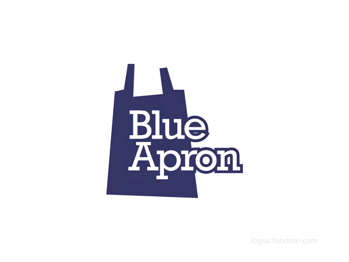
The first logo stuffed the name inside a filled apron shape, with rounded letters stacked across the middle. Everything competed for the same small space.
It read as one dense blue object instead of a name you could scan quickly. At thumbnail size, the letters started to disappear into the silhouette behind them.
2013 To 2025: The Icon Steps Out
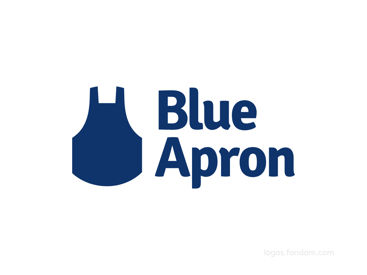
In August 2013, Frank Collective pulled the two halves apart. The apron became its own clean symbol on the left, and the name moved beside it, which gave the lockup room to breathe and scale.
Color did a lot of the work here. The deep blue landed at hex #313565, or CMYK 52, 47, 0, 60 for print, reading as calm and trustworthy in a category built on handing strangers your dinner.
The wordmark used a customized Signika Bold, a sans serif with soft, friendly edges. It held its shape at small sizes and from across a room, so the logo stayed sharp on a box, a wine label, or a phone screen. That pairing carried the brand for more than a decade.
2025 To Present: The Wordmark Stands Alone
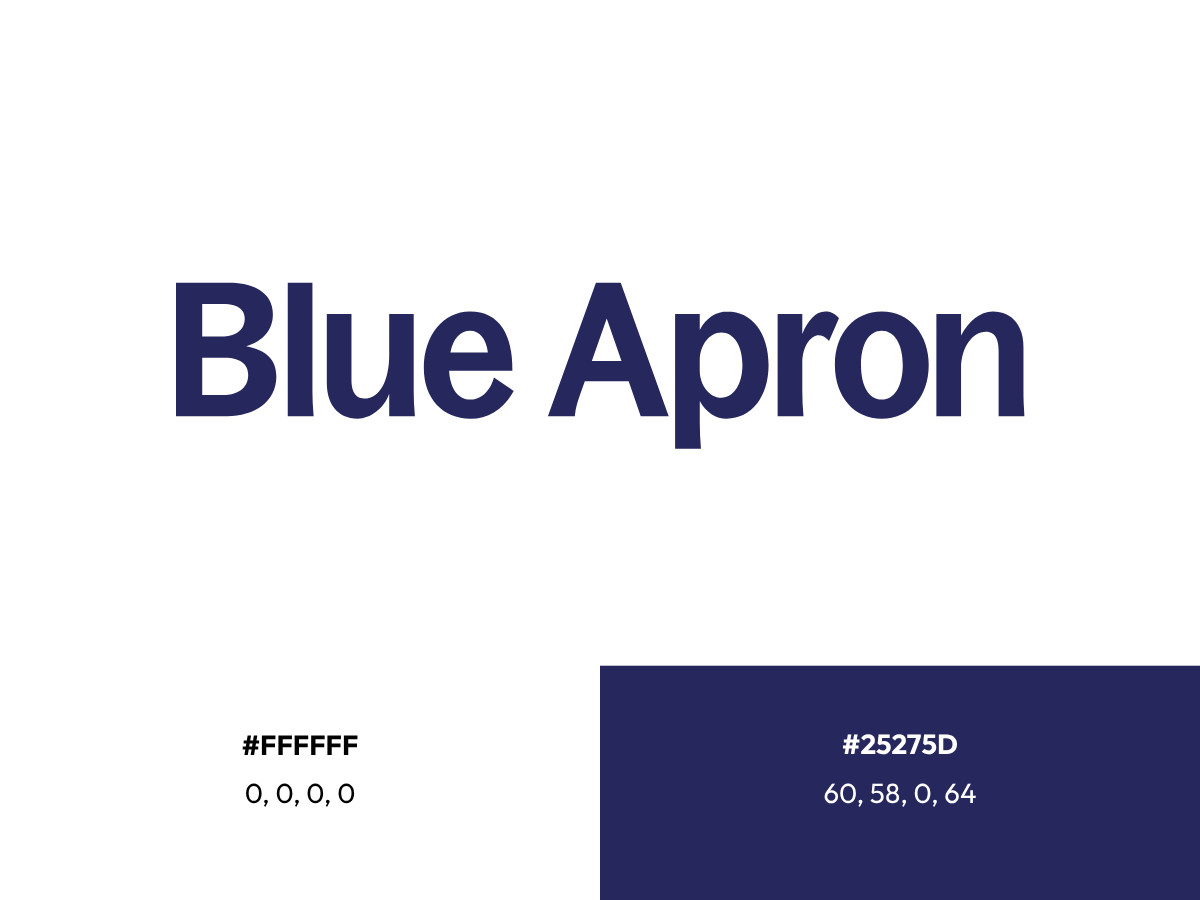
In August 2025, Blue Apron relaunched with a new look and traded its subscription-only model for à la carte ordering. The agency Associates by Design led the new visual and verbal identity, built for a cleaner, more modern feel across the site and packaging.
The current logo is the "Blue Apron" wordmark on its own. The navy carries over but shifts a little deeper, landing at hex #25275D, or CMYK 60, 58, 0, 64 for print.
The letterforms come from a custom typeface, with heavier, more geometric shapes than the old Signika Bold. Dropping the icon puts all the weight on those letters, so they had to carry the brand alone.
The apron steps out of the primary logo, yet it never really leaves the brand. You still see it in the mobile app icon, and the refresh added a mascot called the Blue Apron Sous, an illustrated sous-chef who appears as a man, woman, or child in a blue apron.
One Mark, Every Product Line
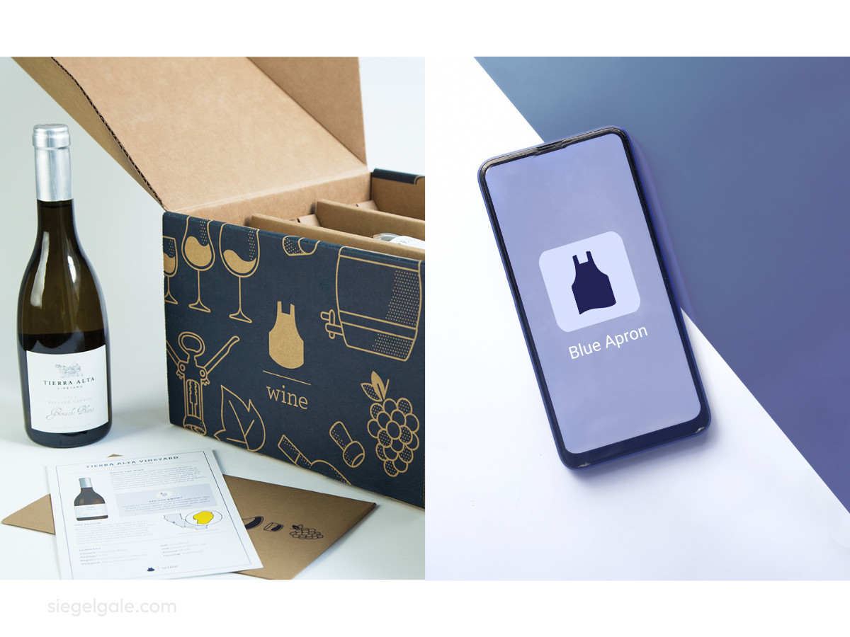
The icon was never meant to live only on a meal-kit box. The core mark also carried Blue Apron Market, the shop for cooking tools and pantry goods, plus the various meal plans, while wine is where the identity stretched furthest into its own system.
When Blue Apron added wine, the identity needed room to move. Siegel+Gale refreshed the wine packaging and iconography to feel clear and a little playful, so picking a bottle felt inviting instead of fussy.
Their logo signature system simplified the mark by dropping the brand name in favor of a clean illustration. They also drew a custom icon set inspired by the original icons, so the wider portfolio shares one coherent style. You can see the same discipline across DesignRush's packaging design examples.
That flexibility, the same trick that keeps simple marks like Coca-Cola's and Uber's working across every format, is what separates a single logo from a working brand system.
Blue Apron's own leadership framed the thinking in plain terms. "By simplifying...it allows us to unleash far more discovery and out-of-the-box solutions," said Jared Cluff, then chief marketing officer at Blue Apron. You can watch that principle play out as the mark travels across formats, right alongside other food and beverage logos that lean on one strong idea.
The Recognition That Backs The Design
The extended identity earned outside validation. It took Silver in Packaging at the Creativity International Awards and Bronze for Best Use of Packaging at the Transform Awards North America.
Both honors point to a system that performs on the shelf and across digital channels. You see the same judged-and-proven quality in Giani's ice cream branding, another mark that pulls a lot of story from a little space.
FAQ: The Blue Apron Logo
Who Designed The Blue Apron Logo?
Frank Collective created the 2013 logo that defined the brand for a decade. Siegel+Gale later extended the identity for the wine line, and Associates by Design led the 2025 refresh.
What Does The Blue Apron Logo Symbolize?
It points to lifelong learning in the kitchen. The blue apron nods to chefs who wore one while training, and the color itself reads as trust and calm.
Has The Blue Apron Logo Changed Over Time?
Yes, three times over. The 2012 mark packed the name inside an apron silhouette, Frank Collective split it into an apron icon beside a Signika wordmark in 2013, and the 2025 refresh dropped the icon for a wordmark-only mark. The apron still turns up in the mobile app icon and the Blue Apron Sous mascot.
Our team ranks agencies worldwide to help you find a qualified partner. Visit our Agency Directory for the Top Logo Design Companies as well as:



-preview.jpg)