Standout Features:
- Basic geometric shapes
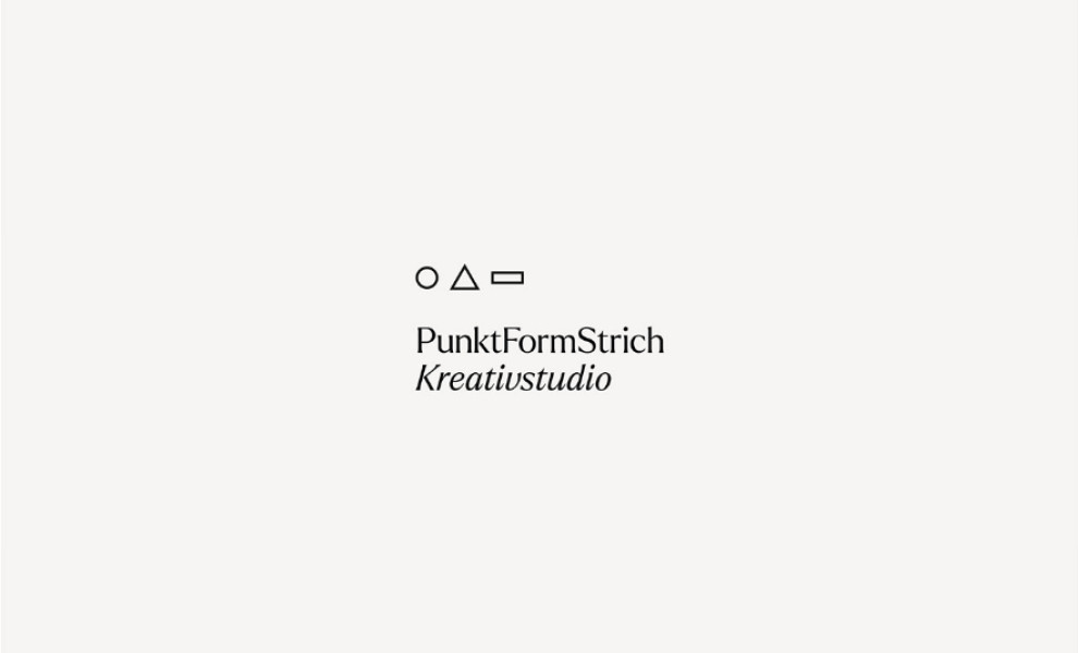
- Minimalist logo design
- Monochromatic color story
Minimalist logos, despite their simplicity, can be super hard to pull off. They can either make your brand look chic and sophisticated or too generic and unappealing. PunktFormStrich is one of those brands that found the sweet spot.
The Austria-based multi-award-winning creative studio showed they are indeed masters of design through this clean and crisp logo design. It visually represents the agency’s simplistic approach, emphasizing brilliant elegance and pure minimalism.
The three shapes (circle, triangle, and rectangle) as the brand’s key logo symbol shows how the designers focus on the essentials rather than the extravagant and distracting visual elements.
Pairing that basic illustration with an elegant and cohesive serif font style for the logotype added a layer of simple sophistication that elevated the aesthetic.
And the icing on the cake? The monochromatic color palette. It made for a clean and pristine layout and made the logo more flexible and easier to incorporate into various branding assets. Check out our article on best finance branding examples.


