- Article by
- Jermaine Dela Cruz


#FFFFFF #000000 #525C05 #2D3D32
- Agency: Visinex
- Client: Q-Selection
- Category: Logo Design — Professional Services
- Location: Zwolle, Netherlands
- Project Brief: Create a logo system that represents sustainable progress, quality assurance, and a growing community of responsible organizations.
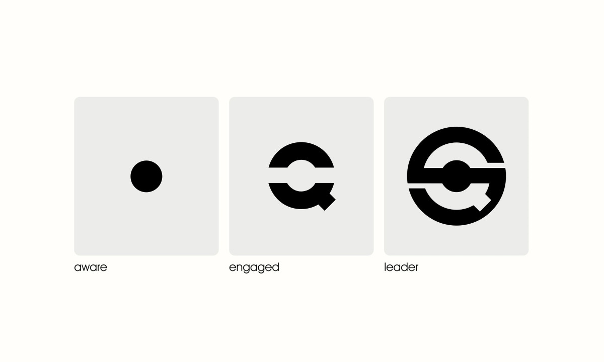
A professional services logo works when the mark itself carries the brand's argument. Q-Selection's icon does exactly that: a circular form with an arrow and a centered dot that reads simultaneously as a Q, a recycling symbol and a directional indicator pointing forward.
The three-stage progression from Aware to Engaged to Leader is where the identity system gets interesting. Each stage derives from the same Q-logo, starting with just the dot, building into the rotating form, then completing into the full closed circle. It is not a badge system; it is a visual evolution told through a single letterform.
That structural logic means the mark earns its complexity. The leader version feels resolved because you have seen it build from something simpler. Organizations at the Aware stage are not handed a lesser logo; they are handed the beginning of one.
The decision to derive every stage from the same graphic source keeps the system coherent across all three levels. There is no visual discontinuity between a partner just starting out and one that has reached leadership. The same form, at different stages of completion, is the whole idea.

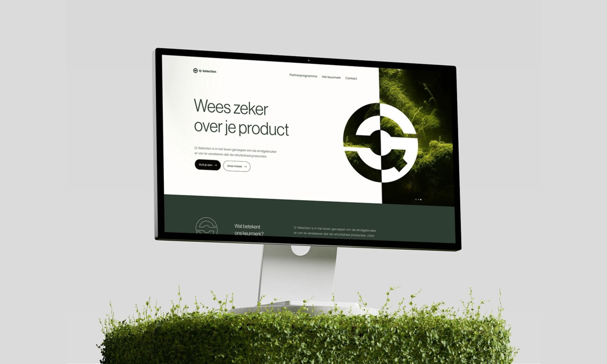
Q-Selection

Rickenbacker Marina Park
Apax Architecture