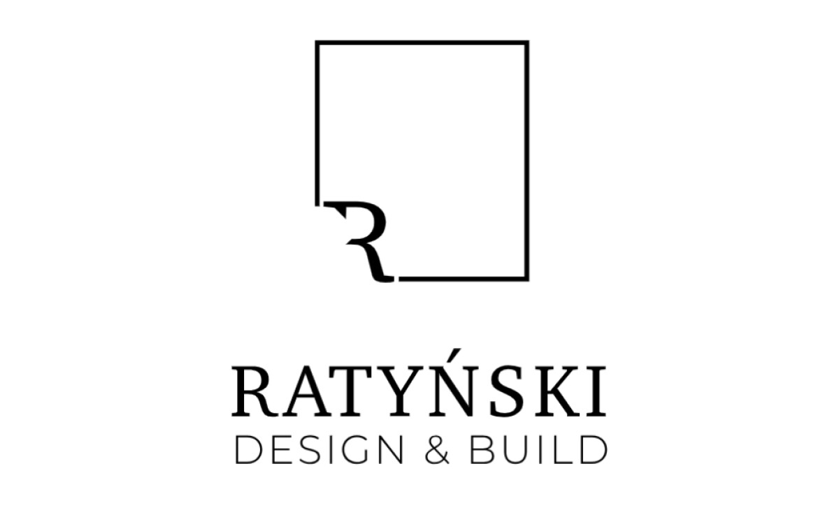
Standout Features:
- Integration of the initial “R”
- Minimalist and elegant design
- Clever negative space use
Ratyński Design & Build specializes in arranging and constructing commercial spaces across retail, office, and healthcare sectors. Its lettermark logo, created by Rarytas.Studio, aims to reflect this dual focus on design and build using a clean, modern, and sophisticated approach.
The logo features a clever integration of the letter “R” within a square, with the bottom left corner of the square "cut out" by the stylized initial. This unique design merges architectural symbolism (the square representing structure and stability) with the company's initial.
The design is characterized by simple lines and an uncluttered structure, with "RATYŃSKI" in a classic serif and "DESIGN & BUILD" in a thinner, more modern sans-serif. This typographic pairing communicates high-quality professionalism and ensures timeless appeal.
The design also leverages negative space, where the sharp, precise cut-out in the letter “R” renders its bottom left half invisible. Despite this, the initial is still readable. In fact, this thoughtful use of the void also evokes a sense of space and openness. It could also reflect Ratyński's ability to create innovative, functional designs.
The minimalist and monochrome design of the Ratyński lettermark ensures its timelessness and versatility across various applications. The insight here is that a clean, conceptually strong lettermark often has greater longevity and adaptability than more complex or trend-driven logo designs.


