The Red Bull Logo: KeyPoints
- Red Bull’s unwavering logo consistency has reinforced an 8.7B EU global brand value (2025) known in over 170 countries, selling 12.670 billion cans in 2024.
- The iconic twin bull motif draws on deep cross-cultural symbolism, representing power, determination, and duality, while the circular backdrop channels the concept of unending energy and completeness.
- Strategic alignment of logo with extreme sports marketing (F1, cliff diving, eSports) has helped Red Bull build a high-octane lifestyle brand, not just a beverage product.
Before it became shorthand for adrenaline, extreme sports, and energy in a can, the Red Bull logo was a calculated branding move rooted in cultural symbolism and visual psychology.
What makes the Red Bull logo so enduring? It’s not just good design. From Thai roots to Formula 1 sponsorships, this emblem has helped drive a brand now worth over $12 billion, proving that when visual identity aligns with market strategy, the result isn’t just recognition, but dominance.
Hear the highlights: How the Red Bull logo became a global asset through strategy, symbolism, and consistent brand execution.
Red Bull Logo Design and Symbolism: Power, Purpose, and Psychological Precision
The Red Bull logo has remained virtually unchanged since its debut in 1987, a strategic design decision that speaks volumes in today’s constantly shifting branding landscape.
Bulls: Universally Recognized Symbols of Power
The two red bulls locked in motion are not just aggressive design choices; they're symbols with layered cultural resonance:
- In Thai culture, the gaur represents strength and fearlessness.
- In Western mythology (e.g., Roman and Greek), the bull is a totem of virility, endurance, and willpower.
- In financial markets, the “bull” is synonymous with growth and optimism, reinforcing Red Bull’s aspirational positioning.
The dual bulls clashing in mirrored stances also suggest internal conflict and balance, a nod to the human push-pull between instinct and control, rest and energy.
The Golden Circle: Energy, Unity, and Wholeness
Behind the bulls is a vibrant yellow circle, representing:
- The sun: a natural energy source and life-giver
- Perpetual motion: the circle signifies completeness, cycles, and timelessness
- Focus and intensity: visually grounding the bulls in a unified burst of energy
In semiotics, circles convey infinity, harmony, and protection, making it a potent counterbalance to the bulls’ aggression.
Color Psychology: Engineered for Impact
- Red is known to increase heart rate, arousal, and urgency, aligning perfectly with Red Bull’s energy-boosting effects.
- Yellow evokes alertness, clarity, and positivity, reinforcing the mental energy proposition.
Research indicates that warm colors such as red and yellow increase arousal and attention, significantly enhancing brand recall.
Additionally, another published research found that red has been shown to promote impulse buying behavior, making these colors especially effective for driving impulse purchases in beverage retail environments.
Red Bull Logo History
The Red Bull logo’s history is as distinctive as the brand itself. Remarkably unchanged since its debut, it defies the norm of regular updates or redesigns. Let’s get into the story of one of the best logo designs that’s so enduring and unique, it defied trends and remained relevant without ever needing to evolve.
1976 – 1987: From Krating Daeng to Global Powerhouse [The Origins of Red Bull]
Red Bull’s story began with Chaleo Yoovidhya, a self-made Thai billionaire and founder of TC Pharmaceutical. In the 1970s, he created a local energy drink named Krating Daeng, targeting blue-collar Thai workers in need of physical stamina. The brand name means “red bull,” referencing the gaur, a large wild ox native to Southeast Asia.
In the early 1980s, Austrian marketing executive Dietrich Mateschitz discovered Krating Daeng while on a business trip in Thailand. Seeing its market potential in the West, Mateschitz proposed a partnership.
Together, Chaleo and Mateschitz co-founded Red Bull GmbH in 1984. Chaleo provided the formula and brand inspiration, while Mateschitz repositioned it for a global audience by adding carbonation, reducing sweetness, and rebranding the packaging for the Western palate.
1987 – Present: Brand Expansion and the Role of Logo Consistency
Red Bull’s visual identity has never needed a facelift. Why? Because the logo doesn’t just sell drinks; it sells a lifestyle.
Since its global debut in 1987, Red Bull’s brand has aligned with extreme sports, elite sponsorships, and adrenaline culture. These associations aren’t accidental:
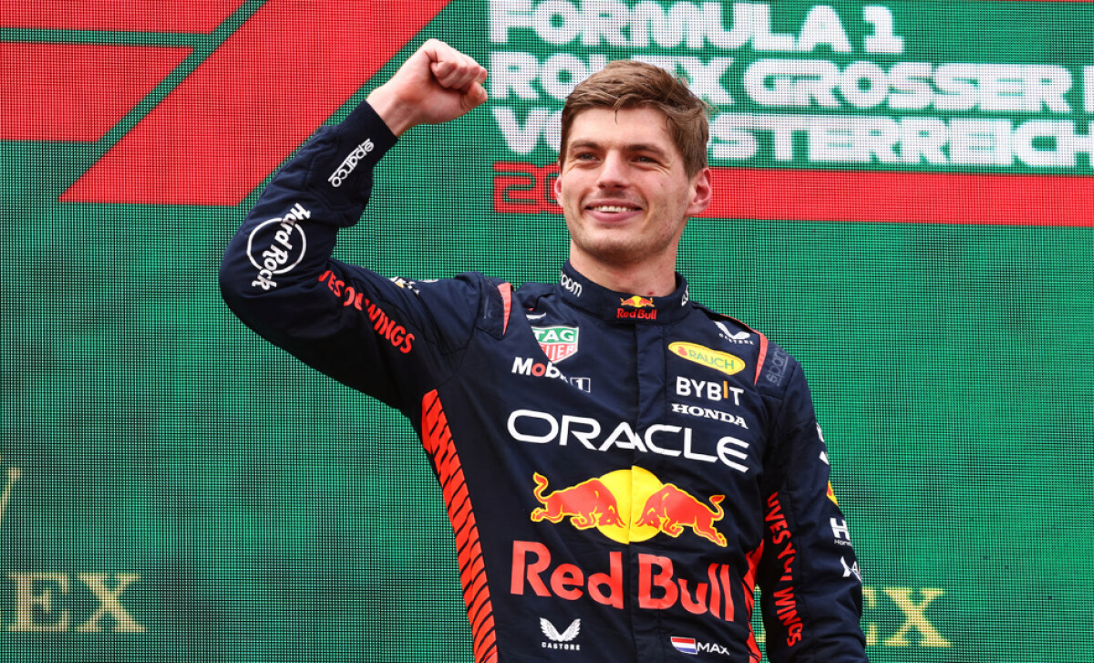
- Red Bull Racing (F1) has won 6 Constructors' Championships and elevated brand prestige.
- Red Bull Stratos (2012), the space jump by Felix Baumgartner, was watched by 45 million people, amplifying brand reach.
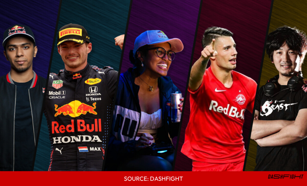
- Red Bull sponsors over 500 athletes, owns sports teams, and runs global events in cliff diving, air racing, breakdancing, and eSports.
These efforts create consistent brand-signaling environments where the logo appears dynamically: helmets, parachutes, car chassis, jerseys. This omnipresence repeatedly exposes audiences to the same core design, compounding brand recognition and loyalty.
The Power of Refusing to Rebrand
Most brands undergo redesigns every 5–10 years to keep up with trends. Red Bull hasn’t budged in over 35 years. That’s not laziness, it’s a flex.
This unwavering identity has allowed Red Bull to:
- Cultivate deep visual trust and instant brand recognition
- Avoid brand confusion across global markets
- Maintain a coherent narrative from product to platform (drink → sport → lifestyle)
This consistency pays off. As of March 31, 2025, Red Bull’s global revenue over the trailing 12 months reached $4.33 billion, reflecting a 2.27% year‐over‐year increase.
That growth builds on an even larger revenue base in 2023 — €10.9 billion, equivalent to roughly $12.71 billion — fueled by the sale of over 12.1 billion cans worldwide.
So what’s the takeaway? A logo rooted in meaning, strategy, and cultural context becomes more than a visual, it becomes a durable business asset with global staying power.
What Brands and Agencies Can Learn from the Red Bull Logo Strategy
Beyond the visual strength of the Red Bull logo, the company offers strategic marketing insights that elevate its design framework and guide agency playbooks:
1. Local Adaptation with Consistent Global Identity
Red Bull empowers local teams to interpret and promote the brand in ways that resonate culturally (across Europe, Asia, and North America) while preserving the core logo and symbols
Takeaway: Replicate this by creating brand guidelines that allow regional flexibility without diluting your core identity.
2. Guerrilla Marketing Amplifies Brand Iconography
Early tactics, ranging from empty-can-filled bins to handing out free samples to DJs, built grassroots visibility without traditional advertising
Takeaway: Use innovative, low-cost activation strategies that place your logo in unexpected, high-traffic environments.
3. Strategic Market Testing & Perseverance
Despite early struggles in Austria, Mateschitz doubled down, refining both the product and placement until resonance was achieved
Takeaway: Resist the impulse to redesign early; instead, iterate and learn from audience-driven insights.
4. Singular Focus Fueled by Innovation
For years, Red Bull focused on one core product, then expanded thoughtfully with new editions and localized launches, maintaining its visual brand across variants.
Takeaway: Start with a clear brand anchor, then extend it carefully ensuring each new variant remains visually cohesive.
5. Cultural Sponsorship Keeps Logos Front and Centre
Owning sports franchises (F1, football clubs) and orchestrating branded events ensures frequent, global logo exposure
Takeaway: Align your logo with immersive experiences, on athletes, at events, and across digital platforms.
6. Embedding Logo in High-Value Content
Red Bull Media House produces rich content, from cliff-diving to Stratos, that ensures the logo isn’t just seen, but felt
Takeaway: Make your visual identity more than decorative, embed it within storytelling that’s shared and fought over.
Actionable Takeaways for Agencies
- Develop a “core + local” design framework that supports global consistency with regional relevance.
- Pilot unconventional logo placements; guerrilla tactics can build perception before big budgets arrive.
- Double down on design, don’t ditch it. Red Bull kept the logo despite early resistance; it paid off.
- Plan expansions with branding continuity; new products or services should echo your core identity.
- Anchor sponsorships to your brand values, choose the right platforms for repeated visual exposure.
- Produce your own content; branded media helps logos become part of cultural narratives, not just products.
Whether you're crafting the next beverage brand or rethinking your visual identity, choose a creative partner who sees design as business strategy. Visit our Agency Directory to find top-rated firms in:
Or explore our Best Beverage Logo Designs collection to see what makes a visual identity thrive in competitive markets.