Team Behind the Design
Logo Design Analysis
A strong brand identity for the urban planning sector needs both clarity and conceptual depth.
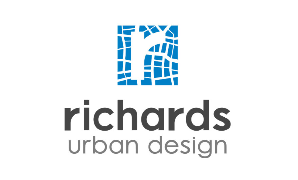
This professional services logo design achieves that by blending real-world urban geometry with a clean, modern mark. For Richards Urban Design Ltd, each decision helps communicate precision and professional expertise.
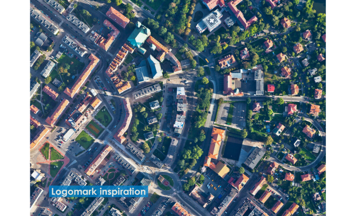
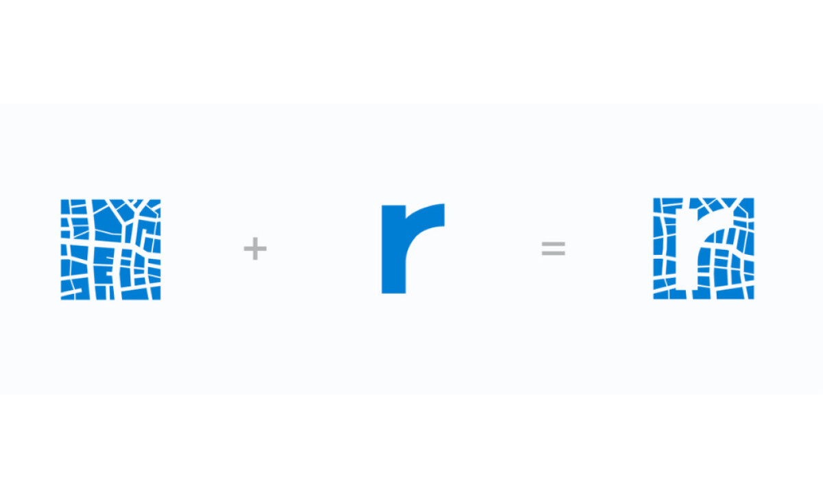
- Logo Concept and Symbol: The mark combines an abstract street grid with the letter R, forming a monogram that feels intelligent and site-specific. I appreciate how the grid pattern echoes aerial city layouts, giving the identity a direct link to urban planning work.
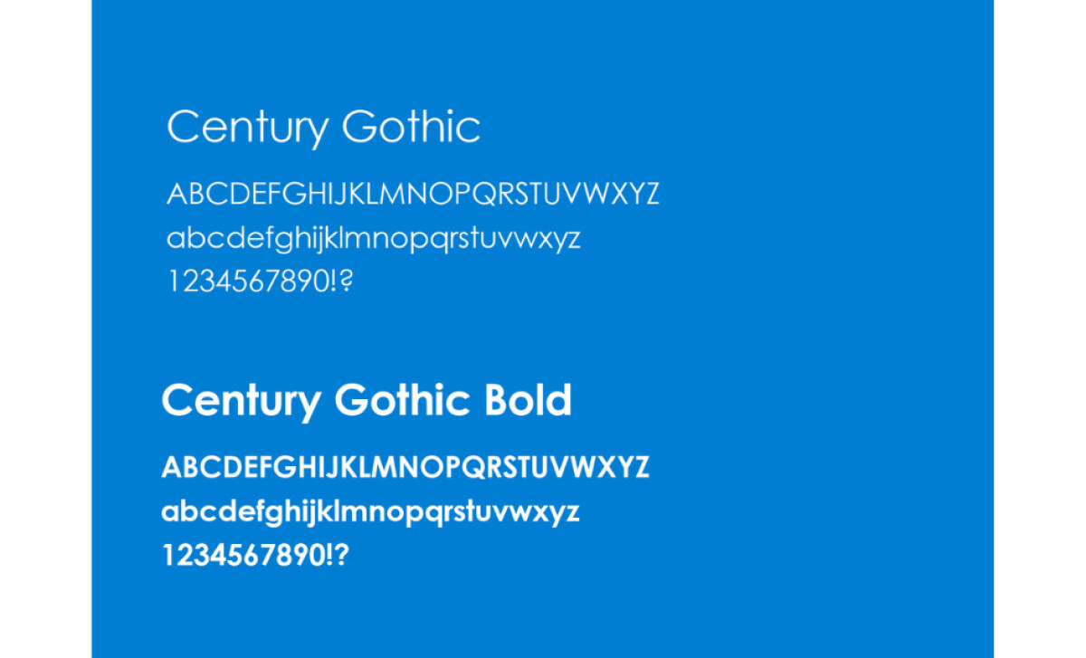
- Typography and Structure: Century Gothic adds a friendly, modern feel while staying professional. Its rounded geometry pairs well with the structured grid, creating a balanced visual contrast that helps the wordmark remain readable at any size.
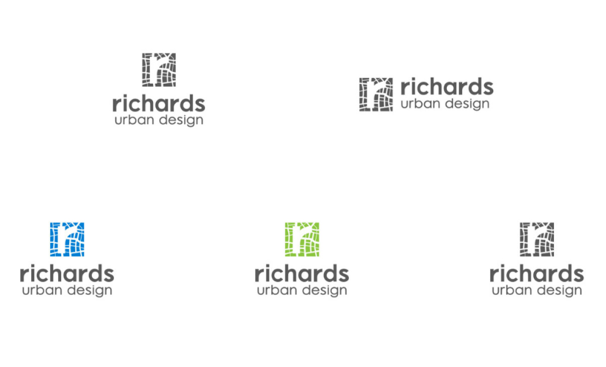
- Color Palette: The blue palette reinforces trust and authority, which is essential for consultancy firms. I find the crisp contrast between the rich blue and white helps the logo stand out across both digital and print applications.
- Versatility and Application: The modular mark scales cleanly and adapts well to different formats, from reports to signage. The simplified grid ensures the symbol remains recognizable even in small sizes, making the identity practical for long-term use.
What Brands & Agencies Can Learn from Richards Urban Design Ltd
Richards Urban Design’s identity shows how structure and clarity can create a memorable brand system rooted in place and purpose.
1. Let Real-World Form Shape the Symbol
The monogram’s grid pattern draws directly from aerial city layouts, turning the practice of urban planning into a visual language. This approach grounds the brand in its discipline without relying on literal imagery.
2. Pair Geometry with Calm, Modern Typography
The rounded forms of Century Gothic soften the structured grid, striking a balance between technical expertise and approachability. This helps the brand feel professional while remaining human and easy to engage with.
3. Use Color to Reinforce Stability and Trust
The blue palette gives the identity a dependable tone that works well for consultancy environments. Its clarity and contrast keep the mark strong across reports, signage, and digital formats.
About DesignRush Featured Designs
At DesignRush, we review hundreds of agency projects each month. The featured designs stand out for creativity, relevance, and execution.
Many go on to be recognized as winners of our Monthly Design Awards.
Discover more examples here:
- Best Logo Designs
- Best Website Designs
- Best App Designs
- Best Print Designs
- Best Packaging Designs
- Best Video Designs
For a full list of design agencies and related services, see our Agency Directory.