Team Behind the Design
Agency: JP Creative
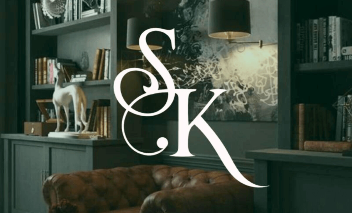
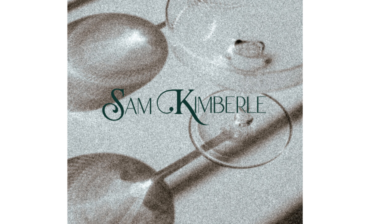
Client: Sam Kimberle
Category: Logo Design (Arts & Recreation)
Location: South Carolina, United States
Project Brief: Create a logo conveying an artist’s identity through elegant serif typography, muted emerald palette, and monogram elements for refined recognition.
Logo Design Analysis
Related Articles:
I often assess logos by their idea, lettering, versatility, and performance across mediums.
Here’s how Sam Kimberle's logo, designed by JP Creative, stands out:
- Concept: I appreciate how the design mirrors the client’s artistic philosophy. The use of broken-beauty symbolism translates into a logo that feels timeless yet deeply personal.
- Typography: The elegant serif typeface instantly communicates sophistication. It aligns with the "vintage, old-money" aesthetic that reinforces artistry and recreation.
- Color Palette: The emerald-green and gold pairing adds refinement. This palette not only resonates with the artist’s sculptures but also conveys healing, stability, and prestige.
- Applications: The monogram provides flexibility across media. From print to digital, the mark maintains clarity while elevating Sam Kimberle's professional image.
Get connected with the right logo design agency for your project.
GET STARTED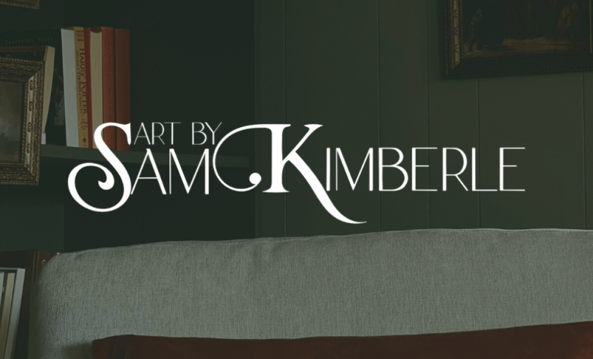
About DesignRush Featured Designs
At DesignRush, we review hundreds of agency projects each month. The featured designs stand out for creativity, execution, and relevance to client goals.
The strongest projects move forward to compete for our Monthly Design Awards, earning industry recognition.
Discover more standout projects in related categories:
- Best Logo Designs
- Best Website Designs
- Best App Designs
- Best Print Designs
- Best Packaging Designs
- Best Video Designs
For a full list of design agencies and related services, see our Agency Directory.
Get a chance to become the next Design Awards winner.
SUBMIT YOUR DESIGN
-preview.jpg)