- Designers: Catherine Lemieux, Gabriel Pelletier, Louis-André Labadie
- Client: Museum Innovation Incubator
- Category: Logo Design — Arts & Recreation
- Location: Québec City, Canada
- Project Brief: Create a unified yet flexible logo for a first-of-its-kind museum collaboration, capable of expressing experimentation, cross-disciplinary dialogue, and ongoing evolution while remaining usable by teams across two institutions.
Arts and recreation logo design for an innovation incubator requires a system that communicates openness and experimentation rather than fixed authority.
The Museum Innovation Incubator (IIM) positions the brand as a living framework; one that can expand, mutate, and adapt across physical and digital environments.
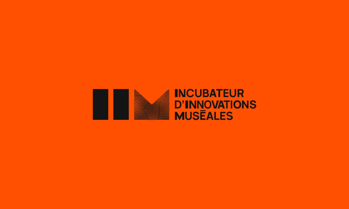
- Generative Mark & Symbol Logic: The logo combines strict geometry with organic, line-based textures that feel algorithmic and tactile at once. I believe this tension functions as a visual metaphor for innovation. It is structured enough to be institutional, yet open-ended enough to invite exploration.
- Color & Contrast Strategy: High-impact orange paired with deep black creates immediate visibility and urgency. This contrast reinforces the incubator’s role as a catalyst within traditionally neutral museum spaces, signaling disruption rather than preservation.
- System Thinking & Modularity: Patterns, symbols, and typographic blocks behave as modular components rather than fixed compositions. I appreciate how this allows teams from both museums to apply the branding freely without breaking coherence, supporting long-term scalability.
- Application Across Physical & Digital Media: From tape graphics to screens and editorial layouts, the visuals perform consistently across formats. I think the system is especially effective in how it turns functional elements into expressive moments, blurring the line between communication and installation.
What Brands & Designers Can Learn from Museum Innovation Incubator
1. Treat Identity as a Living Framework
Generative marks and modular components allow the system to evolve across teams, programs, and environments. Designing for change encourages participation rather than rigid brand enforcement.
2. Use Contrast to Signal Disruption
High-impact orange against deep black creates urgency and visibility within traditionally neutral museum contexts. Strategic contrast positions the incubator as a catalyst for new ideas rather than preservation.
3. Let Application Drive Expression
The system performs consistently across tape graphics, screens, and installations. When functional elements become expressive, identity shifts from static branding to an active experience.