
As of June 2026, the Spurs are in the NBA Finals for the first time in over a decade, facing the New York Knicks in what is Victor Wembanyama's first appearance on basketball's biggest stage.
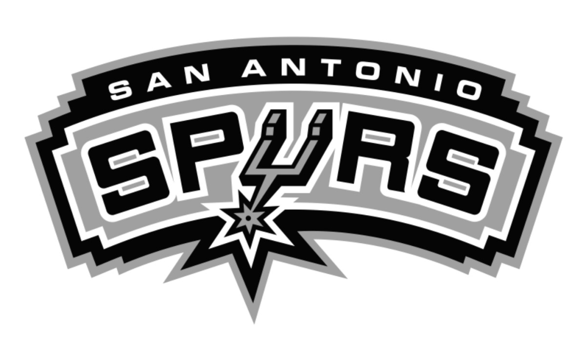
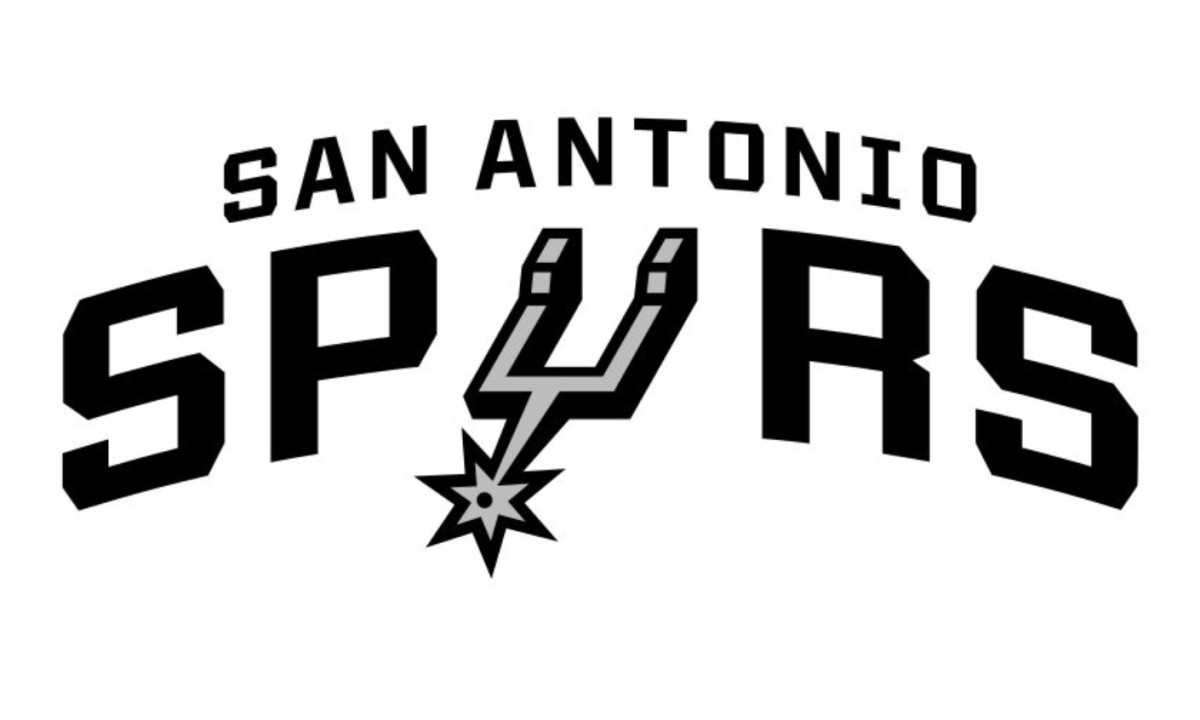
The logo going into that moment is the 2018 refinement: black, silver, white.
No flourish. No drama. Just a spur.
That's the point.
In a league that runs on color, hype, and visual maximalism, the San Antonio Spurs logo is about as restrained as professional basketball gets — and that restraint is a design statement all by itself.
Here's the full history of how it came to be, what it means, and why it keeps outlasting everything around it.
Before There Were Spurs: The Dallas Chaparrals (1967–1973)
The franchise that would become the Spurs didn't start in San Antonio.
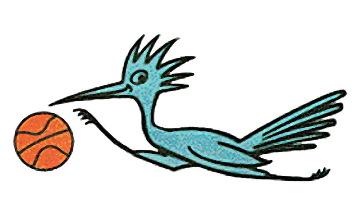
It started in Dallas, in the American Basketball Association, as the Dallas Chaparrals, named after the roadrunner bird native to the Southwest.
The original emblem was cartoonish: a light blue bird running with a basketball, the kind of mascot logo every regional team seemed to have in the late '60s.
A 1970 redesign added a Texas state silhouette in the background and shifted the palette to blue, white, gray, and red.
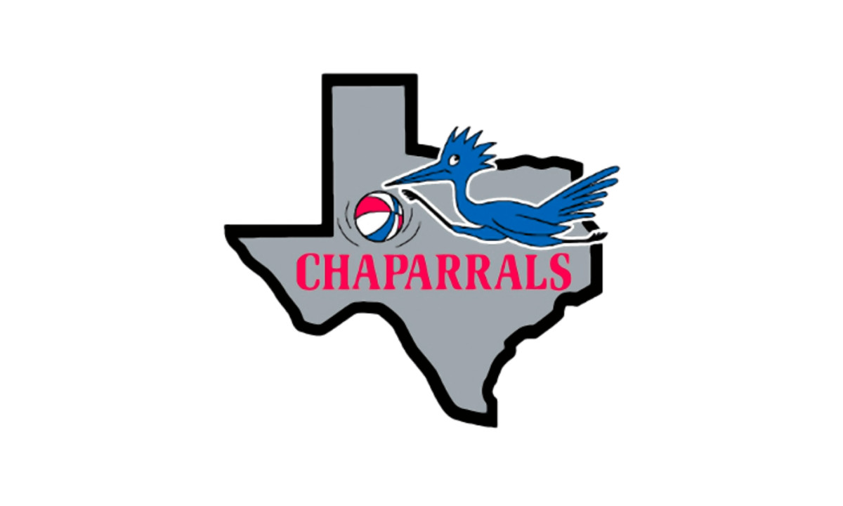
Memorable for a moment, but mostly forgettable across the long arc of what this franchise would become.
The bird wouldn't survive the move.
When new owners relocated the team to San Antonio in 1973, they didn't just change the city. They changed the entire philosophy.
1973–1989: The Spur Is Born
This is the origin story. And it happened surprisingly fast.
The San Antonio Spurs logo was designed by Finis Collins in 1973, while he was working at the Pitluk Group advertising agency.
The new ownership, led by Red McCombs, gave him minimal direction: put a spur somewhere in the design.
Collins visited the Witte Museum in San Antonio to study actual spurs on exhibit, produced three options in four days, and submitted them.
Management approved his work the very next day without a single change.
"They didn't change anything," Collins recalled in an interview with Sports Illustrated. "It takes, usually, a lot of grinding and a lot of work. But in this case, it just went flying through, bang, bang, bang."
What Collins created was deceptively clever: the wordmark spelled out "SPURS" in black and silver, with the spur itself serving as the letter "U," placed at an angle with a fairly realistic design, and "SAN ANTONIO" arched above it.
No mascot, no player silhouette, no emblem of Texas bravado. Just typography with a piece of ranching equipment embedded in it.
For a franchise trying to establish itself in a new city, in a new league, competing for attention, that choice was either incredibly confident or slightly crazy.
Looking back, it was both.
1989–2002: The Fiesta Colors Era
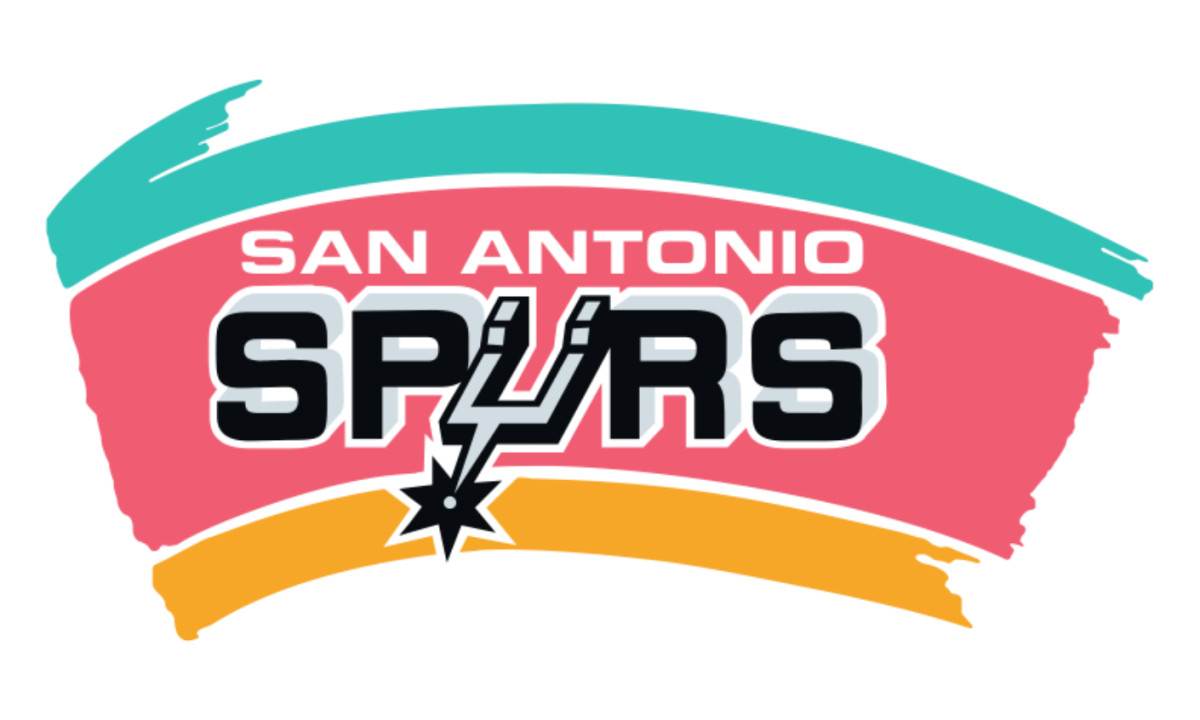
Here's where things get interesting. In 1989, the Spurs placed their clean, severe wordmark on a very different kind of background.
The dark logo was set against a bright backdrop of three arched stripes: turquoise, light pink, and yellow.
Those colors were a deliberate nod to the Mexican and Chicano heritage that defines San Antonio as a city, a kind of visual handshake with the community that had just adopted this team.
The spur-as-U stayed. The core wordmark stayed. But now it was sitting on a fiesta.
This era has its fans. The standalone spur alternate from 1990 to 2002 is rated by logo enthusiasts as the second-highest-rated Spurs mark ever, with a community score of 5.41.
There's genuine affection for that burst of color — it's the one time the Spurs logo visually reflected the city's personality rather than the franchise's poker face.
But by 2002, the fiesta was over.
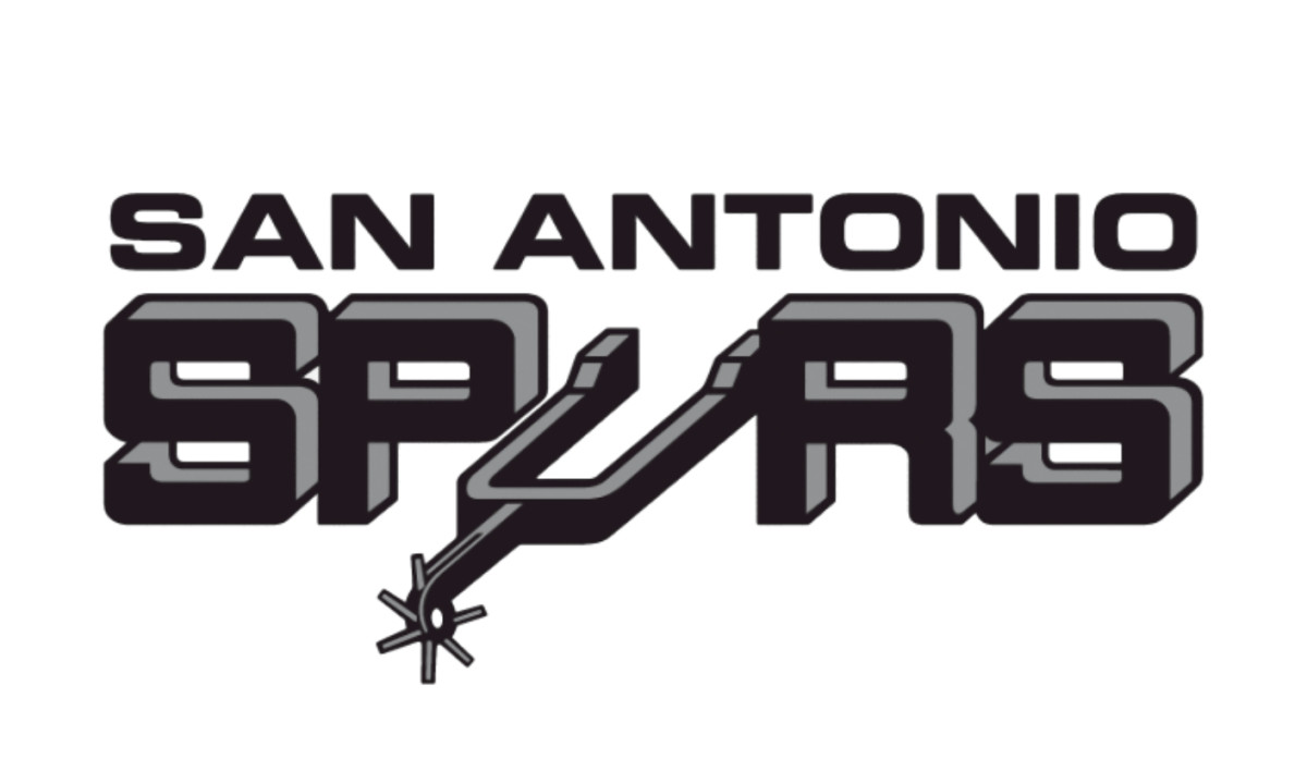
2002–2017: The Dynasty Aesthetic
The Spurs won their first NBA championship in 1999. And in 2002, right between two more titles, they stripped the color out of their logo and never looked back.
The colorful background disappeared.
In its place: black and gray lettering arched over a silver banner framed in black, with "SAN ANTONIO" set in white above.
It looked less like a sports logo and more like a hallmark of industrial craft.
The timing was no accident.
The timing was no accident. This coincided almost perfectly with the Tim Duncan era hitting full stride.
Duncan — one of the most efficient and least flashy superstars in league history — was winning titles while barely raising his voice.
The logo matched him perfectly — both spent their careers being the best in the room without ever needing you to know it.
The Spurs went on to win championships in 2003, 2005, 2007, and 2014 under this identity, same logo, same colors, same restraint throughout.
2017–Present: The Refinement
The 2014 run in particular, a clinic in selfless moving-ball basketball still studied by coaches worldwide, didn't need a loud logo any more than it needed a designated hero.
In 2017, the Spurs updated their logo — and if you weren't paying close attention, you might have missed it entirely. That's intentional.
The arched wordmark stayed. The spur-as-U stayed.
What changed was the typeface: the letterforms were refined with diamond-shaped angles on letters like S, O, P, and R, giving the wordmark a sharper, more contemporary character while preserving every element fans already recognized.
After more than four decades, the spur-integrated "U" stands as one of the NBA's most enduring logo symbols, refined but never replaced.
That same season, the franchise introduced a secondary mark: an "SA" monogram on a black basketball, visible across Spurs merchandise at the NBA Store.

It works as a compact, adaptable version of the identity without displacing the primary wordmark.
The official colors, per the team's brand guidelines:
- Silver: Pantone PMS 877 C / Hex #C4CED4
- Black: Pantone PMS BLACK 6 C / Hex #000000
No red, no gold, no blue.
In a league where the Knicks wear orange, the Lakers wear purple and gold, and the Raptors have cycled through more logo iterations than most teams have had head coaches, the Spurs wear silver and black.
That's the whole conversation.
The Alternate Spur: The Community's Favorite Mark
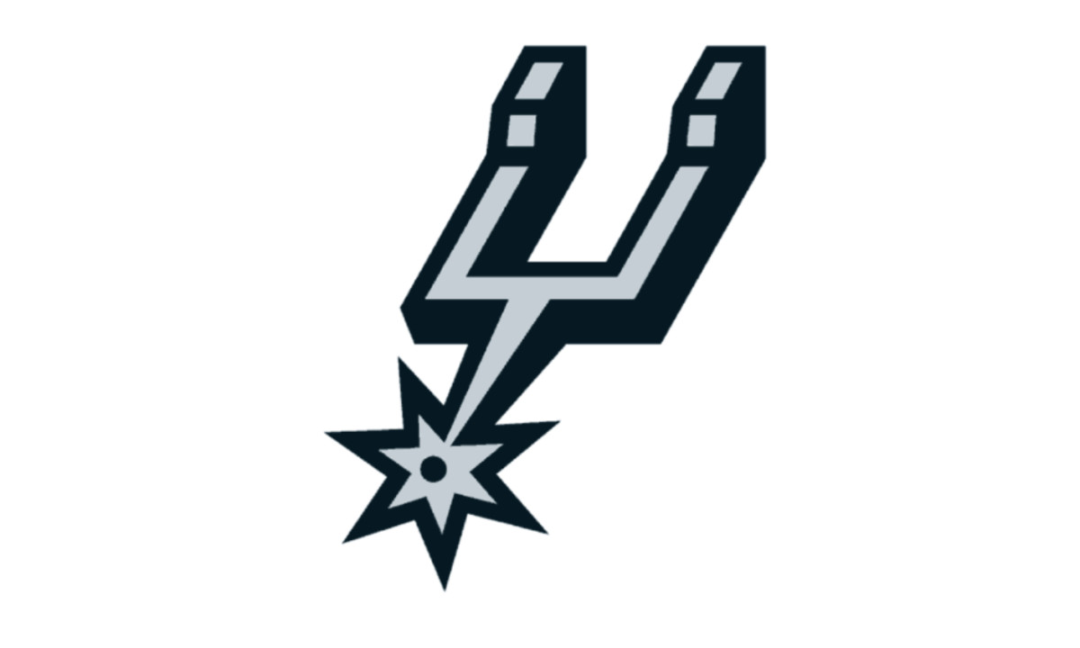
The standalone spur alternate, in use since 2003, is rated the highest of any Spurs logo among fans who track this stuff obsessively, scoring 5.48 out of 10 and edging out even the beloved Fiesta-era alternate.
No wordmark, no team name.
Just the piece of hardware that defines the franchise's identity, rendered in silver and black, living as a secondary mark on center court at the Frost Bank Center since 2002.
Most alternate logos try to do more.
The Spurs' alternate does less, and fans rate it higher because of it.
A spur is a tool designed to do one thing efficiently. So is the Spurs organization.
Why the Logo Works: A Design Argument
Most professional sports logos are built around intimidation, regional pride, or mascot energy.
The Thunder have a storm. The Bulls have a charging animal. The Heat have, well, heat. The Spurs have a letter replaced by riding equipment.
What makes it work is confidence through understatement: black conveying authority, silver conveying sophistication, and the absence of loud color reinforcing a minimalist approach no other NBA franchise has sustained for this long.
While other teams cycle through rebrands chasing relevance, San Antonio built a recognizable, beloved identity through sheer consistency across 50-plus years — a principle visible across classic NBA logo history, where the most respected marks tend to change the least.
That's a lesson most franchises, and most brands, never learn.
The Wembanyama Angle: The Most Unusual Player, The Most Restrained Logo

(Source: Yahoo Sports)
Here is the tension that makes the 2026 Finals so fascinating from a design perspective.
Victor Wembanyama is 7'4". He blocks shots that other players thought were unblockable, shoots threes off the dribble, handles like a guard, and moves with an angular fluidity that has no NBA precedent.
He is the most physically unusual basketball player the league has ever seen, a player who literally looks like a different category of human being.
And he wears the most visually restrained logo in professional basketball.
There's something almost philosophical about that pairing.
The player defies categorization. The logo refuses it.
Wembanyama is impossible to reduce to a simple visual idea, which is exactly why he'd look wrong under a roaring mascot or an emblem that tried to describe him.
The Spurs logo doesn't try to describe its players. It describes the organization's posture: serious, purposeful, here to stay.
The logo on his chest was sketched in four days in 1973 and approved the next morning.
Fifty years later, nobody's touched it.

Our team ranks agencies worldwide to help you find a qualified partner. Visit our Agency Directory for the Top Logo Design Companies as well as:
- Top Sports Marketing Agencies
- Top Design Agencies
- Top Branding Companies
- Top Graphic Design Companies Think your brand could go 50 years without a redesign?Submit Your Work


-preview.jpg)