New sports teams often struggle to establish recognition, but the Kraken did something different. By tapping into mythology, regional pride, and the psychology of visual memory, the Seattle Kraken logo became an immediate classic.
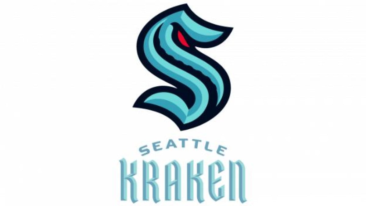
Its stylized “S” nods to Seattle’s hockey past, while the hidden tentacle and striking red eye play on the brain’s instinctive attraction to mystery and contrast. Let's break down how the Seattle Kraken logo was designed for instant impact, why its details trigger strong fan engagement, and what it tells us about the science of great branding.
Seattle Kraken Logo Design Details
The best logos tap into subconscious triggers: contrast, symbolism, and familiarity to create an emotional connection. The Kraken logo does this with three key design elements.
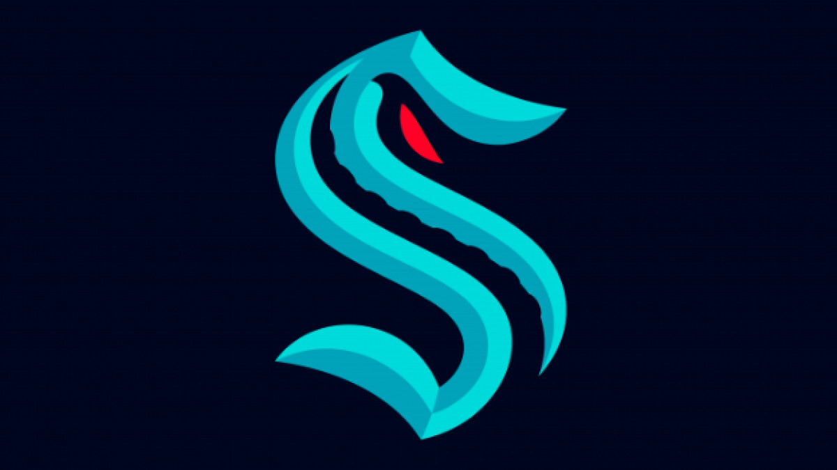
The bold, stylized “S” is a deliberate nod to Seattle’s hockey heritage. The Seattle Metropolitans, the first American team to win the Stanley Cup in 1917, used a similar “S” in their uniforms. By incorporating this shape, the Kraken logo subconsciously makes it feel like an established hockey brand despite being one of the NHL’s newest teams.
Beyond its historical tie-ins, the Kraken symbol of a tentacle and red eye add layers of intrigue and emotion. The tentacle, hidden within the curves of the “S,” suggests the presence of something vast and powerful just beneath the surface.
On the other hand, the various shades of blue reflect Seattle’s maritime culture, grounding the logo in the city’s geography and lore. Meanwhile, the red color — limited solely to the Kraken’s eye — adds a striking visual cue without overpowering the design.
This balance ensures that the logo feels mysterious and aggressive, like the legendary Kraken itself. Through these strategic choices, the Seattle Kraken designed a logo that feels historic yet modern, simple yet layered, familiar yet ominous — creating an instant emotional connection with fans and the broader sports world.
Seattle Kraken Logo History
For most teams, logo evolution happens gradually. The Kraken, as a new franchise, had one shot to get it right. Their design process was rooted in fan psychology, local history, and strategic branding choices.
2018–2020: The Psychology of a Placeholder Identity
-desktop.jpg)
Before the Seattle Kraken had a name, they had a concept — and concepts shape expectations. The franchise’s preliminary emblem featured only the city’s name, written in a fluid, handwritten script.
The design itself leaned into familiarity. The sweeping strokes and connected letters created a sense of flow, while the unified crossbar of both ‘t’ characters made the logomark cohesive. Even the elongated underline beneath the ‘l’ gave the wordmark a sense of stability.
The choice of coral red against a white background added another psychological layer: red is an activating color, often used to convey energy and anticipation, making it ideal for a team on the verge of something new.
Though temporary, this design served a purpose. It introduced Seattle’s NHL presence without locking in an identity, giving fans time to speculate, engage, and build emotional investment. The final branding was still to come — but by choosing a warm, familiar aesthetic, the franchise made sure its early presence felt approachable, organic, and intentional.
2020: The Kraken Identity Is Born
Seattle’s hockey fanbase had been without an NHL team for decades, so the Kraken aimed to carve out a distinct identity in the NHL, embracing themes of mystery, strength, and Seattle’s maritime culture. Its logo was pivotal in reinforcing that vision.
The NHL, with its long history of franchises featuring traditional team names and designs, saw the Kraken break away from the norm. Rather than an animal or location-based name, Seattle chose an identity built on mythology, and the logo reflects that with its emphasis on intrigue and storytelling.
This distinct approach set the Kraken apart from their expansion predecessors, such as the Vegas Golden Knights, who leaned into medieval warrior imagery. Instead, the Kraken embraced the power of suggestion — a mythical beast lurking beneath the surface, never fully seen. The minimal yet striking design stands out among NHL logos, most of which rely on more direct depictions of mascots or symbols.
The Anchor Logo as A Secondary Symbol
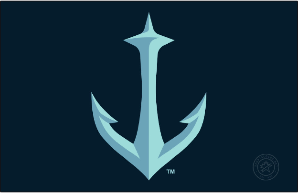
While the main Kraken emblem dominates the team’s branding, the secondary anchor logo remains a well-crafted but less visible piece of the identity. Designed with clean lines and sharp edges, the anchor still represents Seattle’s deep maritime connection. However, its cleverest detail is the integration of the Space Needle into the top of the anchor, a subtle nod to the city’s most iconic landmark.
Despite its strong design, the anchor logo is largely absent from the team’s primary branding, appearing only on select merchandise and uniforms. This choice was likely strategic — the Kraken organization wanted the main logo to be the dominant identity. The anchor could represent a contrasting theme of stability and grounding against the elusive and unpredictable nature of the team’s primary imagery.
See the top agencies specializing in responsive logo design and ensure your brand remains impactful in any format.
Seattle Kraken: A Logo That Anchors a Franchise
The Seattle Kraken logo is more than just a team emblem — it’s a statement about identity, history, and culture. From its immediate adoption by fans to its unique place in NHL branding, it has proven to be one of the most well-received logos in modern sports.
By rejecting convention in favor of intrigue, the Kraken have positioned themselves as a franchise built on anticipation and presence, where the power lies not in what is seen but in what is implied. From the bold “S” that nods to Seattle’s hockey heritage to the lurking tentacle and piercing red eye, every detail is crafted for impact, recognition, and longevity.
Plus, by combining an iconic logo with a strong yet understated secondary mark, the Kraken created a visual identity that is both timeless and modern — one that will continue to define the franchise for years to come.