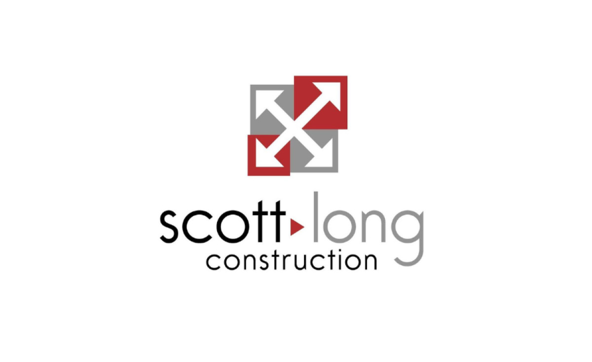
Standout Features:
- Crossed-arrows symbol
- Equilateral triangle hyphen
- Sharp, geometric typography
Scott-Long Construction, a trusted company specializing in hospitality, retail, restaurant, healthcare, industrial, institutional, and multifamily residential projects, needed a logo design that reflects its professionalism and versatility across various industries.
ImageWorks Creative answered this call and created a design that has a crossed-arrow symbol, with bold red, gray, and white hues as its central element. This powerful combination of colors signifies strength, precision, and reliability — the main qualities associated with Scott-Long Construction. The arrows, on the other hand, convey both direction and collaboration — two vital aspects of the construction industry.
To symbolize reliability and solidity, the agency employed an equilateral triangle as a hyphen between the words "Scott" and "Long." The triangle, with its strong base and equal sides, is often associated with stability and balance — reinforcing Scott-Long's commitment to delivering consistent, high-quality work across all sectors.
These visual elements are further enhanced by the sharp, geometrical typography, adding a modern and professional aesthetic to the logo. The clean, structured letterforms ensure the brand name remains highly legible, reinforcing Scott-Long’s strong presence in the construction industry.