Team Behind the Design
Logo Design Analysis
When I evaluate fashion logo designs, I often look at concept strength, typography, scalability, and how well the mark adapts across real applications.
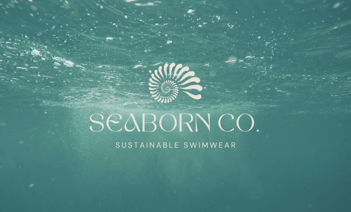
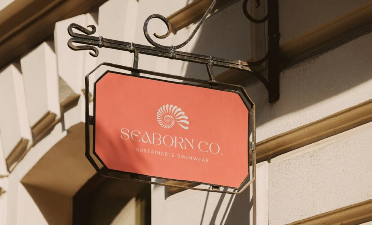
Seaborn Co’s identity blends coastal symbolism with premium fashion cues, creating a logo that feels both natural and elevated.
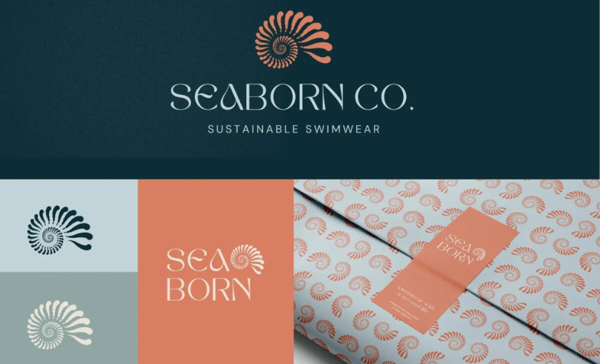
- Concept & Symbolism: The nautilus-inspired spiral serves as a meaningful metaphor for ocean life and natural balance. I like how the abstraction avoids literal shell imagery while still capturing fluidity and ecological harmony.
- Typography: The high-end serif wordmark introduces softness through rounded bowls and gentle curves. I appreciate how the typographic rhythm feels both fashion-forward and coastal, striking a rare balance between polish and ease.
- Color & Palette Integration: The use of deep-sea teal and warm coral ties the identity directly to ocean depth and sunlit shores. This blend feels intentional — the tones carry emotional warmth while supporting strong readability in varied applications.
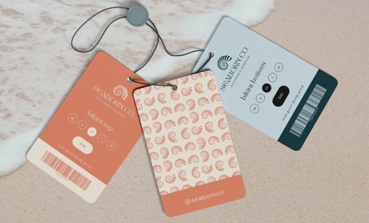
- Scalability: The emblem holds its clarity at both small and large sizes. I like how its symmetry maintains presence on tags, packaging, and signage, helping the brand stay recognizable across formats.
What Brands & Agencies Can Learn from Seaborn Co.
This project shows how sustainability-forward brands can express their mission through subtle geometry and premium typography.
1. Use Organic Forms to Communicate Brand Purpose
Symbols inspired by natural shapes — like spirals, waves, or shells — can deliver emotional resonance without relying on literal illustration. When abstracted thoughtfully, they feel modern and timeless.
2. Balance Elegance With Approachability
Pairing a fashion-driven serif with gentle curvature helps brands appear premium yet relaxed. This harmony works well for lifestyle and hospitality-adjacent markets seeking both credibility and warmth.
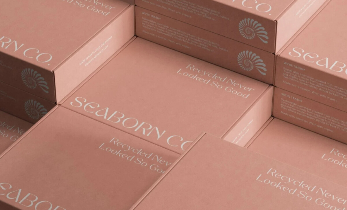
3. Extend Symbolism Into Distinctive Patterns
Turning the emblem into a scalable pattern adds depth to packaging and merchandise. This technique helps unify touchpoints and reinforces recognition while staying true to sustainable storytelling.
About DesignRush Featured Designs
At DesignRush, we review hundreds of agency projects every month across branding, digital, and creative disciplines. The designs we feature represent some of the most compelling recent work, standing out for strong visual execution and brand relevance.
Only the top projects progress to our Monthly Design Awards, an industry recognition celebrating standout creativity and craftsmanship.
Check out more standout work across categories:
- Best Logo Designs
- Best Website Designs
- Best App Designs
- Best Print Designs
- Best Packaging Designs
- Best Video Designs
For a full list of design agencies and related services, see our Agency Directory.