The New York Yankees run two logos at the same time, and most fans only ever picture one of them.
The famous one is the interlocking NY, the navy monogram stitched onto every cap. The official one is the bat-and-hat roundel that shows up on team letterhead, contracts, and printed programs. They do separate jobs, and they arrived almost four decades apart.
Here is the part that throws people. The interlocking NY is older than the team's name. It began in 1877 as a New York City police medal, decades before anyone in the Bronx was called a Yankee.
And here is the second part. The franchise barely touches either mark. While other teams redraw their identity every ten years, the Yankees have kept the same cap insignia since 1909 and the same home uniform since 1936.
The early logo history is busy, with most of the changes packed into the first decade. After 1909, the edits get small and rare. The story is less about reinvention than about a team deciding early what it wanted to look like and then refusing to move. Browse the wider category of sports and leisure logo design and you will not find many marks this old still in active daily use.
1901: The Orange O
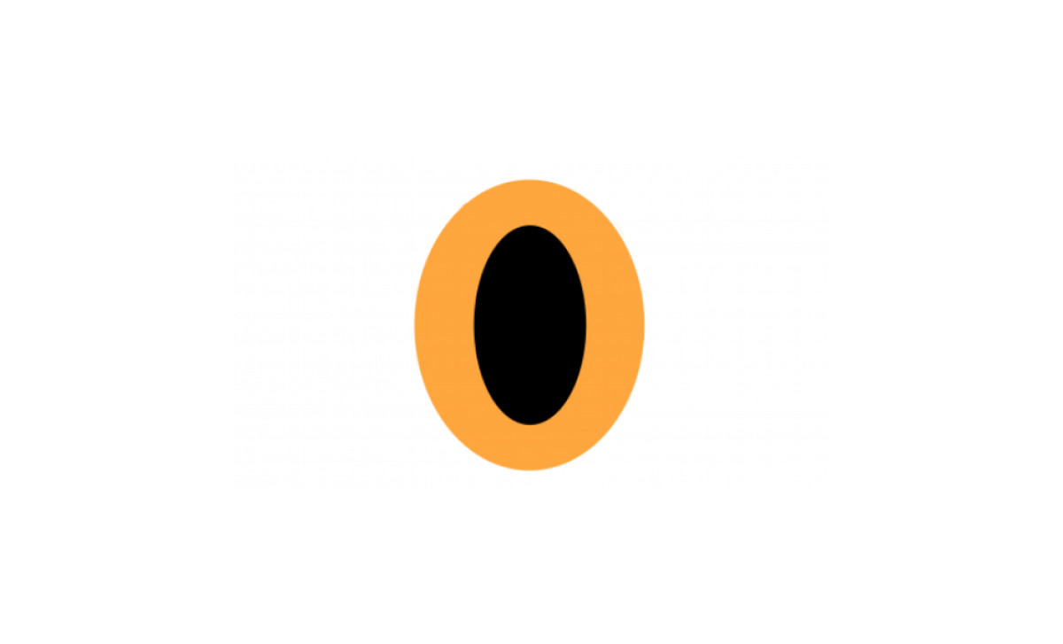
The franchise did not start in New York and was not yet the Yankees. Founded in 1901 as the Baltimore Orioles, the club opened with a plain orange letter O on a black field.
It read as a placeholder more than an identity. The mark named a team and did little else.
1902: The Baltimore B
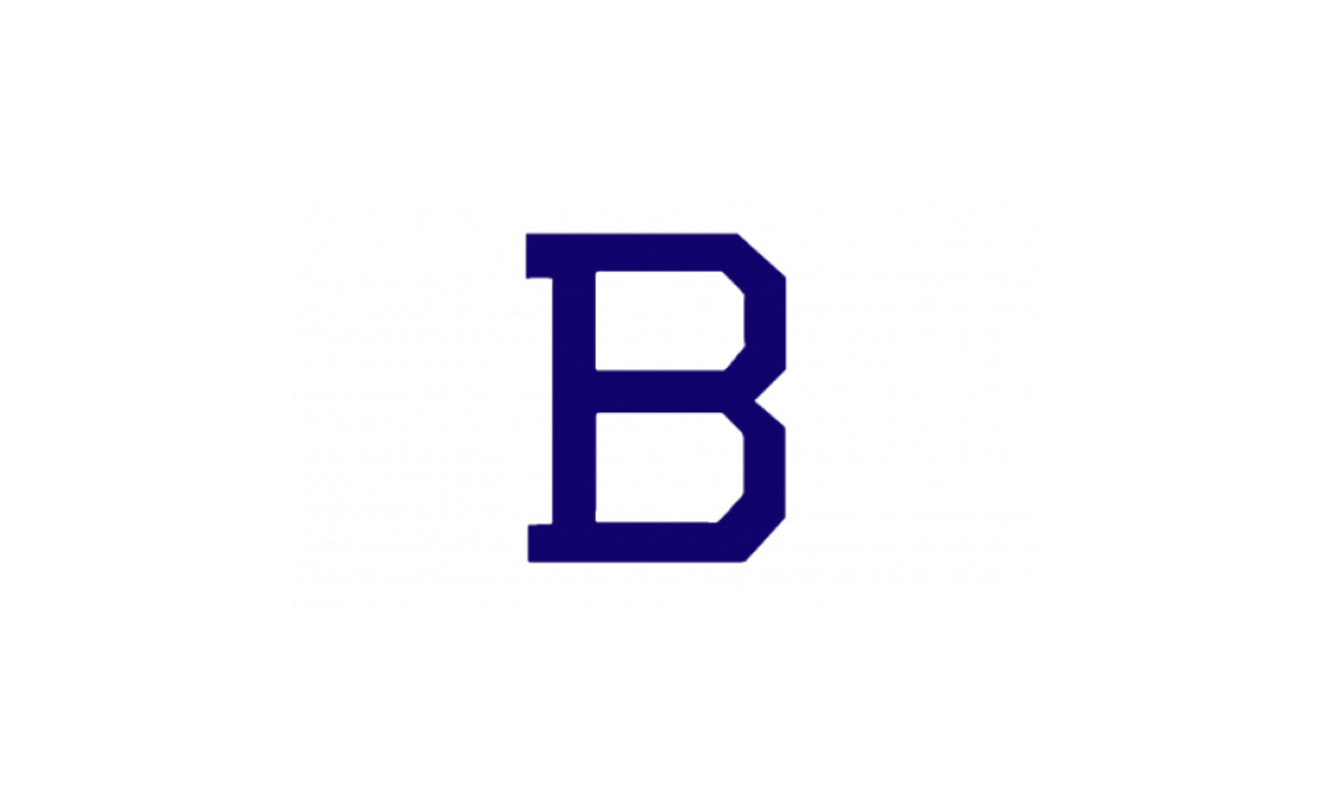
In 1902 the orange O gave way to a blunt blue letter B for Baltimore, geometric and easy to read.
It was clean and forgettable in equal measure. Neither of the first two marks carried the weight the brand would later hold, and both belonged to a team still figuring out who it was.
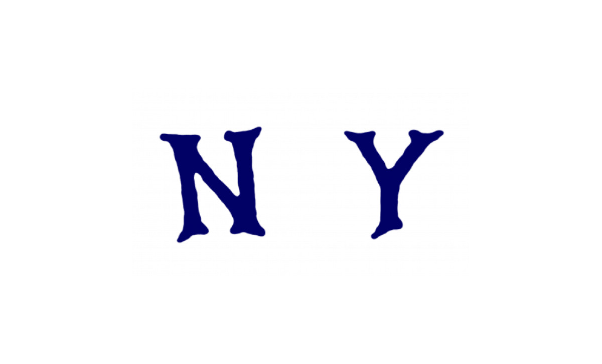
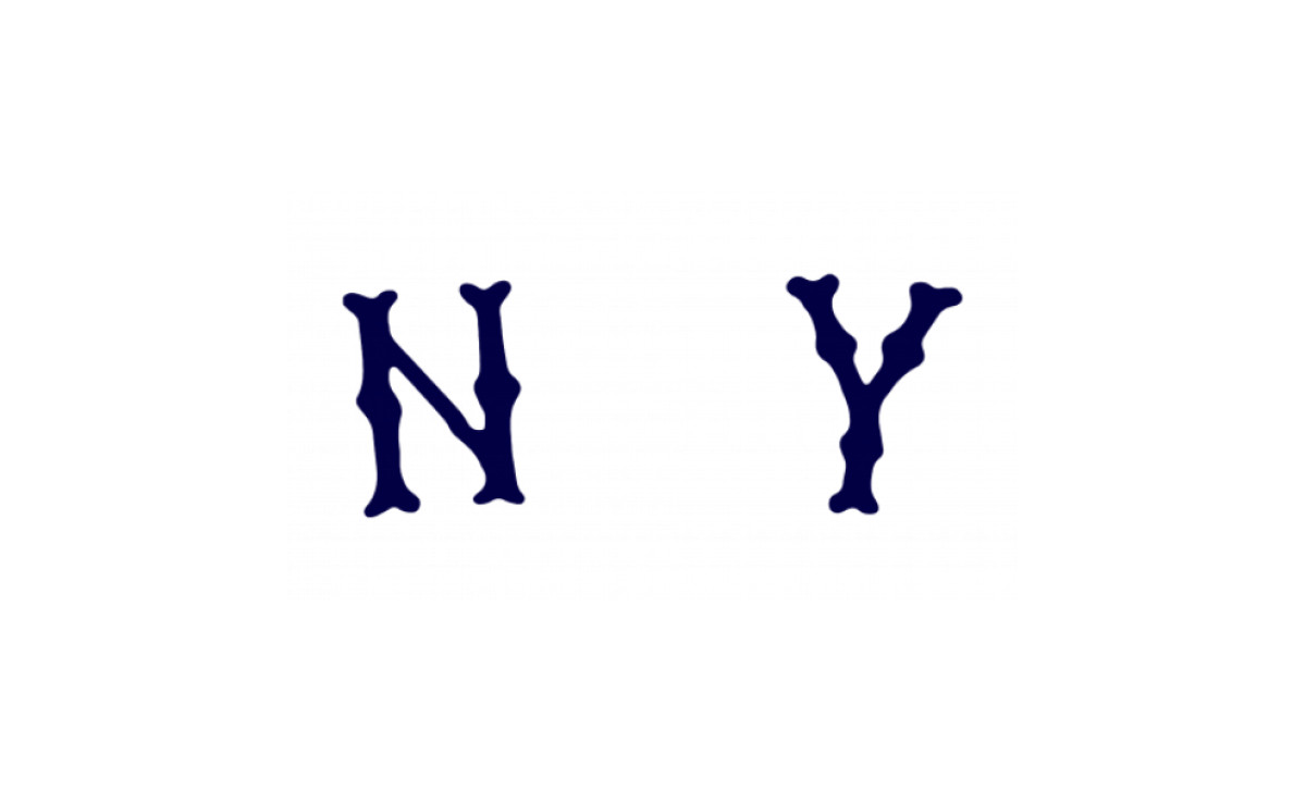
1903 – 1904: The First NY Monogram
Frank Farrell and Bill Devery bought the team in 1903, moved it to New York, and renamed it the Highlanders. The first New York mark set two ornate, serifed letters, an N and a Y in deep blue on white, standing apart rather than joined.
On the jersey, the letters sat on opposite sides of the chest with the button placket between them. The look was formal and a little stiff.
The pieces of the future logo were all here. They just were not connected yet.
1905 – 1906: A Shift to Block Lettering
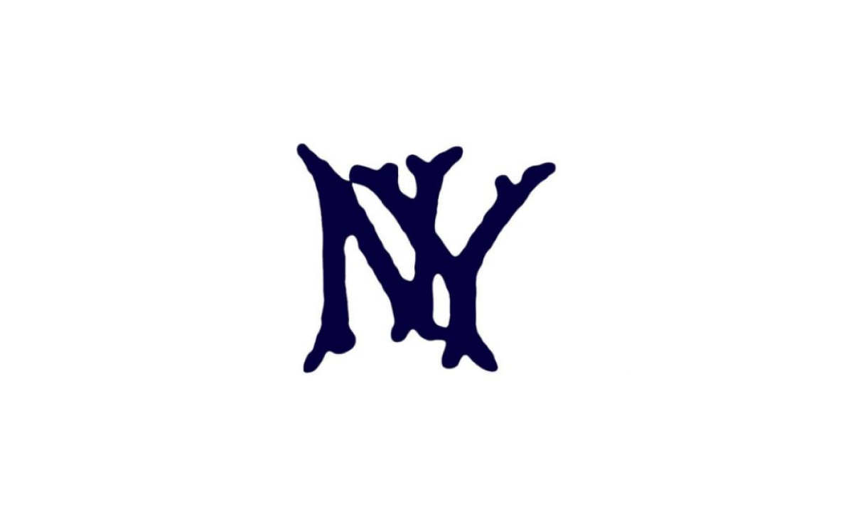
In 1905 the team interlocked the N and Y for the first time, with soft, rounded edges closer to flowing calligraphy than to the sharp mark used today.
It did not hold. By 1906 the club pulled the two letters back apart and spaced them widely again.
The interlocking idea was right and the timing was early. The team needed a few more passes before it would trust the look.
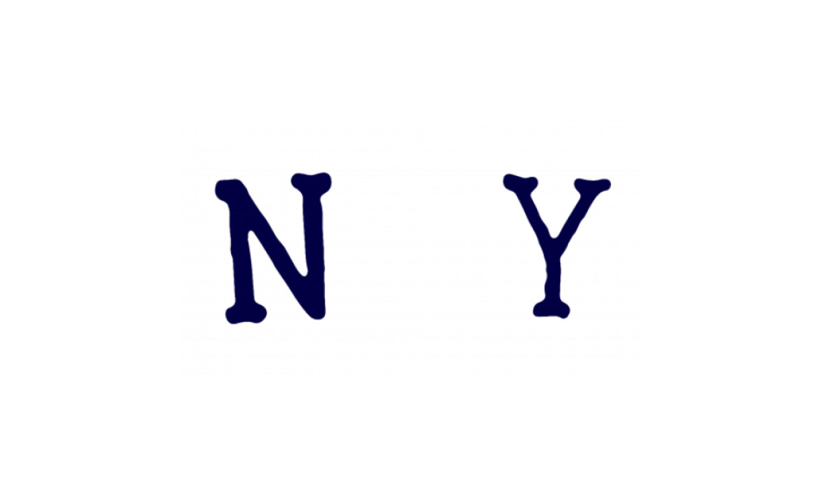
1906 – 1907: A More Defined Monogram
By 1906 the separated N and Y returned sharper. The contours grew more distinct and the strokes more structured, and the blue brightened into a more assertive shade.
The edges stayed smooth and rounded, but they now read as strength instead of softness.
It was a small refinement, the kind of move the franchise would lean on for the next century.
1907 – 1908: A Refined and Balanced Identity
In 1907 the letterform thinned out and the bright blue gave way to a deep navy, the shade that still anchors the brand.
The spacing between the letters opened up, trading the dense earlier look for clarity and breathing room.
The Highlanders were still a team in transition, but the mark was edging toward the authority it would soon carry.
1908 – 1909: The Strengthened Monogram
In 1908 the team brought back ornate lettering, this time arching the N and Y along an invisible curve so the two read as a single composition.
The spacing tightened and the deep navy held, making this the most cohesive version yet.
Everything was now in place for the mark that would end the experimentation for good.
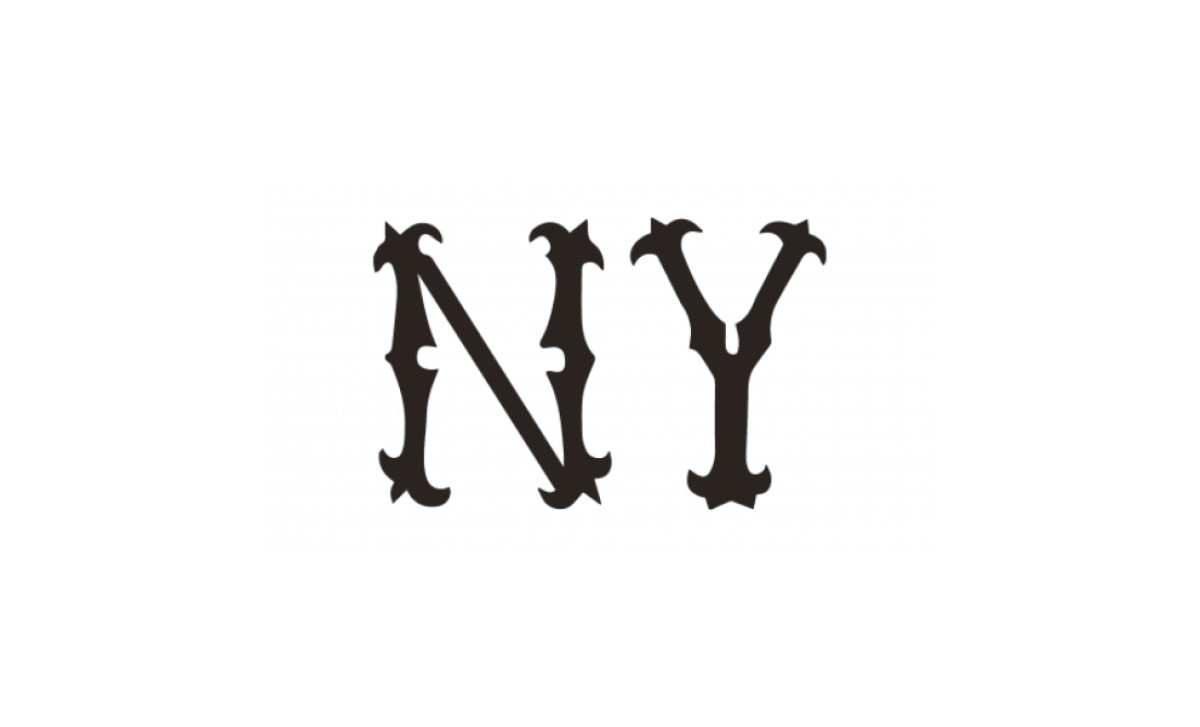
1909 – 1912: The Prototype of an Icon
The enduring interlocking NY debuted in 1909, not the vague early 1900s often cited. Part-owner Bill Devery, a former New York City police chief, is credited with bringing it over, and the franchise traces the design to a Tiffany and Co. medal created by Louis B. Tiffany in 1877 for John McDowell, an officer shot in the line of duty.
This version sharpened the earlier shapes into a gothic-styled letterform with elongated, pointed ends, structured and assertive where the 1905 attempt had been soft. It first appeared on the cap and the left sleeve.
After more than a decade of false starts, the team had found the mark, the kind that still turns up on lists of the most successful logo designs. The custom letterform has never been publicly named or released.
1913–1935: The Team Becomes the Yankees
The club officially became the New York Yankees in 1913. The monogram carried over with minor adjustments to font and color, deepening toward the navy that now defines the brand.
There is a surprising wrinkle in this era. The interlocking NY came off the jersey front after 1916, and the team wore plain pinstripes at home until 1936. The emblem stayed on the cap the whole time, but not on the chest.
That timing produces one of the strangest facts in the franchise's design history. Babe Ruth joined the Yankees in 1920 and played his last season with them in 1934, which means he never wore the interlocking NY on his jersey during his entire Yankees career. He wore it only on his cap. The most famous player in team history is missing from the chest logo's run.
1936–1945: The NY Returns to the Chest
The interlocking NY returned to the home jersey in 1936 and has stayed there since, making the pinstriped home uniform the longest-running design in Major League Baseball. The Yankees stopped experimenting and started repeating.
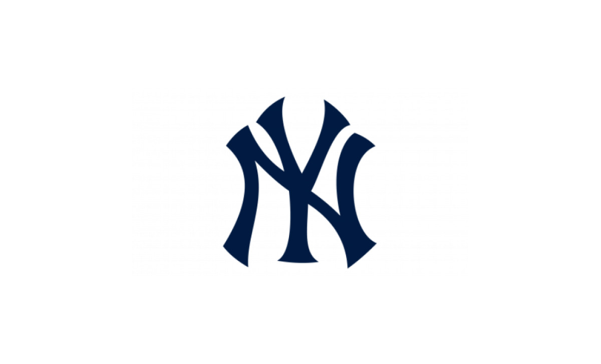
The mark itself is heavy and deliberate. A thick, serifed N and Y overlap in midnight navy, with the Y enlarged and blocky, its right stem dropping straight through the open side of the N and pointed serifs flaring off the end of each stroke. Set against this version, the cap insignia looks restrained by comparison.
The timing lined up with the arrival of a new star. Joe DiMaggio debuted in 1936, the same year the chest logo came back, and the dynasty years that followed were the first to be played in the full modern look.
1946–1967: The Bat and the Hat
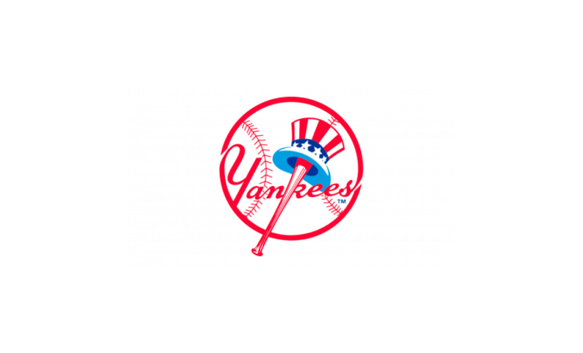
The second Yankees logo, the one the team treats as its official primary mark, arrived after World War II. Co-owner Larry MacPhail, a marketing innovator, commissioned it, and sports illustrator Henry Alonzo "Lon" Keller drew it. It first appeared on team material in 1946 and 1947.
The composition is precise. A white baseball with red stitching anchors the mark, the word Yankees runs across it in red script, and a red baseball bat forms the vertical line of the letter K in Yankees. An Uncle Sam top hat in red, white, and blue hangs from the barrel of the bat. The patriotism was the point, tied to a country emerging from the war.
That K detail is worth pausing on, because it is widely misread as a Y. The bat is the spine of the K, not the Y.
The mark has a contested paper trail. In 2011, a Yonkers woman named Tanit Buday filed a copyright infringement suit in U.S. District Court in Manhattan, alleging that owner Jacob Ruppert had commissioned the design from her uncle, Kenneth Timur, in 1936. Design historian Todd Radom and others have pushed back hard on the claim, noting that Ruppert showed little interest in branding and that the documentation points to Keller. The suit was dismissed, and the Yankees still credit Keller as the creator.
1968–Today: The Refinement That Stuck
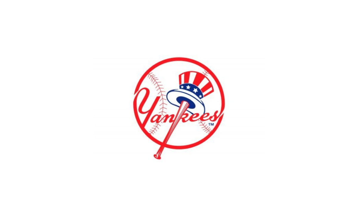
The 1968 update to the bat-and-hat roundel sits at the quiet end of logo redesigns, the kind of change you have to look for. The blue deepened, the contours of the Yankees script sharpened, and the designer dropped the lighter sky-blue tone under the hat brim in favor of white.
Nothing about the structure moved. The baseball, the bat, the hat, and the script all stayed where Keller put them.
This is the version still in use, which means the official Yankees logo has been functionally settled for more than half a century. The team found two marks it trusted and then stopped redesigning.
What Is in the Yankees Logos Today
Good logo design makes every element earn its place. Both Yankees marks pass that test, in part because the franchise tested and rejected almost everything else a hundred years ago.
Here is what each mark is built from:
- Interlocking NY: a custom serif letterform with slightly arched edges and bold strokes, drawn for legibility at small sizes on a cap. It has never been publicly named or licensed as a typeface.
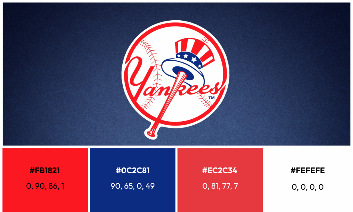
- Bat-and-hat roundel: a white baseball with red seams, the Yankees script in red, a bat forming the K, and a striped Uncle Sam top hat hanging from the barrel.
- Primary palette: Midnight Navy Blue (Hex #0C2340, Pantone 289 C) and White (#FFFFFF) carry the interlocking NY and the home uniform.
- Secondary palette: Red (Hex #E4002C, Pantone 185 C) and Blue (Hex #003087, Pantone 287 C) appear in the bat-and-hat mark and tie it to the American flag theme.
- Discipline: the interlocking NY does not get rotated, recolored outside approved variations, or restyled. The brand guidelines are strict, and that restraint is a large part of why the mark still reads as authoritative after a century.
From the Bronx to the Runway
The Yankees cap is one of the most recognizable fashion objects in the world, worn far beyond any ballpark. The navy and white interlocking NY has crossed fully into streetwear and luxury, often on people who have never watched a game.
The crossover has a traceable start. Spike Lee pushed New Era to produce a red Yankees cap for the 1996 World Series, which cracked the door open. Jay-Z, The Notorious B.I.G., and David Beckham turned the cap into a global staple, and Gucci put it on the runway in 2018.
Few sports marks travel like this. Show the interlocking NY to a hundred people in Tokyo or London and a large share will know it on sight, sport or no sport.
How It Compares
The Yankees claim a logo among the most enduring in sports, and the timeline backs it up. The interlocking NY has been on the cap since 1909, which makes it older than the Chicago Bulls mark, in use unchanged since 1966, and the Green Bay Packers G, introduced in 1961.
The closest peer in baseball is the team that hates the Yankees most. The Boston Red Sox have leaned on their own long-running script and hanging-sock marks, but they have redrawn and reordered their identity more often than New York has.
Longevity is the Yankees' actual design argument. The mark is not necessarily the most inventive in sports. It is one of the oldest still doing daily work without modification, and that consistency is the whole point.
The Logo That Stopped Changing
The Yankees figured out their look early and then chose to protect it. The interlocking NY settled in 1909, the home uniform settled in 1936, and the bat-and-hat roundel has held its shape since 1968.
That is the rare franchise story where the interesting decisions are the ones not made. Other teams chase relevance through redesign, often hiring outside logo design agencies to do it. The Yankees built two marks worth keeping and have spent the last several decades keeping them, which is its own kind of strategy. For more on identities that earned their staying power, see DesignRush's roundup of the most enduring logos in sports history.
Looking to apply the same approach to your growing market? We can connect you with the right creative partners.
Browse our Agency Directory to find the most capable agency that can help elevate your brand:
And if you’re curious for more inspiration, don’t miss our other features on standout logo designs in sports.