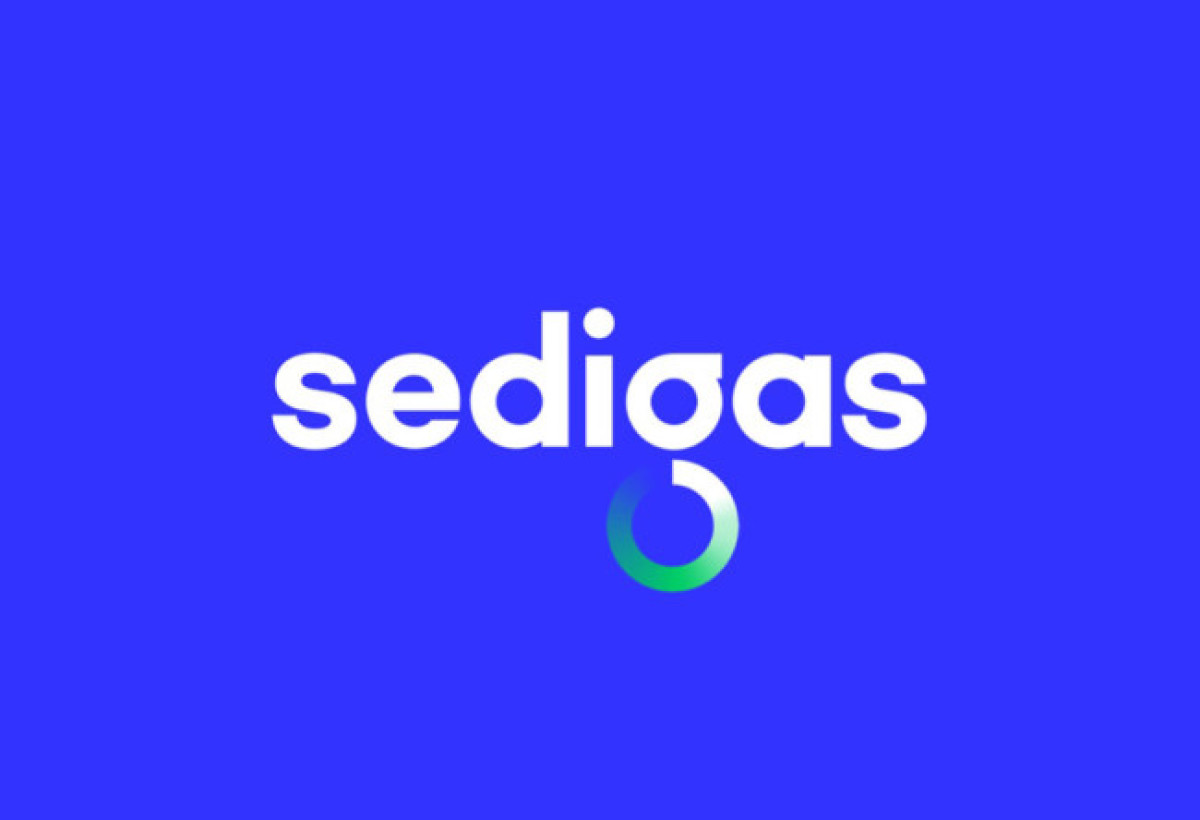
Standout Features:
- Refreshing color gradient
- Big and bold typography
- Integrated spherical icon and logotype
The Sedigas logo proves that gradients don’t just exist for aesthetics; they can also convey a meaningful brand story.
Designed by Morillas Brand Design, this logo beautifully represents the brand’s noble mission: to lead the fight against climate change through sustainable innovations in energy consumption, renewable gas, and so on.
Reflecting nature’s lush colors, the spherical icon integrated into the logotype shines with bright hues of blue and green, blended to create an optimistic and refreshing visual identity.
Nothing like a fresh color palette to symbolize a better and greener planet!
But its true beauty lies in its meaning; the gradient style represents Sedigas as a unified organization comprised of various companies and sectors all working towards a common goal.
The numerous shades in the gradient perfectly represent the brand’s diverse identity, with all its elements working harmoniously. Its circular shape also creates the illusion of movement that catches the audience’s eye.

-preview.jpg)