Standout Features:
- Teardrop shape
- Silhouetted letters
- Earthy colors
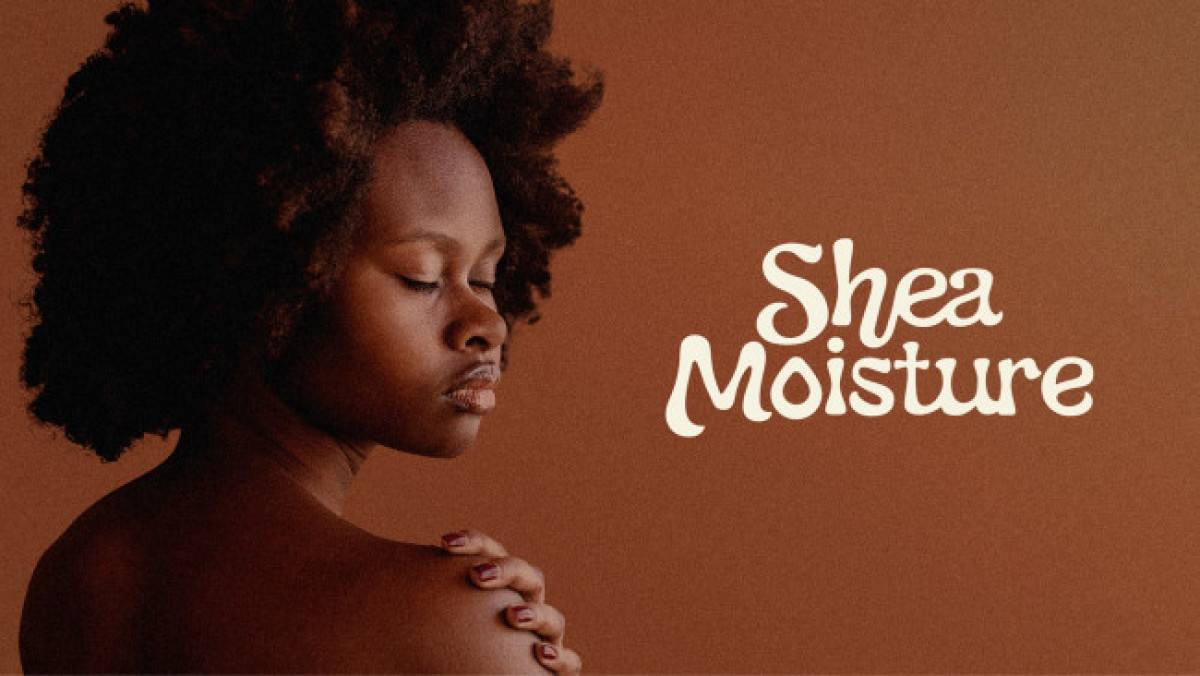
Emily Tillotson created a timeless logo design for Shea Moisture, a hair care brand that started in 1981. The logo design featured a teardrop shape meant to relay a message that they are committed to helping people worldwide moisturize their scalps for silky-smooth, vibrant hair.
The letters S and M are inside the teardrop shape in the form of silhouettes for brand identity. The earth colors used match the branding colors of the hair care brand and it works amazingly.
Get a chance to become the next Design Award winner.
SUBMIT YOUR DESIGN