Standout Features:
- Soothing colors
- Flowing line icon
- Clear typography
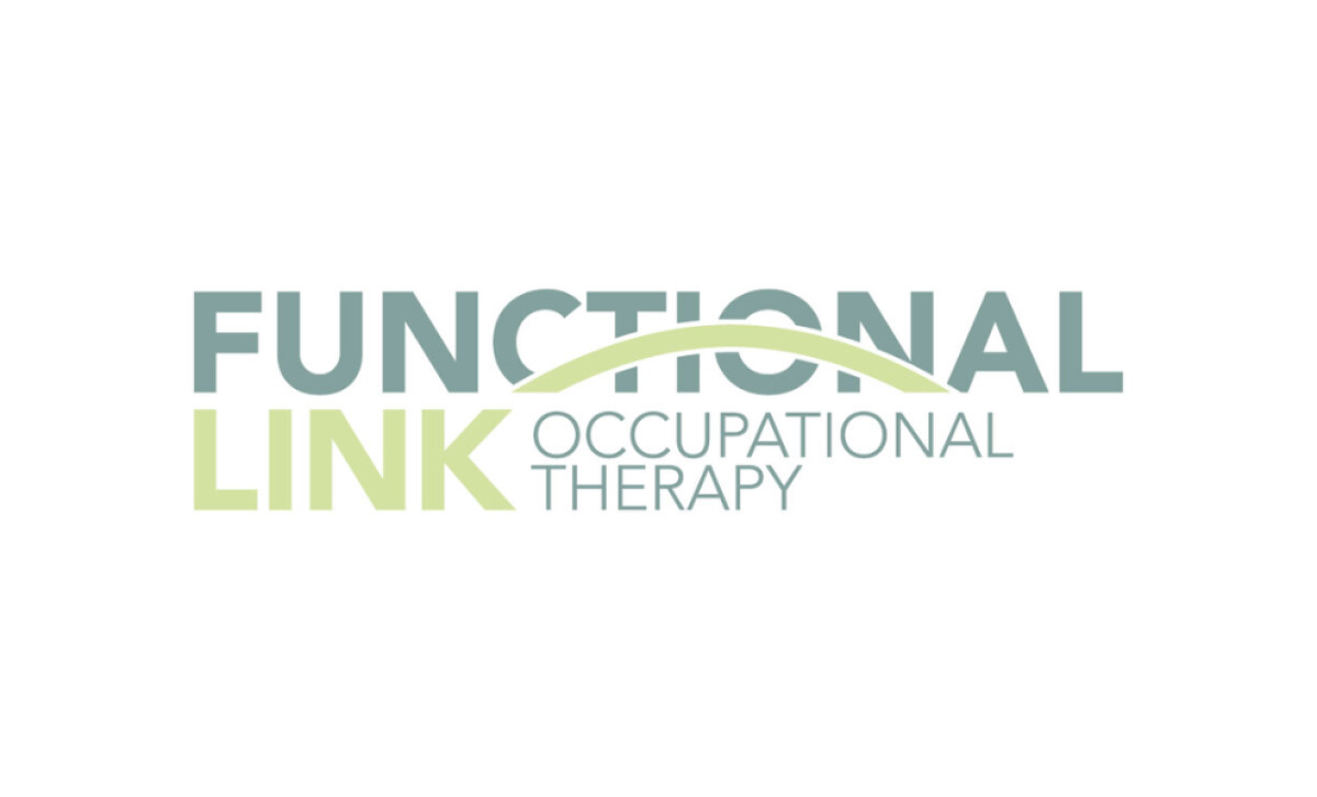
For an occupational therapy firm like Functional Link in Pittsburgh, building trust is paramount as they tailor services for families. Their logo, from the creative team at Visuals For Vigil, plays a key role in this. It has been carefully designed to communicate calm, professional support, and the firm's mission to bridge gaps to community empowerment.
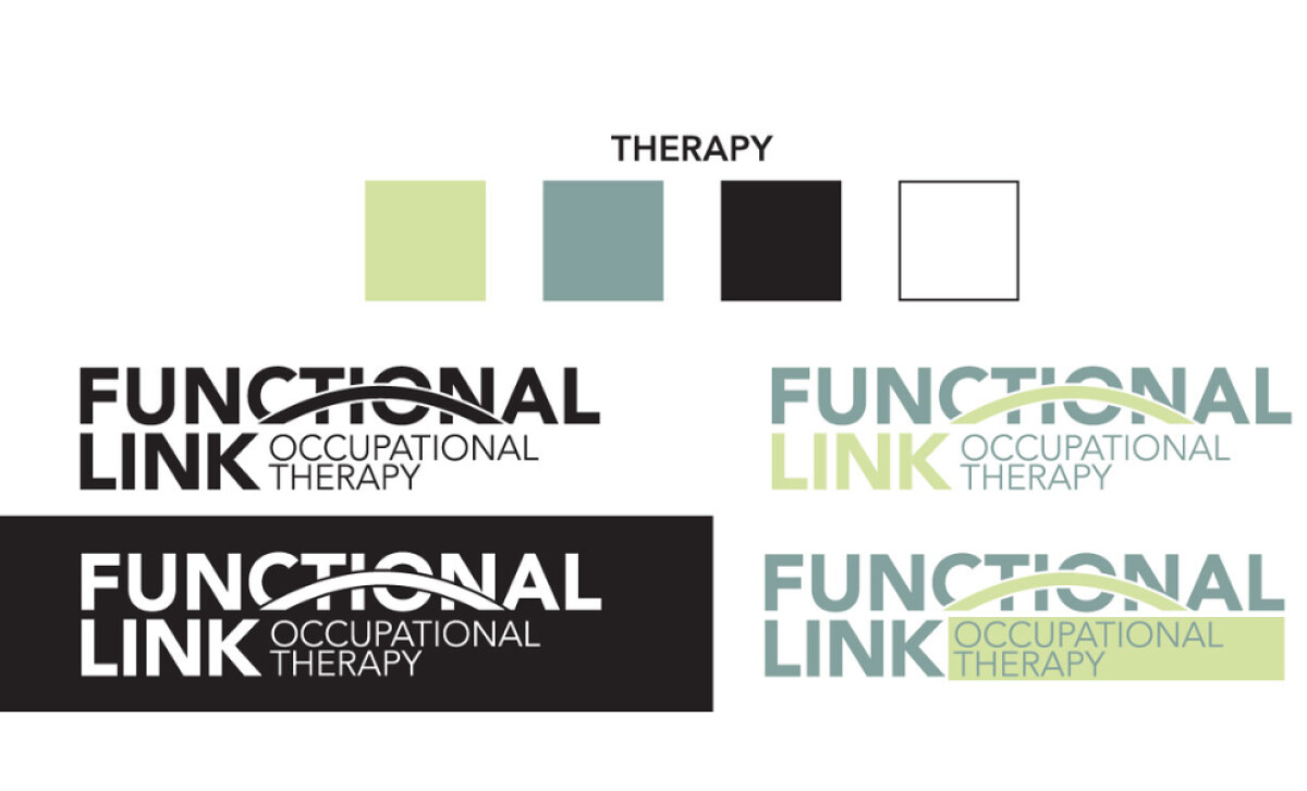
The logo immediately sets a reassuring tone with its calming and professional color palette. You'll notice soft greens and cool blues paired with black. These colors reflect the therapeutic nature of the business. The green suggests growth and healing, while the blue evokes trust — both vital for a healthcare service focused on individual well-being.
A distinctive feature is the dynamic, flowing line that arches gracefully across the word "Functional." This element can be seen as a bridge, representing connection, support, and the firm’s goal of bridging gaps to empowerment. This movement also signals progress and forward momentum, which is important in therapeutic occupational therapy for families.
You'll also appreciate the balanced, modern sans-serif typography. "FUNCTIONAL" is presented in a heavier weight, highlighting the service's core focus, while "Occupational Therapy" appears in a lighter style. This clear hierarchy ensures the logo is easy to read and maintains a professional, accessible appearance across applications.
What Functional Link’s logo demonstrates so well is the impact of strategic design choices that align directly with a brand's core mission. Every aspect supports their goal of empowerment and care. Ensuring your visual identity thoughtfully reflects your purpose can significantly amplify your message and connection.