The Golden State Warriors, one of the most successful franchises in NBA history, have built an identity deeply tied to their region, fanbase, and success on the court. The Warriors' logo underwent several transformations over the years, reflecting the team's journey from Philadelphia to San Francisco and ultimately to global prominence. Each redesign encapsulates shifts in branding trends, cultural sensitivities, and the team's evolving aspirations. From early depictions of Native American imagery to the bridge emblem of today, every version of the Golden State Warriors logo tells a story of growth and a commitment to legacy.
Golden State Warriors Logo Design Details
The current Golden State Warriors icon — considered one of the best brand logos in sports — is a sleek and modern representation of the team’s strong regional identity. The Bay Bridge silhouette reflects the Warriors’ deep ties to the Bay Area. Unlike past designs focused on abstract or symbolic elements, this logo grounds the team in their home state, making them instantly recognizable to fans locally and globally.
The blue and gold remain constants — a nod to the team’s heritage, excellence, and high-energy playstyle. The richer blue conveys trust and strength, while the gold represents success, ambition, and a vibrant energy reflective of the Warriors’ playing style.
Plus, the sans-serif typeface emphasizes clean branding while keeping the focus on the logo’s bridge design. This font choice adds to the logo’s adaptability, ensuring it translates seamlessly across jerseys, merchandise, and digital media.
Golden State Warriors Logo History
The Golden State Warriors’ logo history mirrors the franchise’s growth, relocations, and branding shifts. It has moved from early Native American imagery to a bold, regionally inspired insignia, with each redesign representing a distinct era of the franchise.
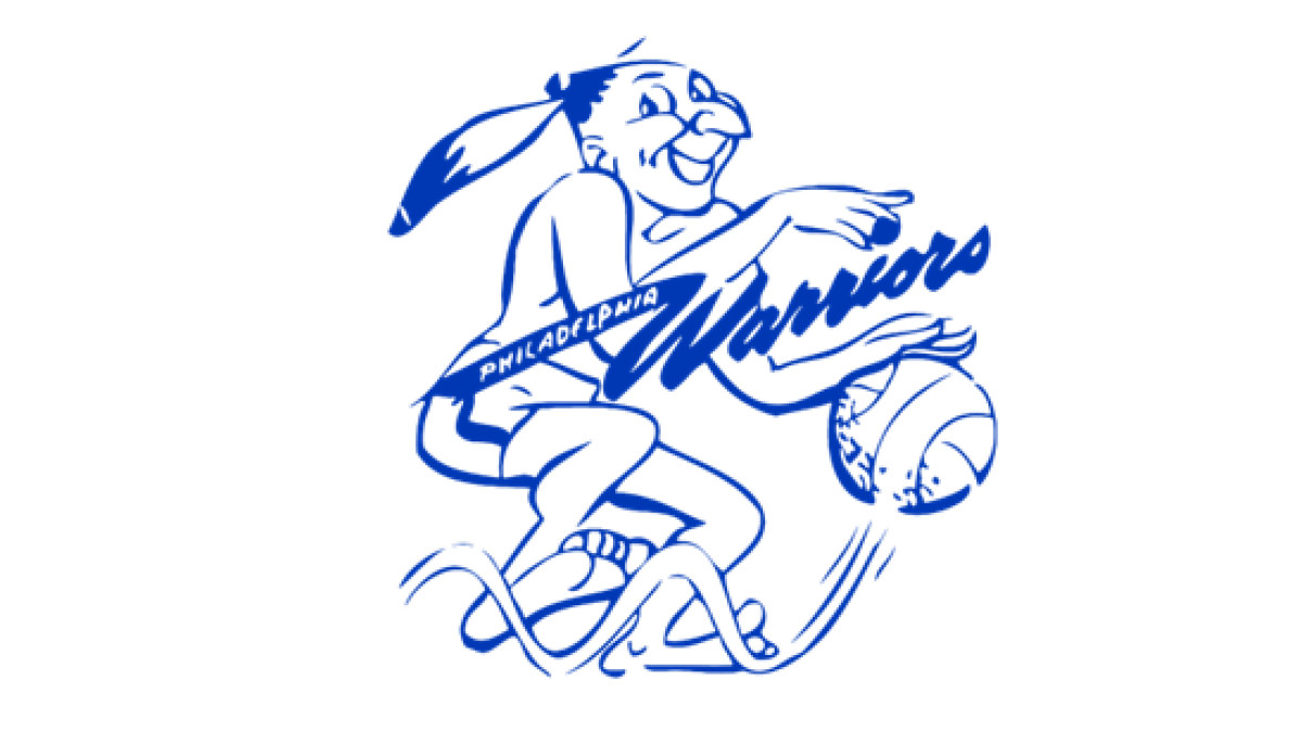
1946–1951: Philadelphia Warriors & the Original Mascot
-desktop.jpg)
Introduced in 1946 for the Philadelphia Warriors, the original Warriors logo is simple, hand-drawn, and symbolic of the team's chosen identity. It featured a Native American man depicted with exaggerated features, sketched in bold purple lines, dribbling a bright yellow basketball.
While intended to convey movement and competitive spirit, the illustration was a product of its time, relying on outdated cultural imagery that would later be reconsidered in modern branding. A stylized, diagonal 'Warriors' inscription in flowing script stretched across the figure. It embodied the team's moniker with a sense of motion.
Additionally, the yellow feather in the man’s hair was an extra visual cue to emphasize the 'Warrior' identity. Though relatively simple, this logo helped establish the team’s presence in the burgeoning professional basketball landscape, laying the foundation for future iterations that would evolve alongside the sport.
1951–1962: Refined Native American Imagery
In 1951, the Warriors refined their logo to reinforce visual strength and sharpen details. The bold lines became more pronounced, lending the icon a greater sense of durability and presence. The team also shifted its color palette to blue and white—a departure from its previous earthy tones.
And the most significant change? The figure’s features were slightly less exaggerated, and the design incorporated cleaner lines to signal a shift towards a more polished team identity.
This change aligned with a broader trend that logo designers followed in sports branding, where simplicity and contrast became key elements of effective design. Most notably, the "Warriors" lettering became more visible and asserted itself as a central design component. The word "Philadelphia" was also subtly incorporated, now appearing in a sleek, white inscription along the elongated tail of the "W," which extended gracefully to the left.
Such adjustments gave the logo an illusion of movement, showing the dynamism and athleticism associated with the team. They reflected the team's professionalism as it solidified its growing NBA presence.
1962–1969: The San Francisco Warriors Era
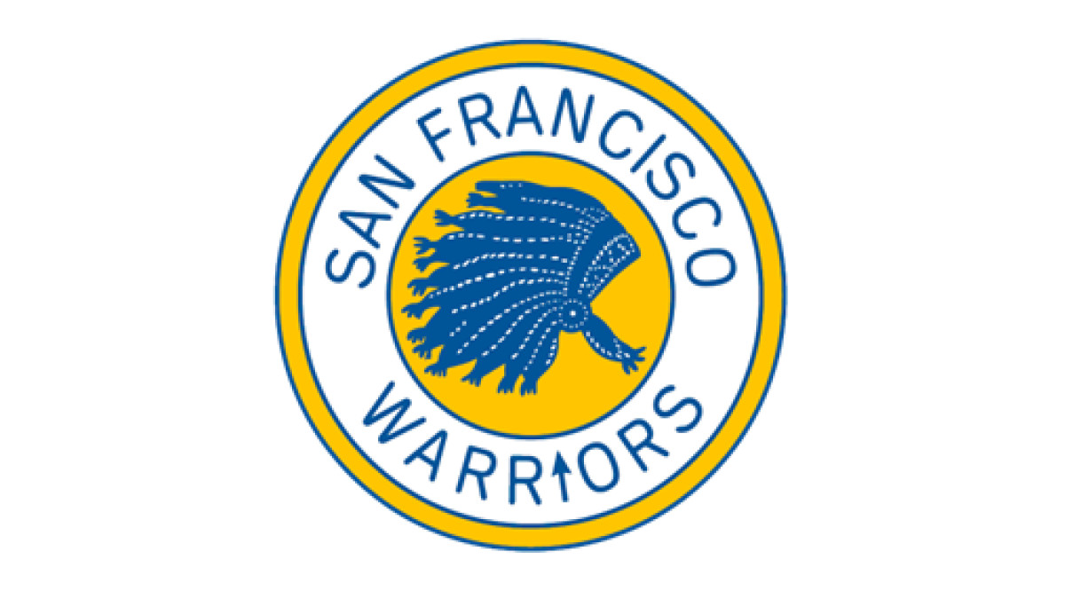
When the Warriors relocated to San Francisco in 1962, their logo transformed to showcase the team’s new identity and the era’s evolving aesthetic trends. The design centered around a circular medallion with a thin yellow outer ring, a broader white frame, and a smaller yellow core at its heart.
This layering created structural depth, balance, and dynamism. At the center of the badge, a detailed blue Native American headdress represented the franchise's previous identity while adapting to its West Coast transition. Around the perimeter, the team’s name was elegantly curved along the white ring, giving the logo a polished, framed appearance.
With these changes, the logo maintained a connection to the Warriors’ origins while signaling a new chapter in San Francisco. It also came with the rise of Wilt Chamberlain and the team’s continued push for NBA dominance.
1969–1971: "The City" Logo
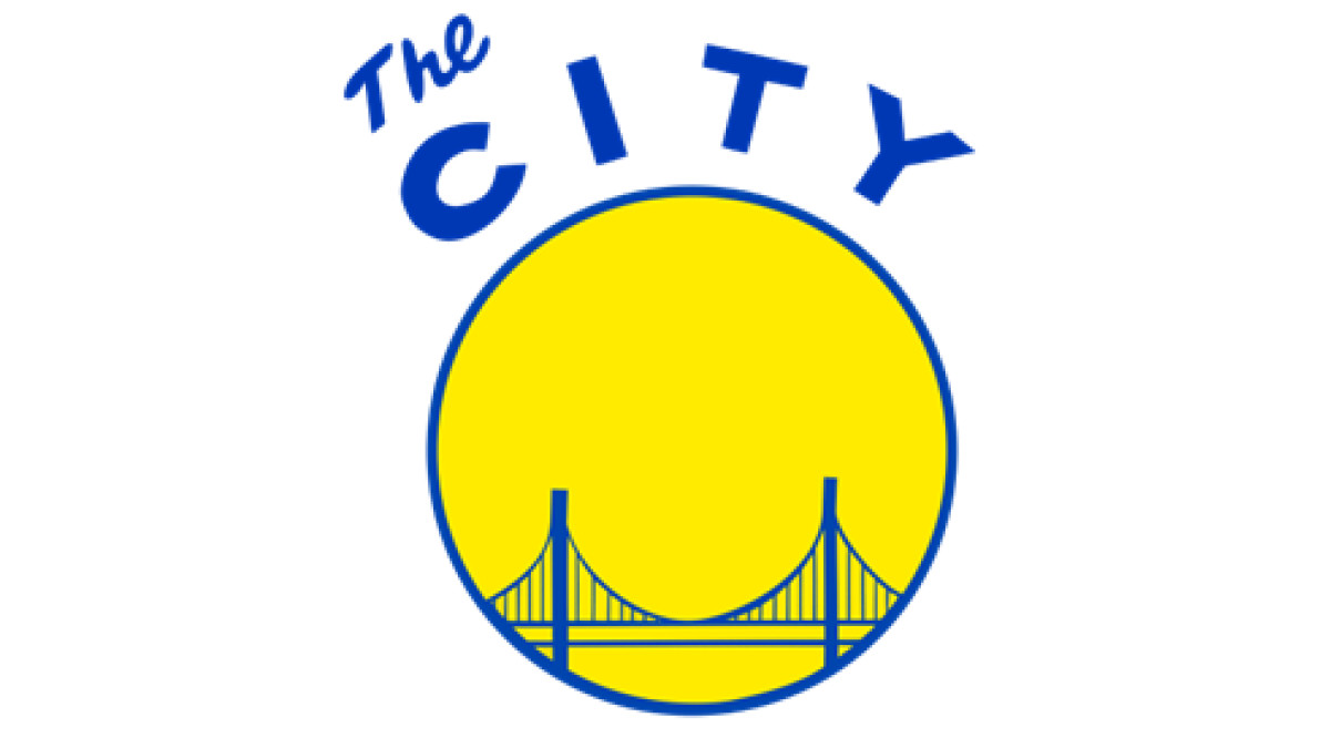
The 1969 logo redesign marked a massive jump from past iterations, aligning the Warriors' visual identity with San Francisco's energy and innovation. A solid yellow circle, bordered by a bold blue outline, embodied a cleaner yet striking aesthetic.
Within this golden medallion stood a simplified yet recognizable blue depiction of a defining landmark of the city: the Golden Gate Bridge. This choice signified more than just geography. It was a statement of belonging, an assertion that the Warriors were now inseparable from San Francisco’s culture and spirit.
Above the emblem, a blue-arched “The City” inscription was playful yet confident. This unconventional branding gave the logo a more relatable appeal, conveying that the Warriors weren’t just a basketball team; they were San Francisco’s team.
The best part? The arrival of this logo coincided with a period of bold changes for the franchise, including the return of superstar Rick Barry in 1972. Later, Barry would lead the Warriors to their first NBA Championship in nearly two decades. More than a logo redesign, this icon signified a cultural shift that embraced the Bay Area's progressive, free-spirited nature while setting the stage for future success.
Check out oversimplified logos and how brands pared down their identities — for better or worse.
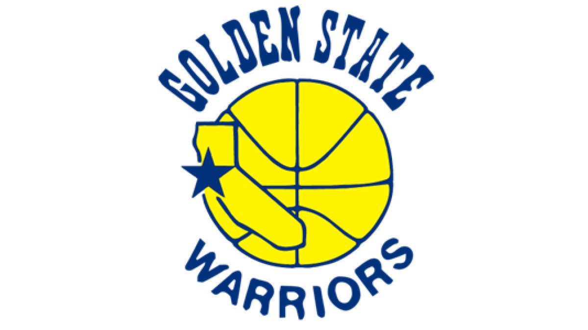
1971–1972: Golden State Warriors and the California Emblem
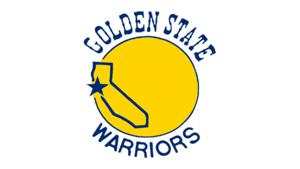
In 1971, the Warriors rebranded themselves as the Golden State Warriors, signaling a broader ambition to represent not just San Francisco but the entire state of California. This shift came with a redesigned emblem that captured regional pride and modern aesthetics.
The logo featured a bold yellow circle to achieve continuity with past designs. The new detail contained a striking blue contour of California, a clear statement of the franchise’s expanded identity. At its core, a solid blue five-pointed star sits over the Bay Area, subtly anchoring the team to its home while visually reinforcing its place within the larger state.
Moreover, typography played a key role in defining the new visual identity. The words “Golden State” are arched above the icon in a bold, Wild West-inspired typeface, a nod to California’s frontier spirit and historical gold rush heritage. In contrast, the word “Warriors” curved beneath the logo in a clean, modern sans-serif, creating a balance between tradition and forward-thinking design.
This logo was more than just a visual refresh. It was a strategic repositioning that set the stage for a new era of California basketball. Around this time, the Warriors drafted George Johnson and signed Jim Barnett: key players who helped the team navigate its move into the decade. While this era saw ups and downs on the court, it laid the foundation for what would become one of the most storied franchises in NBA history.
1972–1975: Introduction of Jersey Numbers
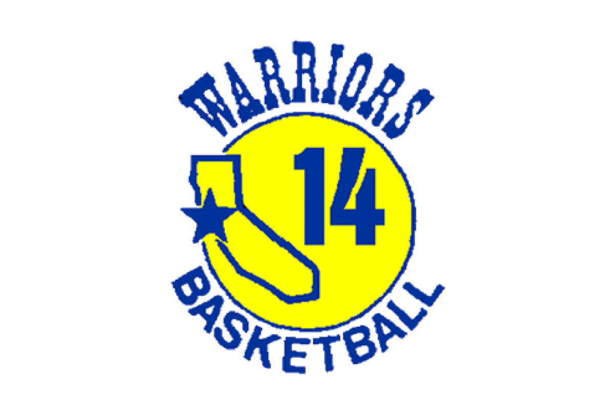
In 1972, the Warriors refined their logo to create a cleaner, bolder visual identity aligned with the NBA's evolving aesthetic. The color palette became more vibrant, with a brighter yellow background that contrasted strongly against the deep blue elements. This adjustment modernized the emblem and enhanced visibility across jerseys and promotional materials.
Moreover, the typography underwent a strategic simplification, with "Warriors" now prominently arched at the top and "Basketball" curving beneath the central design. This streamlined approach made the text more legible and placed greater emphasis on the team's core identity.
The most notable addition, however, was the extra-bold blue "14", positioned on the right side of the emblem, overlapping the state’s contour. This number referenced the jersey of Tom Meschery, one of the team’s standout players at the time. It also reflected an era where personal and team identities were intertwined.
1975–1988: Basketball and California Silhouette
In 1975, the Warriors again refined their logo, solidifying their identity with a sleek, basketball-themed redesign. The once-simple yellow circle was now redrawn as an actual basketball, adding texture and a direct visual connection to the sport. This subtle yet significant shift gave the logo a more dynamic, purpose-driven feel. It showed movement, energy, and the game’s fast-paced nature.
The previously included "14" was removed to create a cleaner, more universally recognizable image. Meanwhile, the California silhouette was enlarged, making the team's regional pride even more prominent. By giving the state outline a greater presence, the design showcased that the Warriors belonged to all of California, not just the Bay Area.
This change concurred with one of the franchise’s most significant moments: their stunning 1975 NBA Championship victory. In one of the most unexpected title runs in league history, the Warriors, led by Rick Barry, swept the heavily favored Washington Bullets to cement their place as one of the NBA’s elite teams.
The updated logo, appearing on championship banners and team merchandise, became a symbol of underdog resilience and triumph, further embedding it into the Warriors' storied history.
1988–1997: Refined Color Palette and Typography
In 1988, the Warriors made subtle yet impactful refinements to their logo for a more polished and contemporary look. The lines were meticulously cleaned and sharpened, removing inconsistencies and giving the design a more structured, balanced composition. It aligned with a broader shift in sports branding, where sleek, high-contrast visuals became the standard.
The color palette was also adjusted, with the yellow hue deepened to a richer, smoother gold, enhancing the contrast against the deep blue elements. This minor but effective tweak gave the logo a more premium and enduring quality, so it stood out on team jerseys and in marketing materials.
Perhaps the most noticeable change came in the typography. The wordmark was redrawn in a sleek, rounded typeface, softening the sharp edges of the previous design. This update not only refreshed the logo but also made it more legible and adaptable for an era when merchandising and television broadcasts were becoming increasingly crucial to a team’s brand identity.
1997–2010: The Modern Warrior
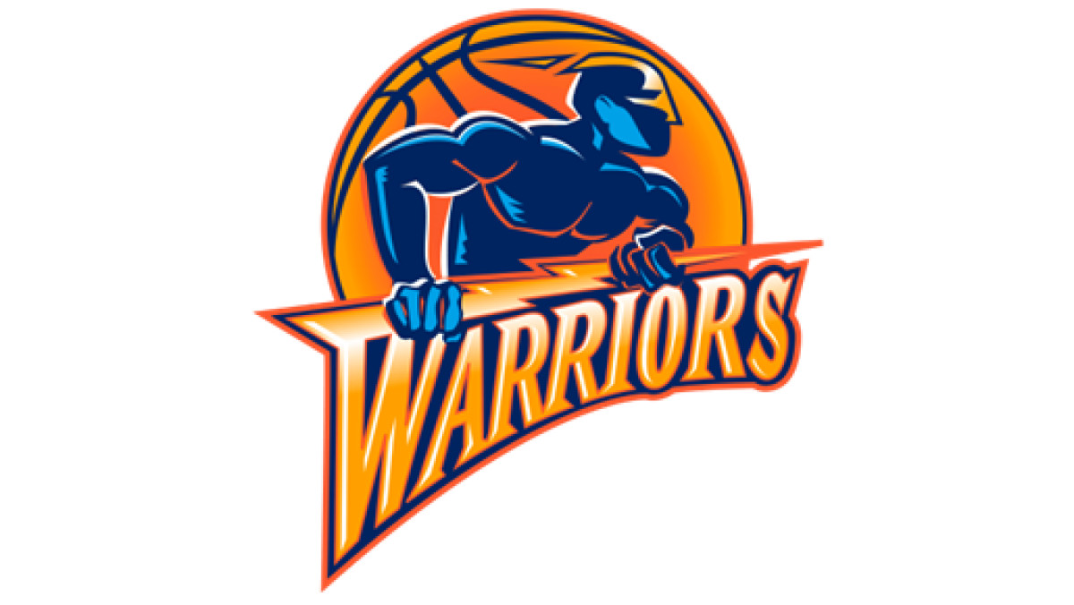
In 1997, the Warriors embraced a bold departure from their traditional imagery, introducing a comics-style emblem that reflected the larger-than-life energy of late-90s NBA branding.
The new design featured an alien-like superhero figure draped in gradient blue tones, standing with a menacing presence against a black basketball background. With exaggerated musculature and a masked face, this dynamic figure embodied the strength, intensity, and fearlessness the franchise wanted to project.
Beneath the superhero, the team’s name was reimagined in a stylized yellow and orange wordmark encased within a striking blue outline. The typography was designed for impact — bold, aggressive, and unmistakably modern. The most distinctive element was the elongated “W” in “Warriors,” which was transformed into a lightning bolt, adding movement and energy to the design. Beyond symbolism, this electrified aesthetic visually aligned with the team’s fast-paced, high-energy playing style.
This logo remained with the club for over a decade, tied with some of the franchise’s most turbulent yet transformative years. Though the Warriors struggled to find consistent success on the court, this era saw the emergence of Jason Richardson, Baron Davis, and the unforgettable “We Believe” team of 2007, which pulled off one of the greatest playoff upsets in NBA history by defeating the top-seeded Dallas Mavericks. It became an icon of resilience and underdog grit, making it a nostalgic favorite among fans even after its eventual retirement in 2010.
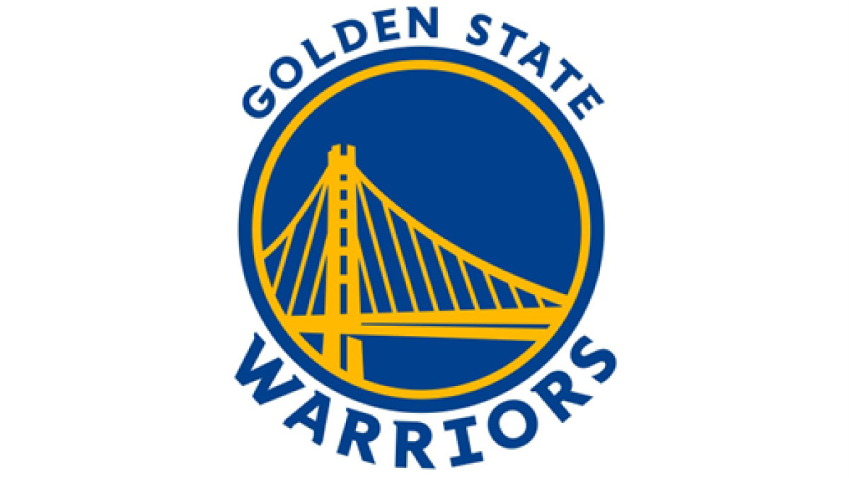
2010–2019: Return to the Bridge
In 2010, the Warriors unveiled a refined insignia that honored their past while embracing a sleek, contemporary aesthetic. At the heart of the design was a light blue circular medallion, enclosed by a double-layered yellow-and-blue border to showcase the team’s vibrant color identity.
The most striking visual element was a meticulously redrawn Golden Gate Bridge, now illustrated with clean, precise yellow lines for elegance and structural integrity. This wasn’t just a symbol of San Francisco; it was a statement of stability, ambition, and deep regional pride.
The typography was also thoughtfully updated. A bold, all-caps wordmark was positioned along the medallion’s upper and lower edges to maintain balance and symmetry. The font — a classic serif typeface with wide, solid contours and delicate, sharp serifs — exuded timeless sophistication and confidence. This shift came with the Warriors entering a new era that would redefine their place in the NBA.
Just a year later, in 2011, the team drafted Klay Thompson, and by 2012, Draymond Green had joined forces with Stephen Curry, laying the foundation for what would become one of the most dominant dynasties in basketball history. The bridge logo became synonymous with the Warriors' rise to excellence, a visual precursor to the team’s championship legacy that followed.
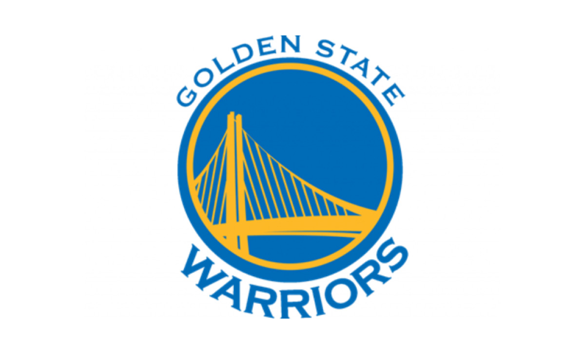
2019–Present: Refined Bridge Design
In 2019, the Warriors refined their logo once more, embracing a deeper, more intense color palette that brought heightened contrast and sophistication. The blue deepened into a richer royal shade, while the gold took on a slightly warmer tone for a bold and timeless look. This subtle shift gave the emblem a stronger visual presence, ensuring it stood out on everything from jerseys to digital screens.
The typography also received a modern and elegant upgrade. The lettering, now set in a commanding serif, featured softened curves and elongated flowing strokes to lend the design a refined, almost architectural quality. This update wasn’t just for show; it reflected the team’s transition into a new era, coinciding with their move to the state-of-the-art Chase Center in San Francisco.
By the time this new logo debuted, the Warriors had already cemented their dynastic status, having won three championships in five years. The new design marked the start of their next chapter — one of rebuilding and resilience. And just three years later, they proved their brand and legacy were built to last by winning another NBA Championship.
Golden State Warriors Logo: A Symbol of Regional Pride and Evolution
The Golden State Warriors' logo history and evolution reflect a journey of resilience, reinvention, and dominance. From its earliest depictions to the now-iconic Bay Bridge image, each logo iteration tells the story of a franchise that has embraced change while staying rooted in its identity.
Today, the Golden State Warriors emblem isn't just a basketball team’s visual representation. It's a logo design of excellence, a bridge between past and future, and a reflection of a dynasty built to last. As they continue to carve their legacy, one thing is certain: when you look at the logo, you don’t just see a team. You see greatness.