Standout Features:
- Scripted wordmark with angular cuts
- Circular emblem with embedded axe motif
- Abstracted woodgrain pattern integration
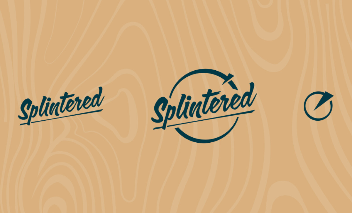
The Splintered Wood logo, in itself, tells a story of its craft. The design is a visual representation of the woodworking process —from the cutting blade to the final wood grain. It’s a smart and cohesive approach to branding.
Rewired Graphic's logo design centers on a hand-lettered script wordmark for "Splintered." It’s rendered in a bold brush script with a slight slant.
Research shows that such handwritten typefaces elicit a perceived human presence, which can help enhance your brand's authenticity.
The defining detail here is the sharp, strike-through baseline that mimics the stroke of a woodworking blade.
This design leans into brand storytelling. The circular emblem and the axe mark together tell a story of craftsmanship and the process of cutting into wood.
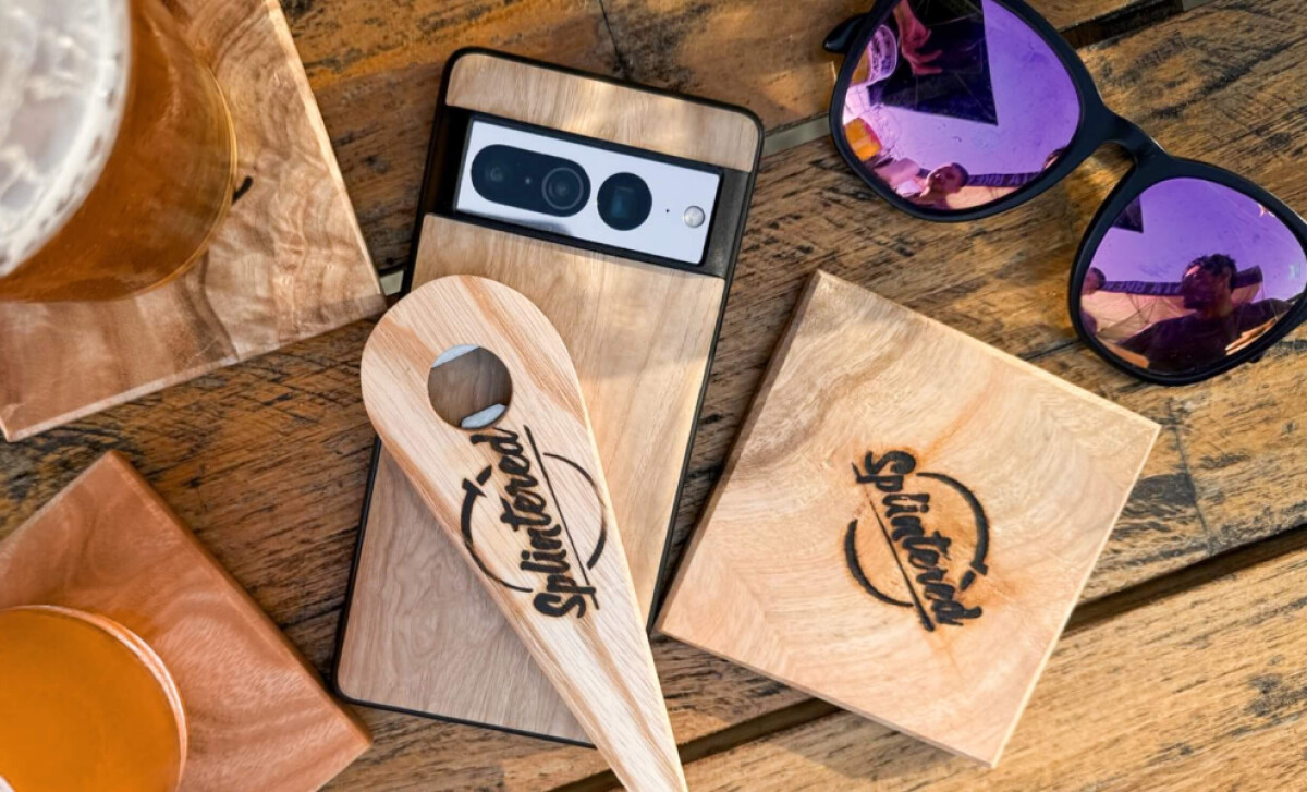
A subtle but sophisticated woodgrain pattern runs throughout the brand identity. You can see it in the background of some logo lockups and on collateral merch. This texture fuses the brand directly to the material at the heart of its craft.
Ultimately, this logo design is a perfect fit for a brand whose medium is as tactile as timber. The takeaway is that a brand identity should always feel connected to the craft it represents.
For any artisan, the challenge is to create a brand that feels as authentic as your craft, and a great logo can tell that story perfectly.
That's why brands turn to expert partners, and our team has ranked the best agencies worldwide to make finding them simple.
Visit our Agency Directory for the Top Logo Design Companies, as well as:
Our design experts also recognize the most innovative design projects across the globe. Visit our Awards section to see the best & latest in logo design.