Team Behind the Design
Logo Design Analysis
A strong education logo must communicate meaning, feature typography that supports its message, and have an identity that adapts across real applications.
In reviewing St Andrew’s College Language Schools, I focus on clarity, balance, and consistency.
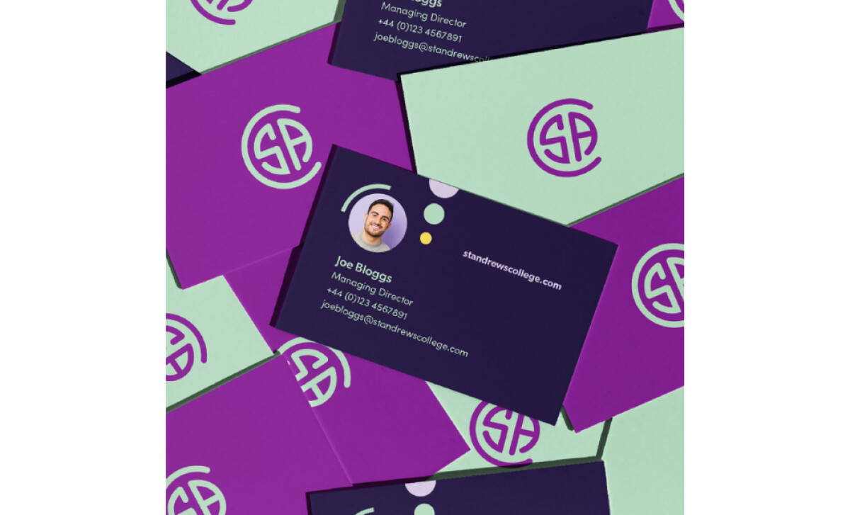
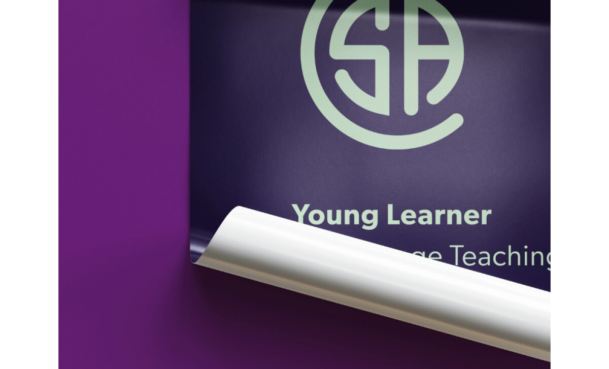
- Concept: I see a circular monogram that feels clean, modern, and structured. The mark carries an academic presence while staying friendly enough for a language school environment.
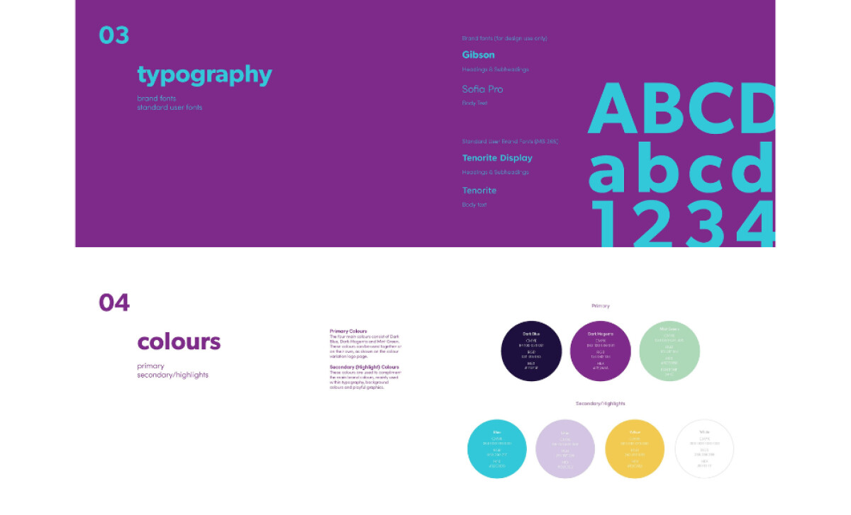
- Typography: The type feels confident and readable. It supports the logo by grounding the identity with a polished, professional tone.
- Scalability: The design holds up well on everything from posters to small merchandise. Even at reduced sizes, the monogram stays sharp and recognizable.
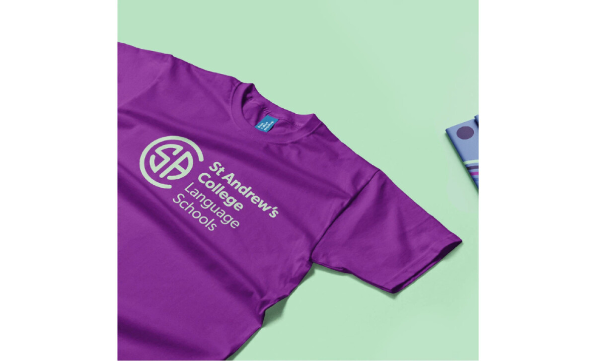
- Applications: I like how the identity performs across business cards, uniforms, and student materials. The bold purple and mint palette brings energy to the brand and keeps the overall system cohesive.
Client Testimonial
"Working with Jo is an absolute pleasure. She understands our needs and timescales and always delivers high quality products. She makes every design process seem easy. We cannot recommend her highly enough."— Elena Bueno Galán, St Andrew’s College Language Schools CEO
What Brands & Agencies Can Learn from St Andrew’s College Language Schools
JoCreative’s design highlights how a balanced, well-structured logo can strengthen connection and clarity for a diverse school community.
1. Use Simple Geometry to Communicate Professionalism
The circular monogram creates a clear focal point and offers instant recognition. This approach shows how clean geometric forms can express academic credibility without feeling rigid.
2. Pair Readable Typography with a Welcoming Tone
The polished type choice supports confidence while remaining approachable. It reinforces how schools and educational brands benefit from fonts that feel steady, open, and easy to read across ages.
3. Let Color Bring Energy Into a Formal Environment
The purple and mint palette adds brightness that lifts the identity beyond traditional academic visuals. It shows how thoughtful color choices can modernize an education brand while keeping it trustworthy.

About DesignRush Featured Designs
At DesignRush, we review hundreds of agency projects each month. The featured designs stand out for creativity, relevance, and execution.
Many go on to be recognized as winners of our Monthly Design Awards.
Discover more examples here:
- Best Logo Designs
- Best Website Designs
- Best App Designs
- Best Print Designs
- Best Packaging Designs
- Best Video Designs
For a full list of design agencies and related services, see our Agency Directory.