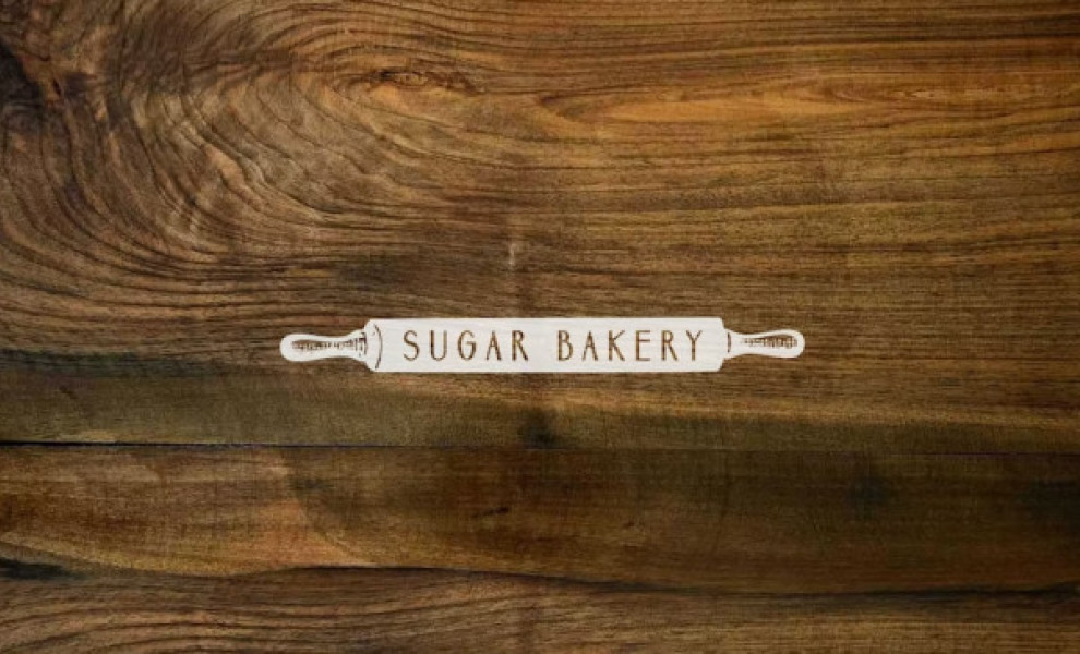
Standout Features:
- Stencil-like color fill
- Straightforward messaging
- Expressive lettering
This Seattle-based bakery decided to go with an upfront messaging for their logo by having a rolling pin with an expressive logotype. Design agency 2767 kept it minimalist and used stencils at the ends to bring focus to the center of the layout.
This is an excellent example of a straightforward yet evocative design. The aesthetics take the customers back to the old-school atmosphere of a lazy day at your grandparents' house, watching them make pastries, then inhaling the aroma of freshly baked goodies once the oven is open. One look and you know you're in for a delectable treat.
The wooden design and its expressive lettering help you grasp the comfortable atmosphere that can be found in this bakery. The logo creates vivid imagery of what goes on behind the kitchen door, inviting you to have a taste of their fresh baked goods.