Count the crosses on the Portugal crest. Most people stop at one. There are three.
One is the cross formed by the five blue shields at the center. The second hides inside each of those shields, traced by five small white dots. The third sits beneath the whole composition, a frame inherited from a medieval military order. Three crosses packed into one badge, and almost none of it reads from the stands.
That gap between what the eye catches and what the mark holds is the whole story. The Portugal crest packs in a military order, a set of battlefield victories and a religious symbol repeated at three scales, all in the colors of the national flag. A fourth layer, the record of conquered territories, sat in the older shield and got cut in the 1966 redesign. This article pulls the badge apart piece by piece, then asks the real question: does all that meaning still work as a modern identity, or has it curdled into noise that only a historian could love?
Here is the other surprise. Portugal has worn the same crest since its 1966 World Cup debut, close to 60 years. Italy redrew its badge after political upheaval, England churned through seven near-identical versions and Brazil kept refining its mark. Portugal made one change and walked away. So the question waiting at the end is blunt: is that confidence, or is it inertia?
Portugal National Football Team Logo History
The badge predates the football team by centuries, because it borrows from the coat of arms of Portugal, a heraldic system that took shape in the Middle Ages. The Seleção badge history runs through two phases: the early decades when the team wore the national shield more or less as it was, and the 1966 redesign that produced the emblem still in use today.
1914 – 1966: The Borrowed National Shield
After the Portuguese Football Union formed in 1914, the regional associations adopted the national shield as their first emblem. The federation, renamed the Portuguese Football Federation in 1926, carried that shield onto its kits with little change for decades.
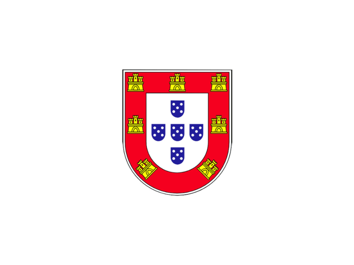
The shield worked in layers. A red field carried seven gold castles around its border. Set inside it was a white shield holding five small blue shields, called quinas, arranged in the shape of a cross. Each of those blue shields held five white dots, known as bezants, set in a diagonal saltire.
Every element already meant something. A traditional legend ties the five blue shields to five Moorish kings defeated by Afonso Henriques at the Battle of Ourique in 1139. The bezants point back to 1143, when the Kingdom of Portugal won recognition and the monarch gained the right to mint coins. The seven castles record fortresses taken during the Reconquista, a number fixed at seven under a later king.
This was the badge as inheritance. The football union did not design a mark so much as adopt one the country had carried for centuries, and that set the pattern for everything that followed.
1966 – Today: The Redesign That Stripped It Back
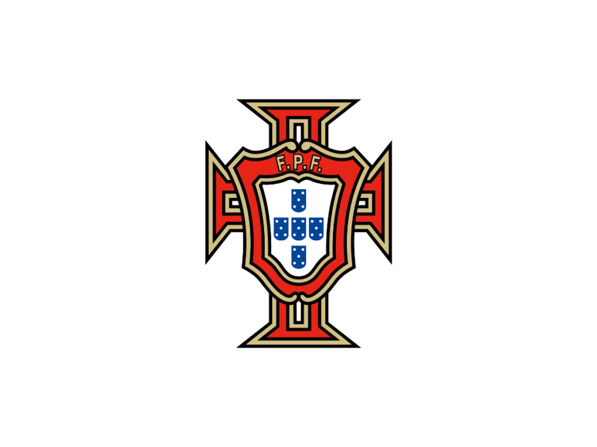
Portugal reached the final stage of a major tournament for the first time at the 1966 World Cup, where the team finished third behind the goals of Eusébio. His nine goals that summer set a Portugal World Cup scoring record that held until Cristiano Ronaldo passed it at the 2026 tournament. For that 1966 arrival the federation introduced a redrawn emblem, and it is the version the team still wears.
The redesign kept the white shield of five blue quinas and dropped almost everything around it, including the red field and the seven gold castles. The federation set what was left inside a frame shaped like the Cross of the Order of Christ, the Portuguese successor to the Knights Templar, whose cross had been painted on the sails of the country's Age of Discovery ships. It rendered that cross in the green and red of the national flag and placed the letters FPF, for Federação Portuguesa de Futebol, in gold across the top.
The change in 1966 was structural, and the federation has held it ever since. The team wore the same crest when it won Euro 2016, its first major title, a sign of how little the mark has moved while the results around it changed. Where other national teams kept adjusting their marks, Portugal settled the question once. That decision is the spine of the Portugal football team logo evolution: one redesign, then stability.
What is in the Portugal National Football Team Logo Today
Good logo design asks every element to earn its place. The Portugal crest both rewards and tests that standard, because so much of its meaning sits below the surface. Here is the Portugal crest design broken down.
- The three crosses: the five blue quinas form a cross at the center; the five bezants inside each shield sit in a saltire, a second cross repeated five times over; and the white shield sits inside a frame shaped like the Cross of the Order of Christ. Most viewers register only the first.
- Five blue shields (quinas): tied by legend to the five Moorish kings defeated in 1139, and the one element that survives in every version of the mark.
- Bezants: five white dots per shield, 25 in total, fixed at five in 1485 as a reference to the five wounds of Christ.
- The cross frame: the green and red surround is shaped like the Cross of the Order of Christ and colored from the national flag. It replaced the red field and gold castles of the older arms, so the conquered-territories layer no longer appears on the badge.
- FPF lettering: the federation initials, the clearest modern addition to an otherwise medieval mark.
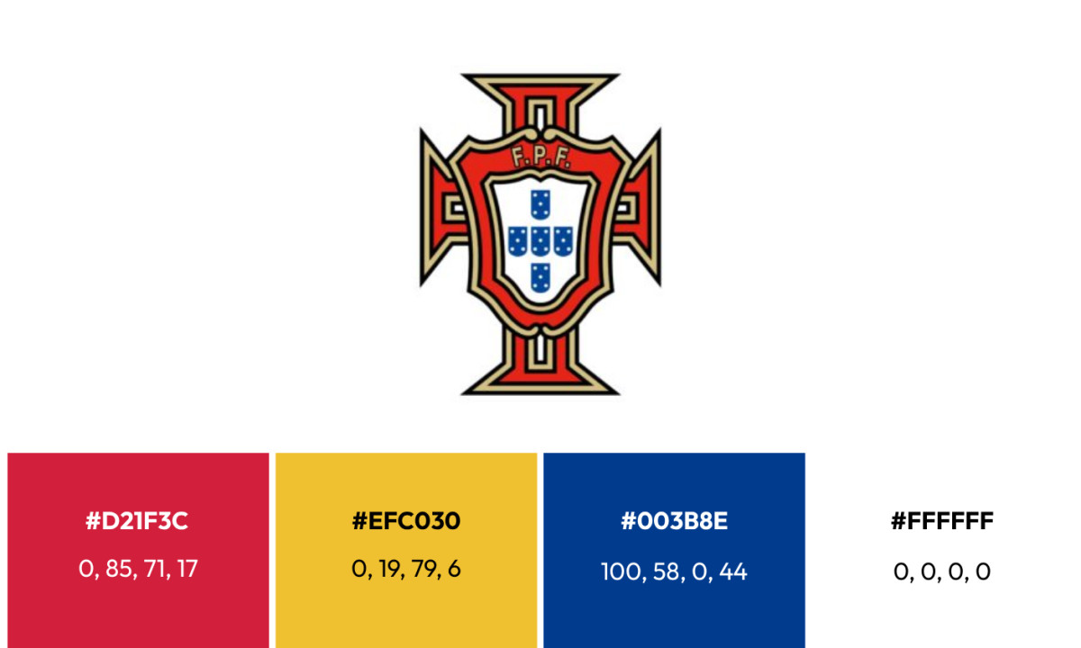
- Primary palette: Red (Hex: #D21F3C, Pantone 186 equivalent) fills the inner frame. Gold (Hex: #EFC030) outlines the cross and forms the FPF lettering. White (Hex: #FFFFFF) holds the central shield.
- Secondary palette: Blue (Hex: #003B8E) tie the crest to the national flag and to the blue of the original shields.
The red and green come straight from the flag the republic adopted in 1910, where green reads as hope and red as the courage of those who fought for the country. The blue is older, a holdover from the medieval shield that the modern flag dropped but the football crest kept.
Portugal national football team logo: dense by design
So does the density hold up? The case against it is simple. A casual viewer gets one cross and a cluster of blue shapes, while the military order, the battle and the wounds all stay invisible without a caption. By the test most designers use, a mark that needs a paragraph of explanation has failed to communicate.
The case for it is the one Portugal has been making for close to 60 years. The crest was never built to be read at a glance. It works as a container for national memory, and the layering is the point rather than a flaw to be cleaned up. Read that way, the FPF badge history looks less like clutter and more like a choice to carry the heraldic shield and its crosses onto the shirt rather than reduce the whole thing to a flat icon. The 1966 redesign did trim the arms, dropping the bordure and castles, which shows the federation was willing to edit when it saw a reason to.
Whether that is confidence or inertia depends on what you think a national badge is for. Held next to the restraint of the England crest, or the wider field of sports and leisure logos, Portugal sits at the maximal end: a federation that decided its symbol was worth more intact than simplified. Cristiano Ronaldo has worn it through the team's biggest wins, including the Euro 2016 title, and the badge on his chest would read the same to a supporter from 1966.
For designers studying the most successful logo designs or weighing a logo redesign, the Portugal crest is a useful edge case. It is proof that a mark can hold far more than it shows and still survive, as long as the institution behind it is willing to leave it alone.

Looking to apply the same approach to your growing market? We can connect you with the right creative partners.
Browse our Agency Directory to find the most capable agency that can help elevate your brand:
And if you’re curious for more inspiration, don’t miss our other features on standout logo designs in sports.