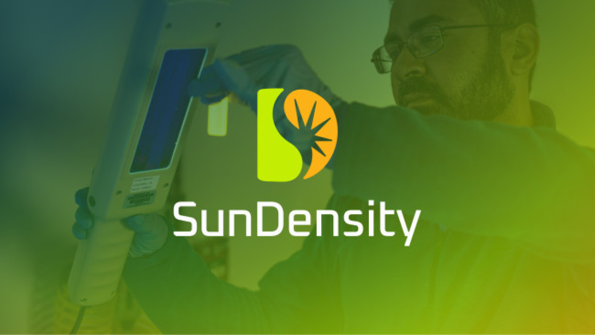
Standout Features:
- S and D encased in one icon
- Sun rays inside the letter
- Lively color story
In their logo redesign for SunDensity, logo design agency BZDesign perfectly captures the brand's essence. The new logo merges the letters 'S' and 'D' into a single monogram, with sun rays intricately integrated within, symbolizing energy and clarity.
Like these impressive logo redesigns, SunDensity's logo offers a new, improved, and more approachable identity. The design is set against a lively color story, echoing the brand's refreshed image.
Explore our collection of the best letter logo designs.
Get a chance to become the next Design Award winner.
SUBMIT YOUR DESIGN