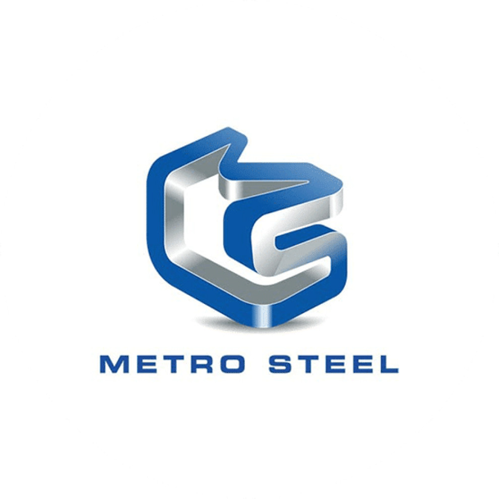
Standout Features:
- Metallic finish
- 3D loop that forms M and S
- Uppercase letters
The Logo Company's design for Metro Steel is a visually striking representation of the company's industrial expertise.
The standout element is the 3D loop that forms 'M' and 'S,' rendered in a metallic blue finish, exuding a polished image. This aligns perfectly with the brand's identity and adds depth and modernity to the logo.
The 3D loop can be reminiscent of a Mobius strip, a symbol often associated with infinity, which subtly communicates the enduring nature of the brand's products and services.
Using uppercase letters in a clean, bold typeface further reinforces the company's presence as solid and dependable.
Get a chance to become the next Design Award winner.
SUBMIT YOUR DESIGN 

