Using letters alone in a brand’s logo can create an iconic symbol. Each curve, line, and style choice in the list of the best letter logo designs has been meticulously designed by the most eligible logo design agencies today. Discover how these designs captivate, resonate, and engrave the brands into the minds of their audience.
Join us as we discover the world of exceptional letter-based logos that transcend the ordinary, and check out more inspiring emblems in our Best Logo Designs catalog.
1. Anagha Bhat Business Coach by Jay Design Studio
Standout Features:
- Stylish monogram
- Energetic colors
- Circular typeface
As a vital part of Jay Design Studio’s rebranding campaign for Anagha Bhat Business Coach, the agency had to develop an impactful logo design.
The resulting emblem balances fierce professionalism and a friendly environment for businesspeople seeking guidance. It features a stylish monogram built from the owner's initials in a funky, laid-back style with lowercase glyphs.
The blue or orange icon is central to the white circular typeface that embraces and elaborates what it represents.
Finally, the logo hints at the Bhat’s workstyle and her persistence through a hidden infinity symbol cleverly placed between the letters, stemming from the holes within the glyphs.
2. ElementQ by Paper Lime Creative
Standout Features:
- Scientific appeal
- Represents a new periodic element
- Symbolic color scheme
ElementQ is the pioneer in providing emotional intelligence education in Alberta, Canada. Since this field of learning is still new to the world, its founding and significance had to be marked effectively. This is why Paper Lime Creative delivered a logo with a scientific appeal.
The idea behind the two-letter symbol inside a colorful hexagon is to resemble a new periodic element, as the system poses itself as very important to diverse target audiences.
The hexagon's gradient colors range from yellow to dark blue. While already aesthetically pleasing, this color story stands for good intentions, too. Dark blue symbolizes stability and professionalism, green is known for natural relaxation, and yellow is energizing. Overall, this combination hints at the emotional colorfulness within us that we could understand with ElementQ’s programs.
3. SafeMi by PROSTE LOGO
Standout Features:
- Monochromatic
- Simple and efficient
- Stylized letters
PROSTE LOGO created the logo of the Poland-based safety provider SafeMi. The logo reflects the subtlety of how the brand provides efficient security options to home and business owners throughout Europe.
The monochromatic logo easily applies to all backgrounds due to its white or black iterations. As for the style, the brand name is spelled out using glyphs with a slightly increased width, and the first five letters are interconnected with the “I” glyph standing next to them.
The logo is simple,e but its efficiency is conveyed through a subtle arch that makes up the move that cuts the “F” letter. The arch stems from the shortened “A” and extends to the top of the “E,” resembling a dome or a barrier.
Check out more simple logo designs that master the art of minimalism.
4. CIAO Patisserie by ColorWhistle
Standout Features:
- Glossy finish
- Mixed typeface
- Multicolor iterations
The CIAO Patisserie logo design, crafted by ColorWhistle, represents everything a distinctive sweets vendor needs: short, sweet, and stylish.
The emblem consists of a capitalized sans serif font style that spells out the brand name and an elegant cursive font style that spells out the second word of the name placed below the CIAO.
The simple, modern aesthetics can quickly adapt to different colors, including pink and gold. The agency also added a glossy finish that exudes glamour and sophistication, making the glyphs stand out.
If you like foodie industry emblems, you’ll love browsing our best bakery logo designs.
5. AOTA by More By Us
Standout Features:
- Modernized
- Minimal design
- Custom font style
More By Us developed a new logo for the French association AOTA. While there were three exceptional proposals, one stood out thanks to its sheer simplicity and visual appeal that modernizes the brand’s identity.
The modernized emblem redesign presents the initials in a custom font style with lowercase lettering. The “A”s and the “O” are similar in this minimalistic project, with the “A” extended via a short tail. The tail is also identical to the ending of the “T” glyph, the most stylized letter.
Its vertical line is elongated, making the space between the cross-section identical rather than slightly longer downwards. The horizontal line also doesn’t cross the vertical one but stems from it to the right.
Check out other impressive logo redesigns.
6. Mikavi by Jakub Sudra
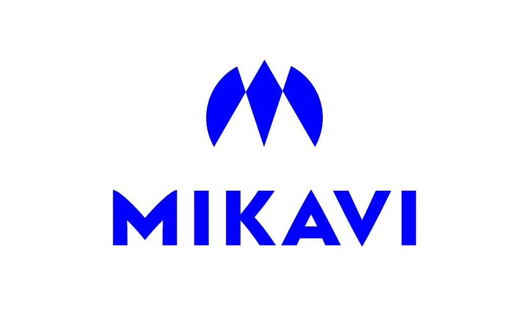
Standout Features:
- A diamond icon
- Electric blue color
- Bold sans serif typography
Jakub Sudra’s design for the Mikavi logo takes inspiration from the Apple brand, a bird, a drone, and a prism. Combining said visuals in mind, the agency shaped Mikavi's logo to look like a letter "M." The result is a minimalist modern logo design that complements the brand's professional image.
Below the icon, the brand name is spelled with a bold sans-serif typography. The icon and the typeface are blue, set against lots of positive space to build a reliable color story.
Blue is known for its stability and trustworthiness, whereas white refers to the pureness that reflects the brand’s product quality.


-preview-webp.webp)