- Article by
- Jermaine Dela Cruz

#B08E47 #423A38 #301E46 #709293
- Agency: Bivins Brothers Creative
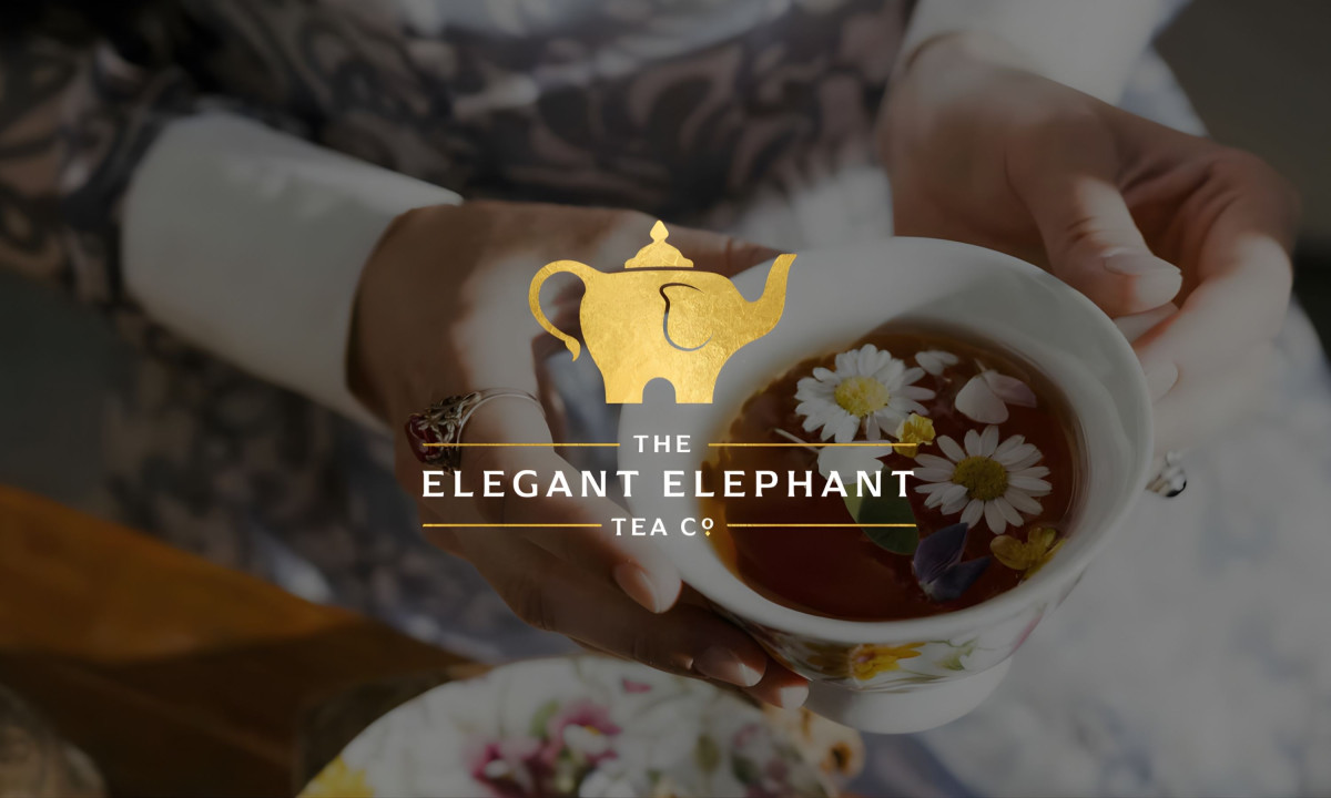
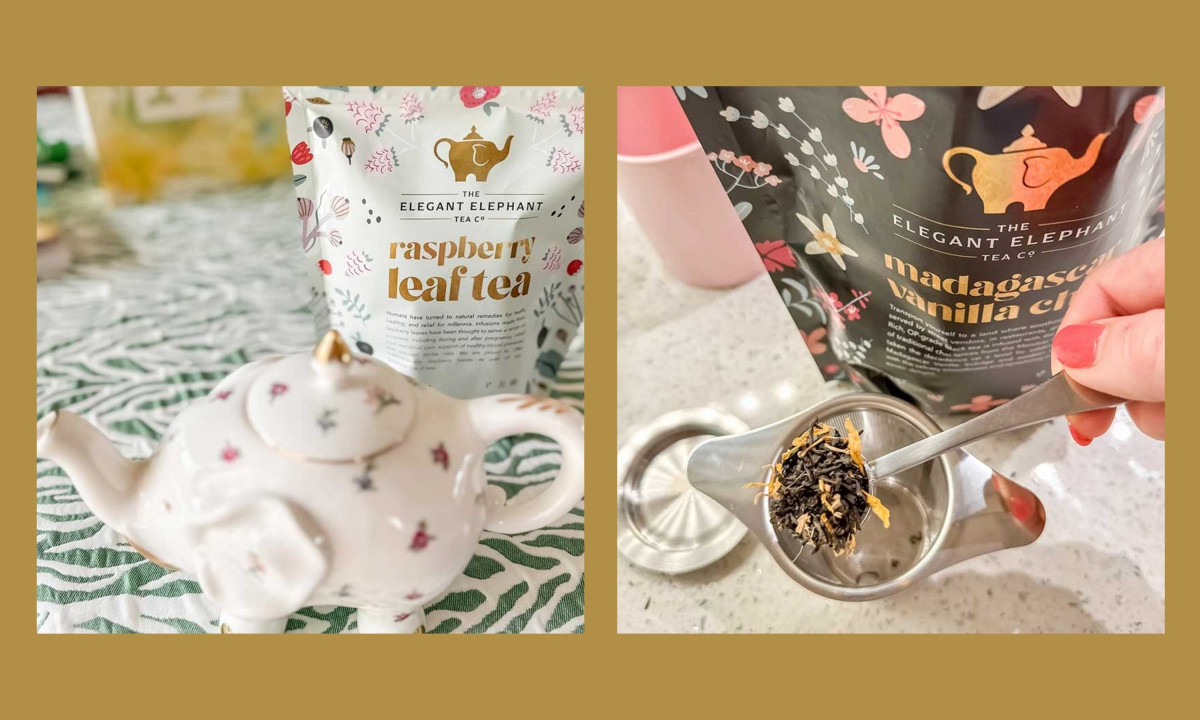
- Client: The Elegant Elephant Tea Co.
- Category: Logo Design — Beverage
- Location: Chicago, Illinois, United States
- Project Brief: Create a logo conveying elegance and warmth through refined iconography for strong brand recognition.
The Elegant Elephant Tea Co.'s logo hides its cleverest decision in plain sight. The gold teapot icon is also an elephant: the spout is the trunk, the handle curves into a tail, and four stubby legs anchor the base. It's the kind of dual-reading mark that rewards a second look without requiring one. At a glance, it reads as a teapot. That's enough. The elephant reveals itself when you slow down.
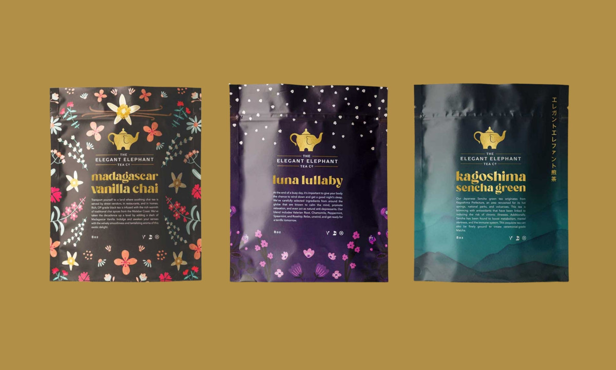
The gold and white palette works on two registers. Against a dark background, it reads as premium. Against the lighter packaging backgrounds, it reads as warm. That range matters for a brand that sells across multiple blends, each with its own color world and illustration style.
The packaging system shows how far the mark travels. Madagascar Vanilla Chai runs on dark backgrounds with warm botanical illustration. Luna Lullaby shifts to deep purple with a starfield pattern. Kagoshima Sencha Green uses dark teal and a watercolor mountain landscape with Japanese script running vertically. Three completely different visual atmospheres, with one consistent mark anchoring them all.
The gold teapot-elephant holds because it's simple enough to reproduce at a small scale and distinctive enough to carry each packaging variant without getting lost in the illustration. That's the harder design problem. Bivins Brothers Creative solved it by giving the brand a beverage logo that doesn't compete with the packaging.

Apax Architecture