Standout Features:
- Elegant geometric "R" monogram with Art Deco influence
- Classic serif typography with modern proportions
- Minimalist color palette supporting brand prestige
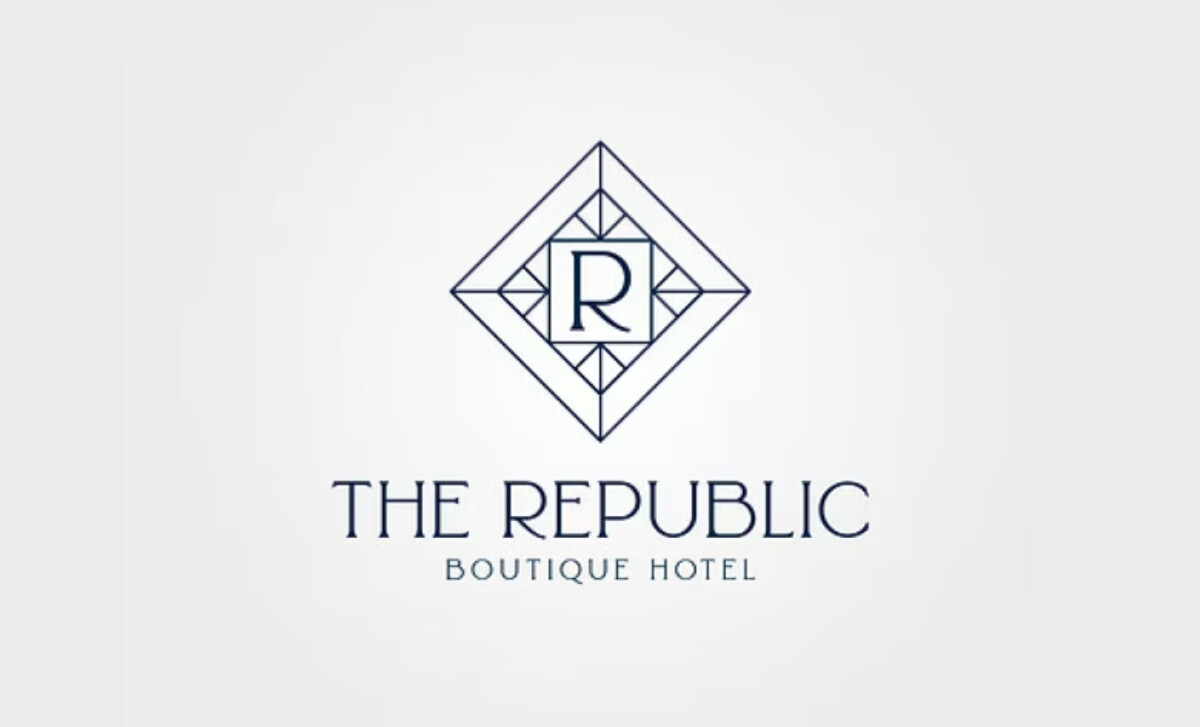
The Republic Boutique Hotel promises an experience where luxury meets personalized care. Their logo, by DRW Studio, needed to reflect this upscale positioning. The design you encounter aims for timeless elegance and exclusivity, perfectly aligning with what you'd expect from a high-end boutique hotel.
At the heart of this logo, you have an intricate geometric monogram. A stylized "R" is beautifully framed by a diamond shape that features detailed linear work, hinting at Art Deco style. This immediately gives you a sense of the hotel’s sophistication, exclusivity, and commitment to beautiful design.
The way the hotel's name, "THE REPUBLIC," is written also adds to the classic feel. It uses an uppercase serif font with clean, tall lines and nice spacing, making it look elegant and easy for you to read. Such typographic choices are significant, as a 2023 study found people link specific font styles to higher-priced, premium products.
This hospitality logo employs a simple yet effective color scheme: just a dark, muted color on a white base. This choice enhances the logo's sophisticated feel. It lets you appreciate the details of the Art Deco monogram and the classic type without any color distractions.
In the end, The Republic Boutique Hotel’s logo is a masterclass in conveying luxury. DRW Studio's design, with its intricate Art Deco monogram, refined typography, and minimalist color scheme, truly captures the brand's promise. If you're looking for an exclusive and elegant experience, this logo certainly sets the right tone.