Standout Features:
- Evocative design
- Harmonious elements
- Balanced
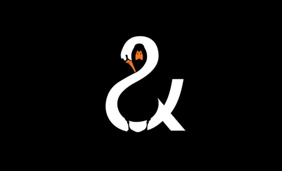
John Randall created a playful and evocative logomark that embodies the three aspects of the restaurant's name by unifying both the swan and mallard through the natural contrast (positive and negative space) within the ampersand.
The monochromatic color palette (with added orange accents) and streamlined illustrations help create a simple, yet balanced feel that is sure to get lodged into the onlookers' collective memory and inspire smiles with its sheer creative charge.
Get a chance to become the next Design Award winner.
SUBMIT YOUR DESIGN