Arizona Coyotes Logo Evolution: Key Points
- Nostalgia sells: Retro logos like the Kachina tap into a $33.5B merch market, boosting fan loyalty and revenue.
- Gen Z & Millennials Crave Retro:60% of Millennials and 55% of Gen Z favor brands that tap into nostalgia.
- Authenticity Wins Fans: Collaborating with Hopi artists gave the original design cultural integrity, turning the logo into a lasting symbol of place and pride.
The Arizona Coyotes logo, anchored by its iconic Kachina symbol, remains a powerful case study in how cultural identity can outlast geography.
In 2024, as global licensed sports merchandise surged to $33.5 billion and nostalgia drove demand across leagues, the Coyotes’ return to their most beloved emblem proved that strategic design can preserve brand equity, even when a franchise changes zip codes.
The Arizona Coyotes Logo at Present: Culture Meets Strategy
The Arizona Coyotes’ current logo, revived in 2021, brings back the bold, Kachina-inspired design first seen in 1996: a coyote clad in full hockey gear, stylized with sharp angles and rich, Southwestern symbolism.
“The colors, with the exception of the purple, were drawn from a Native American palette,” said lead designer Greg Fisher. “We were trying to build regional patterns, motifs.”At its core is the striking coyote mask (a symbol of strength and cunning) set against tribal linework and earthy tones. Unlike today’s minimalist sports logos, every detail here tells a story.
“We wanted to create something unique to the Southwest, with a tribal, handmade feel that would resonate with the people there,” added Fisher.And that’s cultural identity rendered in pixels and thread in the Arizona Coyotes logo.
Reader Reward: Culturally rooted logos generate higher emotional response in fan-based industries like sports and entertainment, according to a 2024 study.
Arizona Coyotes Logo Evolution
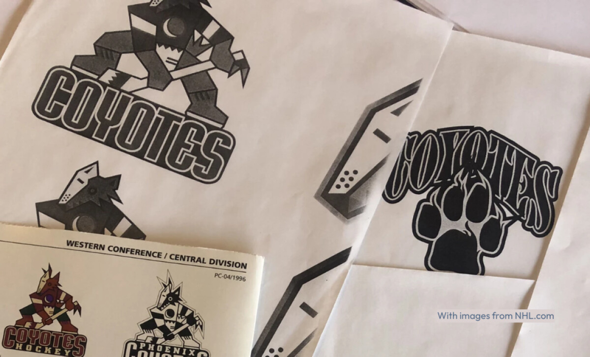
1996 – 1999: The Phoenix Coyotes Debut
Relocated from Winnipeg, the newly rebranded Phoenix Coyotes unveiled a logo that stunned the NHL: a geometric, jagged design inspired by Southwestern Indigenous art.
The original Kachina logo featured a coyote dressed in full hockey gear, stylized through jagged lines and a desert-inspired color palette.
As per NHL archives, designer Greg Fisher collaborated with Native artists to ensure that every line, triangle, and color in the Kachina reflected authentic symbolism.
“We decided to see if we could build this legacy of Coyotes in the desert and the American Indian tradition,” Fisher recalls consulting the Hopi Tribe for approval before unveiling the logo. “That’s where the Kachina logo came from.”By 1999, subtle adjustments were made to improve the logo’s versatility. The lines were refined, excessive detailing was reduced, and the wordmark was removed to let the coyote image stand alone.
Color tones were slightly darkened, resulting in a cleaner, more adaptable version for multi-platform use.
The spirit of the Kachina remained intact, but this iteration marked a quiet move toward visual simplification, a signal of what would come next.
Your logo is strategy. Learn how to get it right from day one.
2003 – 2021: The Modern Howling Coyote
In 2003, the Coyotes unveiled a new logo designed by Adrenalin Design Group, embracing a minimalist visual system that echoed the clean branding trends of the early 2000s.
The design featured a stylized coyote head, howling skyward, rendered in deep brick red and sand tones. Tribal motifs were abandoned in favor of angular simplicity and scalability, aligning with parallel redesigns from teams like the Minnesota Wild and Buffalo Sabres.
This shift was intended to simplify the brand and align with early 2000s design trends. But it came at a cost.
According to a logo perception study on retro vs. modern logos, retro designs tend to evoke stronger emotional responses and higher purchase intent than contemporary redesign, especially in sports.
Criticisms arose regarding the brand’s distancing from its cultural roots. Over time, fan nostalgia for the original identity intensified, laying the groundwork for a return.
Don’t become a case study in what not to do. Design better. Start by avoiding these fails.
2021– 2024: The Return of the Kachina
After nearly two decades, the Coyotes officially reinstated the Kachina as their primary logo. This is more than a tribute to the past. It was a calculated response to shifting consumer behavior and brand performance insights.
According to GWI’s nostalgia trend report, 60% of Millennials and 55% of Gen Z actively seek out brands that remind them of earlier decades. Retro logos like the Kachina score higher on likability, trust, and emotional resonance than their modern counterparts.
The Coyotes capitalized on this insight. Kachina-branded merchandise quickly became one of the team’s fastest-selling items during the 2021– 2022 season. Though official NHL revenue data remains undisclosed, fan response and store demand signaled clear commercial success tied to the brand’s return to its roots.
President and CEO Xavier Gutierrez framed the rebrand as both market-savvy and community-driven.
"Our rebrand will highlight that the Coyotes are a dynamic, energetic and a forward-looking organization, and this campaign will demonstrate our commitment to be a leader in our community. The entire State and Valley is a 'Part of Our Pack.’”In emphasizing the emotional connection fans had with the original Kachina identity, Gutierrez added:
“As always, we listened to our incredibly loyal and passionate fans, and we were overwhelmed by their love for the Kachina brand and desire to bring the logo and jerseys back on a full-time basis. Embracing the Kachina was an easy decision for us, and we are very proud to have one of the best logos and uniforms in the entire NHL."2024 – Present: Kachina’s Final Chapter in Arizona
However, just as the Kachina regained its place as a central brand symbol, the franchise itself faced a turning point.
At the close of the 2023–2024 NHL season, the Arizona Coyotes officially announced their relocation to Salt Lake City. The NHL’s Board of Governors unanimously approved the sale of the franchise to Utah Jazz owner Ryan Smith, ending professional hockey in Arizona after 28 seasons.
The move not only concluded a chapter in Arizona sports history, it also recontextualized the Kachina’s return. What was once a signal of brand revival is now a lasting emblem of regional pride and a team that, while no longer on the ice in Arizona, remains embedded in its cultural fabric.
The Wrap-Up: Your Authenticity is Your Brand Differentiator
The Kachina logo draws heavily from Indigenous symbolism, especially the Hopi Kachina figures, spiritual beings central to ceremonial art and storytelling in the Southwest. Fisher’s original design incorporated angular shapes, bold color blocking, and desert-inspired tones to reflect Arizona’s landscape and heritage.
Final Notes:
- Cultural Collaboration Adds Credibility: Original designer Greg Fisher worked directly with Native artists and sought Hopi Tribe approval. That groundwork created a logo grounded in meaning.
- Familiarity Fuels Brand Recall:A 2023 study found that visual consistency significantly boosts recall, especially in broadcast-heavy environments like the NHL. The Coyotes’ return to a familiar design strengthened recognition and loyalty.
- Emotion Drives Engagement:Research shows culturally rooted logos spark higher emotional attachment. The Kachina isn’t just liked—it’s loved, turning fans into brand evangelists.
In that sense, the Kachina wasn’t just a logo. It became a vessel for community, history, and identity. Its legacy lives on not because it was trendy, but because it was true.
And in the end, that’s what the best sports logo designs do. They don’t just represent a team. They represent a place, a people, and a moment in time that can’t be replicated.