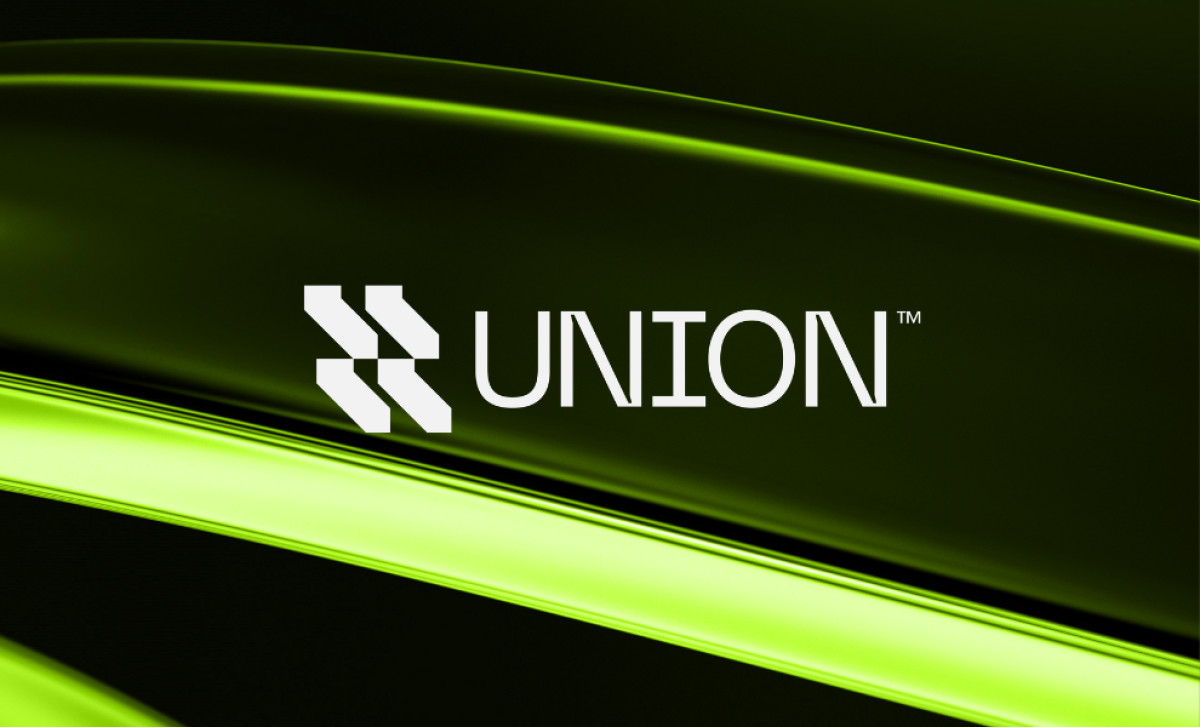
Standout Features:
- Bright neon color
- Futuristic aesthetic
- Geometric emblem symbolic of unity
The Union logo, created by Andrija Designs for the digital studio, effectively communicates the studio's core values through a modern and memorable design. The logo is a case study on bold modernity and understated simplicity.
One of the logo's standout features is its bright neon color. Such a striking hue is a deliberate disruption — an attention-grabbing tactic and a departure from conventional, often muted, corporate palettes. With such a memorably colored logo, Union gets a fighting chance to stand out online.
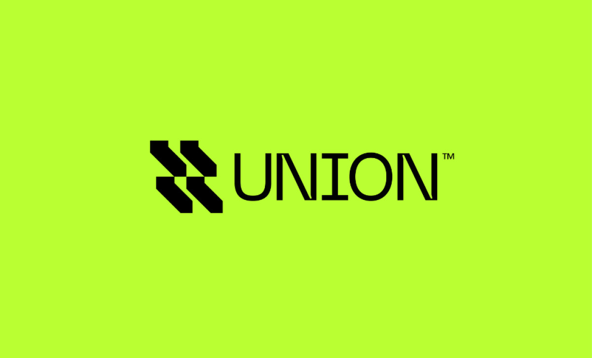
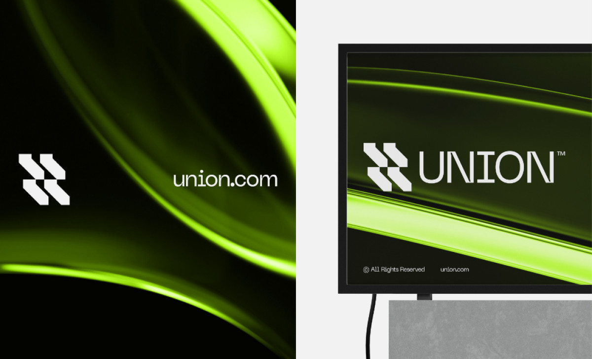
The logo design also has a futuristic aesthetic, as seen in its background of free-flowing abstract lines and its sharp, sans serif typography. This design choice contributes to the logo's modern feel: Anything as sleek and minimalist as this logo immediately communicates expertise in current digital solutions.
However, the geometric emblem is where the design's conceptual core truly resides. The designer used four geometric elements united in one as a reference to the studio’s name. Together, the elements symbolize unity and collaboration — what better way to align with the brand's focus on empowerment and innovation?
All in all, this professional services logo weaponizes simplicity and vibrant color to carve a space in the digital landscape. The logo's success lies not in what it explicitly states, but in the questions it provokes: what future are they building, and how will their unified approach redefine the services it provides its clients?