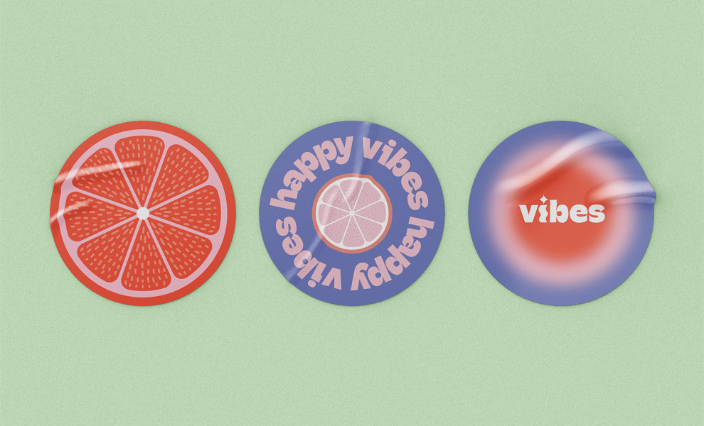
Standout Features:
- Lowercase sans-serif lettering
- "i" as a candle visual
- Monochromatic color palette
Vibes' logo design merges contemporary lettering and a playful candle symbol to communicate with this brand’s target audience: the Gen Zs. Albena Design chose lowercase sans-serif lettering to exude a modern vibe, reflecting the brand's youthful and trendy appeal — a design strategy that instantly positions the brand as relatable.
Another way this logo communicates with the brand’s audience is the stylized "i," which resembles a candle. With its curvy lines and a playful starry dot on top, this element adds a touch of joy and whimsy to the design. It serves as a visual representation of the hand-crafted nature of Vibes' candles.

Moreover, the designers employed a monochromatic color palette to ensure clarity and visibility, allowing the brand name to take center stage. The logo grabs attention and effectively communicates the brand identity without distractions by keeping the color scheme simple yet impactful.
Overall, Vibes’ logo perfectly balances modernity, playfulness, and clarity, embodying the essence of the brand's unique candle offerings.
_74518cd1a820-desktop.jpg)

-preview.jpg)

