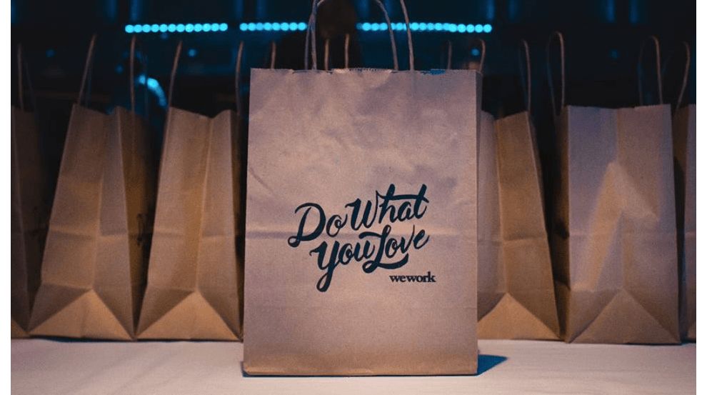
WeWork is a New York City company founded in 2010 by Adam Neumann and Miguel Mckelvey. WeWork provides shared workspaces for entrepreneurs, small startups, and freelancers. WeWork is ranked no. 3 on CNBC’s 2017 Top 50 Disruptor list. The company has a valuation of $18 billion.
Over 100,000 people in 65 major US cities and 44 international cities utilize WeWork’s shared office space.
The logo is black and the two “w” letters are lowercase.
Although it's a fairly straightforward and common visual scheme, leading logo design companies use black to convey authority, power badness, sophistication and elegance. WeWork embodies these attributes effortlessly.
This forces the two “w” letters to work together and equally share their own space in the logo—exactly like the entrepreneurs that share workspaces through the company.
Why were “we” and “work” chosen for the brand name? We represent a community, inclusion, sharing, and team. Work represents how each member of that community serves their customers, through their own unique talents and skills. This intentional brand name choice not only embodies the company's values but also boosts their SEO by using keywords that resonate with their audience, increasing online visibility and relevance. Discover our curated list of the top seo agencies.
The wordmark is very distinctive. As the company continues to grow and acquire new workspaces, brand awareness will continue to increase exponentially.
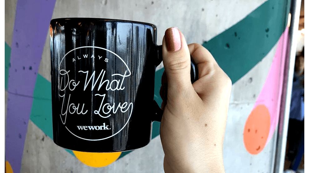
It can fit a variety of formats because of its traditional feel. We can stamp it onto a mug or onto an expensive office door. It belongs.
The font used is a bold Garamond Serial -- an old-style serif typeface. This gives the logo an elegant feel, just like the workspaces of the company. The serifs on each letter have their own personality, like the many workers in WeWork’s buildings. It is professional and timeless. Plus, it’s among the trending fonts free to use by designers for various brand assets!
The logo is a wordmark and not a symbol. The company does not need a symbol because the wordmark is seen repeatedly throughout every one of its locations.
Notice the repetition used in the “w” and “w” letters. They are exactly the same with matching interconnected lines at the top. Repetition builds brand memory and recognition amongst consumers.
While top creative agencies often try to infuse their designs with innovation, WeWork is a perfect example, that less is more, and it's not dull, by any means. This logo is powered by an elegant simplicity that symbolizes the brand's purpose: to bring entrepreneurs together to share workspaces and create a flourishing, low-cost work environment in the process.
Timeless font, a repetitive sound represented by closely nestled letters, and an instantly recognizable wordmark make this logo iconic and striking.
WeWork is a typographic logo design in the Professional Services industry.