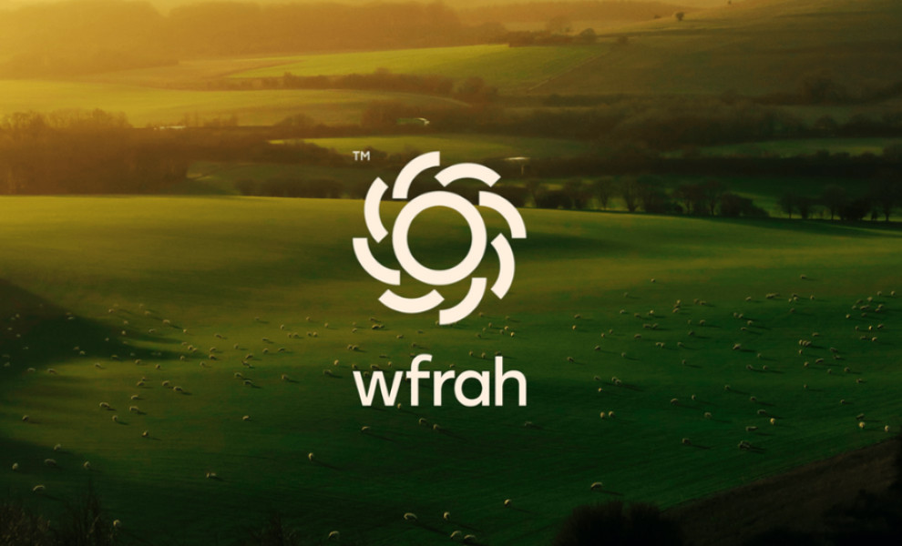
Standout Features:
- Lowercase bold typography
- Windmill logo
- Meaningful design
The wfrah logo is a bold and dynamic representation of productivity, perpetual movement, and abundance. Developed by Moe designs, the logo's bold lowercase typography conveys a modern and approachable aesthetic, while the stylized windmill acts as the visual centerpiece.
The windmill's lines, extending outward in a circular motion, symbolize the continuous flow of energy and the brand's commitment to progress and innovation. The overall design is simple yet meaningful, leaving a lasting impression of a company constantly moving forward and creating abundance.
Get a chance to become the next Design Award winner.
SUBMIT YOUR DESIGN