The best rebrands always aim to solve a specific business problem rather than rebranding for the sake of it. That could be rebuilding trust, signaling a pivot, escaping a limiting category, or making a legacy brand feel current again.
Best Rebranding Examples: Key Findings
- Rebranding works best when it solves a specific business problem like closing a perception gap, rebuilding trust, or removing growth constraints.
- The strongest rebrands protect existing brand equity while upgrading usability.
- When the strategy is right, results can be dramatic, as Old Spice proved by aiming for 15% and delivering 60% year-over-year body wash sales growth.
Why Bother Rebranding?
Rebranding takes time, costs money, and is a little risky. Done poorly, it confuses loyal customers and turns into a new logo on the same old problems. So why bother?
Because when the market’s perception lags behind what your brand has become, or where it’s going next, that gap can be far costlier.
Left unchecked, the perception gap can be more expensive than a rebrand thanks to:
- Weaker conversion and slower growth
- Margin pressure as you compete on price instead of value
- Higher churn (and higher effort) as trust erodes
Good examples of rebranding start with a clear business reason, then align positioning, messaging, and the real customer experience.
Success will show in metrics like share of search/organic demand, conversion rates at key touchpoints, customer retention/churn, and sales lift in priority segments.
A firm believer in strategic brand building and agile marketing, Courtney Bozigian, branding director for Digital Silk, says that “business is dynamic and both strategies and executional plans must be built to shift and adapt with the market.”
She goes on to say that being too rigid with your brand can “limit innovation and close off the right opportunities”.
So, let’s look at some of the most successful rebranding examples.
1. Old Spice: Regain Relevance With a Bold New Voice
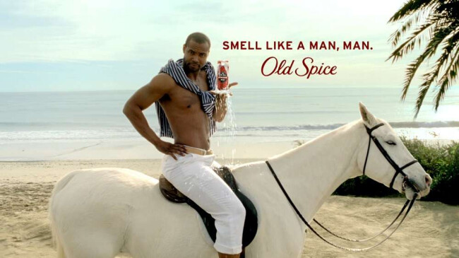
By the late 2000s, Old Spice was stuck in the “your dad’s brand” box while the body wash aisle was being won by newer, louder competitors. The breakthrough came from treating the brand like entertainment and giving it a voice so iconic that people wanted to repeat it.
What made the rebrand work was how broad the shift was:
- A clear hero character (and a voice) people could instantly recognize
- Campaign work designed to travel across platforms, not just run as ads
- Rapid, internet-native content that kept the momentum going after the launch
The payoff was way bigger than expected. Wieden+Kennedy reported the goal was to lift body wash sales by 15%, but by May 2010 sales were up 60% year-over-year and doubled by July.
The lesson here is to choose a sharply differentiated tone and execute it consistently across every channel until recognition becomes automatic.
2. Gucci: Refresh the Creative Direction for a New Generation
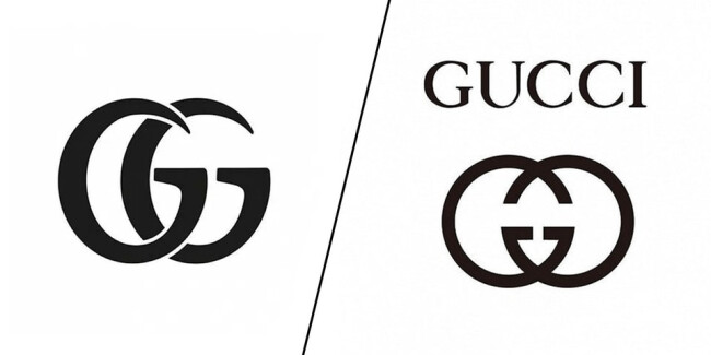
Before its mid-2010s resurgence, Gucci’s momentum had cooled and the brand was at risk of feeling predictable. That’s deadly in a category that rewards cultural heat. The reinvention brought Gucci back into the limelight: more talked-about, more desirable.
What made this shift work is that it wasn’t just visual polish. It was a broader reset in how the brand showed up in culture: a stronger creative point of view, clearer product storytelling, and more momentum in the way collections were launched and talked about.
The result showed up quickly in performance: Gucci delivered a 17% jump in comparable third-quarter sales (at the time, its first double-digit quarterly sales growth since 2012), fueling a sharp rise in parent company Kering’s shares.
This case shows that successful reinvention requires a cultural and creative reset (product, storytelling, and symbolism) not just a new look.
3. Burger King: Modernize the Look Without Losing Heritage
Burger King’s glossy, gradient-heavy identity started to look dated once ordering shifted to apps and packaging became the main brand touchpoint. The rebrand went back to its roots to feel more food-forward and more readable everywhere.
Rather than chasing a trendy redesign, the brand intentionally pulled from its own history. The rebrand brought back a heritage-inspired logo and paired it with a warmer, more food-forward design system that looks better on screens, packaging, and delivery apps.
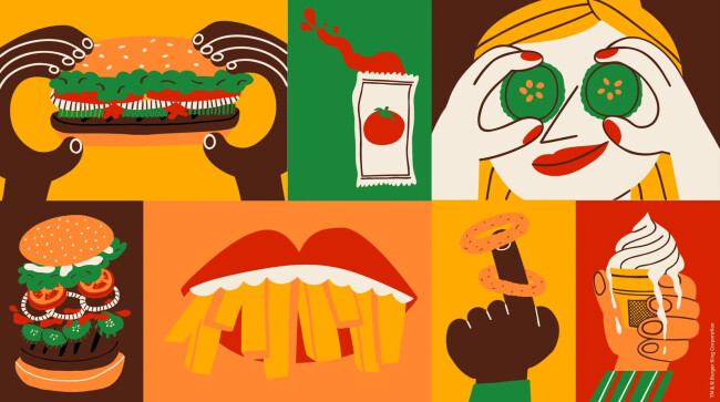
Where it really lands for agencies and in-house teams is the coherence: the identity is so much more than a new logo, it’s an adaptable system that scales across touchpoints (menus, wrappers, apps, signage) while staying unmistakably Burger King.
Investors like it, as evidenced by the fact BK shares climbed 7.8%, and the rebrand made consumers 66% more likely to pick Burger King over McDonalds.
The lesson for brands is to preserve distinctiveness and trust while modernizing for today’s touchpoints by deliberately mining the brand’s heritage.
4. Nokia: Reintroduce the Brand With a New Identity
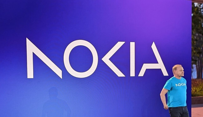
For many people, Nokia still meant classic mobile phones long after the company had evolved into a networks-and-enterprise technology business. That was a problem for the company as it sought to reinvent itself.
The rebrand helped close that perception gap, so the market could recognize what Nokia actually does now.
Rather than aesthetics, the update was mainly about repositioning clarity:
- A refreshed logo system built for modern digital contexts
- A brand world flexible enough for different business lines and audiences
- Messaging that reinforces the long-term strategic transformation
Nokia publicly framed the move as part of an updated company and technology strategy unveiled at MWC 2023, pairing the new identity with a clearer story about where the business is headed (networks, enterprise, and cloud).
It drew immediate attention at the show and across industry coverage, which helped reset expectations for the brand as a modern B2B technology player rather than a legacy phone company.
5. Domino’s: Own the Criticism and Prove the Product Change
View this post on Instagram
Domino’s had a problem design alone couldn’t fix in that customers were openly skeptical about the pizza itself. Rather than gloss over it, the brand leaned into the criticism and made the course correction the focus of the story with its 2009 Pizza Turnaround campaign.

To rebuild credibility, Domino’s bravely chose to acknowledge quality problems publicly, then prove the company had actually improved the product.
Here's why it worked:
- Instead of hiding criticism, the brand used it as the starting point
- The change wasn’t symbolic, it was operational (recipe and product improvements)
- Marketing became proof rather than spin
The result was immediate and public. Domino’s reported domestic same-store sales growth of 14.3% in Q1 2010, attributing the lift to traffic driven by its new and inspired pizza. That’s a rare case where the business outcome clearly tracks back to the rebrand’s core promise.
6. Mastercard: Go Icon-First for Instant Recognition
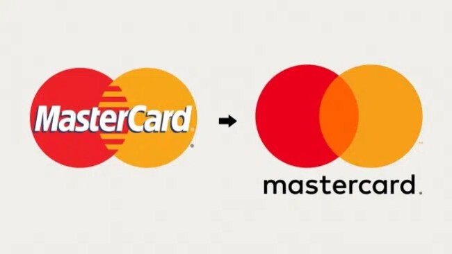
Smaller screens, faster interactions, and less room for clutter on digital interfaces had become a problem for Mastercard by 2016. The brand needed to streamline its identity to stay instantly recognizable across modern digital contexts.
The redesign leaned into what the company already owned: the interlocking circles.
The concept from Pentagram used the identity system to prioritize simplicity and flexibility, keeping the brand recognizable even when reduced to its most minimal form.
Later, Mastercard took the next step and began using the symbol without the wordmark in select contexts, which is a move only brands with massive recognition can pull off confidently.
This rebrand is especially instructive because it shows restraint. The “new” work is essentially a clearer, more usable version of the old equity, optimized rather than reinvented.
7. Apple Inc.: Remove Limitations From the Name
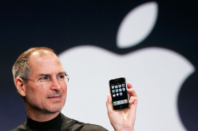
By 2007, Apple Computer, Inc. was no longer just a computer company, with its product direction clearly expanding beyond Macs. Dropping “Computer” from the name removed a built-in constraint and signaled the broader future the brand was moving toward.
This rebrand was, in fact, a statement about its trajectory to become so much more. That one change made it easier for the market to accept Apple’s expansion (at the time) into consumer electronics. It’s a classic example of how naming can remove friction from growth.
View this post on Instagram
This kind of rebrand is often the difference between a great product company and a category-defining brand, because the name itself stops boxing in the brand. A narrow label like “Computer” leads customers and investors to think of you as a single-category business.
A broader name creates permission to expand, so the next product feels more like a natural extension of the brand than a risky left turn.
8. Airbnb: Build a Trusted Identity for a Global Marketplace
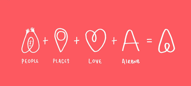
By 2014, Airbnb had outgrown its scrappy startup look. It was expanding beyond early adopters and into new markets. As such, the brand needed to feel consistent, mainstream, and resonate emotionally at global scale.
Rather than merely swap a logo, the company rolled out a broader redesign across its digital footprint to match a bigger promise: “Belong Anywhere.”
View this post on Instagram
A big part of what made this rebrand work is how simple and flexible the new identity system was, so it could show up everywhere without losing meaning:
- A new icon (“Bélo”) + wordmark designed to be recognizable, scalable, and community-forward
- A refreshed website and mobile experience that made the product feel more intuitive and brand-consistent
The result is one of the rare modern rebrands that became an instantly identifiable symbol. It didn’t need to become something radically new but rather deliver a clear emotional center and a visual system strong enough to carry a global community brand for years to come.
The lesson for brands is to anchor the rebrand in a single, emotionally resonant, and instantly understood concept that can scale consistently across markets, products, and experiences.

9. KFC: Shorten the Name to Shift the Focus
As health conversations grew louder and menus expanded, “Kentucky Fried Chicken” started to carry baggage the brand didn’t want to lead with. In 1991, the brand opted to keep the heritage and recognition, but shift the first impression away from the word “fried”.
The smart part is that "KFC” didn’t feel like a forced reinvention because it matched how people already talked about the brand, which is crucial because initials only work when awareness is already there.
The strategic benefit is clear:
- The name becomes cleaner and shorter for signage, packaging, and digital UI, with fewer regional associations to explain.
- The brand avoids leading with the most polarizing descriptor.
- Marketing can emphasize taste, convenience, and menu range without the name undercutting it
The shorthand clearly stuck, and KFC is now the default name, which makes the brand feel modern and globally consistent.
At the same time, it didn’t erase the story, as the Colonel Sanders iconography and “Kentucky” heritage cues still anchor the brand’s roots.
So, if you’re thinking about simplifying your brand’s name, try to match real-world usage and (when possible) strategically reduce negative or outdated association.
10. CVS Health: Align the Brand With a Bigger Mission

CVS Caremark Corporation had always been a pharmacy chain, but by 2014 it was becoming a broader healthcare company and the corporate identity needed to reflect that.
The move to CVS Health aimed to align with a visible repositioning for the company. The new name supported a broader mission, to “build a world of health” around their customers.
What made this move credible is that it came paired with the concrete, values-driven decision to end tobacco sales at CVS. This turned brand positioning into an operational choice customers could see and feel.
Positioning only sticks when behavior reinforces it, so try to align name, identity, and operations around a credible strategic shift. CVS formally announced the name change as a reflection of its broader health care commitment.
Because the rebrand was tied to real behavioral change, it read as strategy more than marketing.
Best Rebranding Examples: Final Words
A rebrand should be a decision to reduce a specific kind of friction, whether that’s a perception gap, a trust deficit, or a growth constraint.
The brands that got it right protected what was already recognizable, clarified what the business now stands for, and backed the message with tangible proof in product, experience, or behavior.
Start by naming the business problem in one sentence, identify the equity worth keeping, and then build a system that makes the new story impossible to miss.

Our team ranks agencies worldwide to help you find a qualified partner to make the most of your brand. Visit our Agency Directory for the Top Branding Agencies, as well as:
- Top Brand Strategy Agencies
- Top Brand Positioning Firms
- Top B2B Branding Agencies
- Top Corporate Branding Agencies
- Top Small Business Branding Agencies
And don’t miss our Awards section, where we showcase the top agencies recognized for exceptional creativity and impact.
Best Rebranding Examples FAQs
1) How do you know whether you need a rebrand or just a refresh?
If the business strategy hasn’t changed and customers still recognize the brand, a refresh is usually enough (tighten the system, improve usability, update execution).
A full rebrand is more appropriate when there’s a persistent perception gap, like if people don’t understand what the company does now, trust is eroding, or the name/identity actively limits growth.
2) What’s the most common reason rebrands fail after launch?
The most common reason rebrands fail after launch is a credibility gap: the brand looks and sounds new, but the product, service, or customer experience doesn’t change, so audiences read it as cosmetic and disengage (or react negatively).
Try tying the rebrand to a specific business shift, launching with at least one tangible proof point, and prioritizing consistent execution across the highest-visibility touchpoints first.
