18 Ranch worked with Victor Design to develop packaging for its range of chicken "ready meals." Working with the brand’s mascot and established guidelines (also created by Victor Design) the studio took an unusual approach that juxtaposes the warmth and visceral qualities of product photography with the modern and convivial character of geometric illustration, solid color and white space.
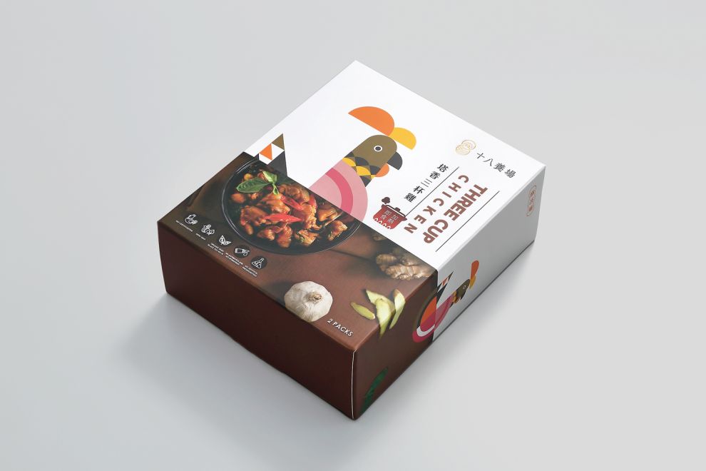
We experience an intersection of two quite different visual styles. Individually, these are straightforward in their intentions and stylistically distinguished. These leverage the instinctive and reassuring qualities of warm and rustic food photography, and the quirky and unexpected illustrative qualities of 18 Ranch’s visual identity.
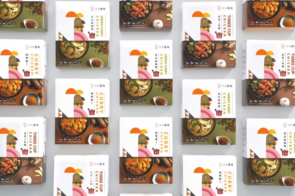
The chicken is a well-established mascot and has a uniqueness in color, geometric character and circular body that also acts like a connective tissue. The bowl completes the lower half of illustration. The use of space, the choice and setting of type, and the illustrative component are consistent and dominant elements.
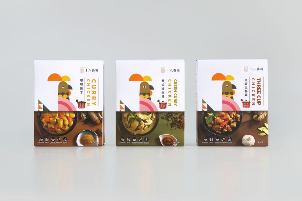
It is certainly distinctive. And although typesetting is awkward — the balance between the two different languages feels unresolved — the font choice sits well alongside illustration. Photography is in service of concept through its simplicity, arrangement, and consistency. Pack hierarchy is perhaps a little challenging. White space and illustration draws the eye, makes a clear connection with the brand; however, differentiation between the range feels secondary.
Although the line between the two styles is abrupt, it is also playful, if a little under-defined.
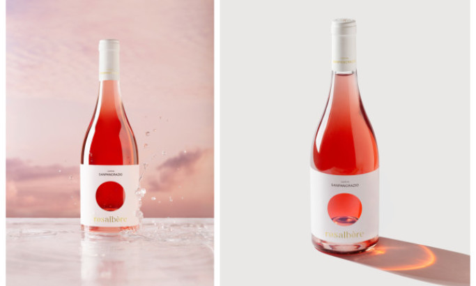
18 Ranch Chicken Dishes is a fun packaging design in the Food & Beverage industry.
-preview.jpg)