VIS/N collaborated with The Honorable Distillery to craft a packaging design for their Joulupukki Christmas Whiskey, reflecting the distillery's mission to honor local traditions and craftsmanship. With folklore-inspired illustrations, subtle festive accents, and carefully curated typography and color, the packaging captures the holiday spirit while celebrating regional heritage.
Key Insights for Brands:
- Folklore-inspired illustrations foster narrative intrigue and deepen emotional connections
- Festive elements and regional motifs emphasize authenticity and local heritage
- Artisanal typography, like script fonts, enhances the premium, handcrafted appeal of the product
Joulupukki and Canoe Illustrations Anchor the Design in Folklore
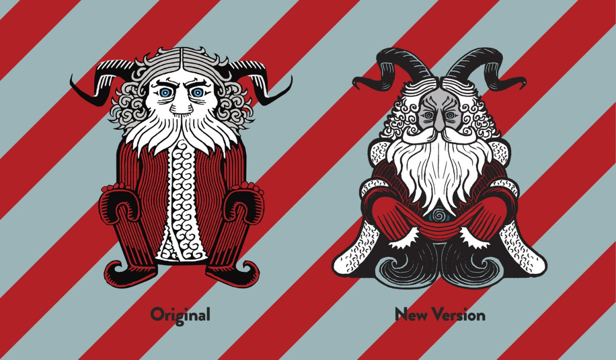
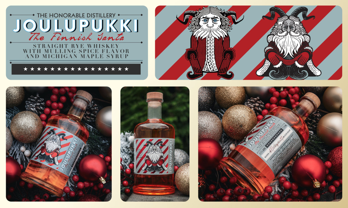
At the heart of the Joulupukki Christmas Whiskey packaging is a striking illustration by Lauri Ahonen, a redesign of the original copyrighted artwork from the film Rare Exports. This figure reimagines the Joulupukki, a Christmas Finnish figure, blending its traditional goat-like features with modern aesthetics.
Joulupukki, which literally means “Christmas Goat,” is depicted with a grim expression and horns — a nod to ancient traditions in which men dressed as goats roamed neighborhoods during the holidays, demanding food and drinks, especially leftover alcoholic beverages.
Professional packaging designers often borrow similar olden elements to introduce a layer of mystery and depth to the design. Here, this approach adds a layer of intrigue and depth, contrasting the cheerful depiction of modern-day Santa Claus.
To bridge folklore with contemporary festive imagery, VIS/N design agency implemented elements of the familiar Santa: a red coat trimmed with white fur alongside the signature white beard and mustache. This juxtaposition of old-world mystique and modern charm creates a unique, unforgettable design.
The handcrafted canoe illustrations further enrich the packaging, symbolizing the whiskey's artisanal nature and deep connection to Michigan’s regional heritage. Together, these illustrations ground the product in local traditions and storytelling, crafting an authentic, charming, and creative packaging design.
The Design Reinforces Regional Identity and Festive Themes Through Subtle Details
Following some high-end packaging designs, VIS/N added subtle yet impactful details that connect the product to its regional roots and the festive season. The snowflakes and stars subtly reference the wintry landscape and the celestial charm of the season, adding layers of meaning to the visual narrative.
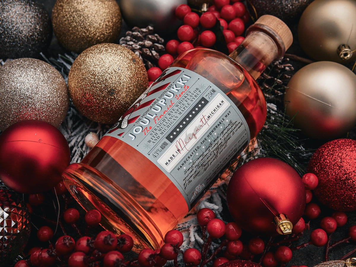
The stamp-like frame containing a silhouette of Michigan’s Upper Peninsula is another thoughtful touch, reinforcing the distillery's commitment to local heritage. Sitting above this silhouette is the "Made in Marquette, Michigan" inscription, underscoring the use of locally sourced ingredients, such as Olson Brothers Sugar Bush Maple Syrup, which infuses the whiskey with a distinct, regional flavor.
By incorporating these motifs, the design reinforces the brand’s heritage and creates a visually cohesive package that resonates with the local audience.
A Thoughtful Selection of Fonts Enhances the Design’s Elegance and Clarity
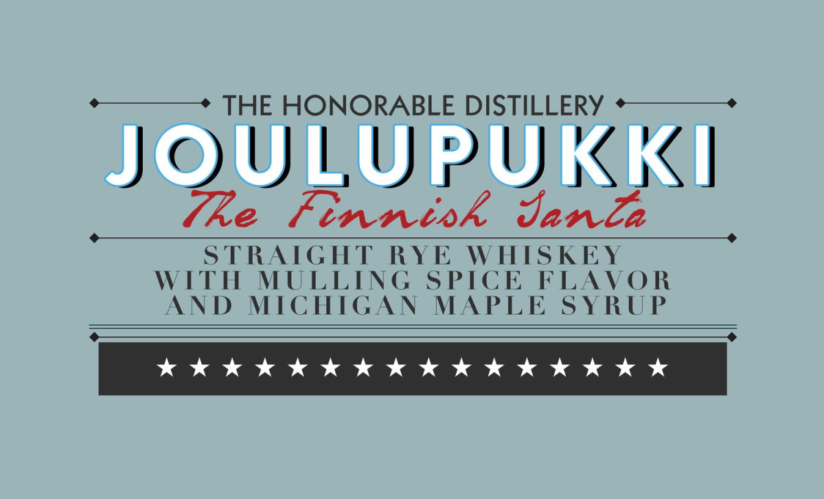
Typography in the packaging design plays a crucial role in conveying the product's premium quality and handcrafted essence. The script fonts for the branding message and handwritten signatures add a personal and traditional touch, emphasizing the whiskey's handmade aspect. This brand design element aligns with The Honorable Distillery's identity of producing goods "The Honorable Way," underlining its ethos of craftsmanship and quality.
The bold sans-serif font for the product name "Joulupukki" also ensures it stands out prominently on the label. In contrast, the serif font for the product description adds an element of sophistication, enhancing the overall elegance of the packaging.
This combination of fonts ensures clarity and visual hierarchy, making key information legible while maintaining an upscale aesthetic. Ultimately, this design strategy reflects the deluxe nature of the whiskey, aligning it among the best luxury branding designs.
Joulupukki Christmas Whiskey’s Refined Color Palette Exudes Festive Spirit
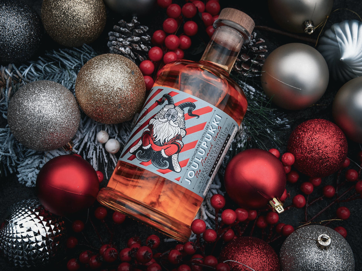
The packaging design’s grayish-blue, charcoal, and red color palette contribute to the overall visual impact. The vibrant red, a traditional Christmas color, highlights key elements like the Joulupukki figure and signature scripts, reinforcing the festive theme and ensuring the packaging stands out on shelves.
The grayish-blue serves as the background color, creating a serene canvas that highlights the detailed illustrations and text. This color also frames the silhouettes, subtly anchoring the design in a wintry, festive atmosphere without overpowering the other elements.
On the other hand, charcoal is predominantly used for the fonts, providing a strong contrast against the grayish-blue background. This choice enhances the legibility of the text, ensuring that information stands out while maintaining an understated elegance.
All in all, The Joulupukki Christmas Whiskey packaging design is a testament to the power of visual storytelling and regional authenticity. Through its thoughtful use of colors, intricate illustrations, subtle details, and a well-chosen typography combination, the design captures the essence of the product and connects it deeply with local folklore and heritage. This harmonious blend of tradition, modern aesthetics, and festive charm makes the packaging a worthy recipient of the Design Awards.


