Standout Features:
- Typographic character logo
- Bold color-coded origin labels
- Simple smile motif
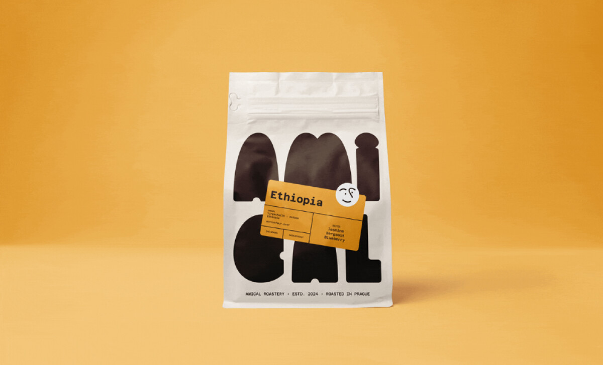
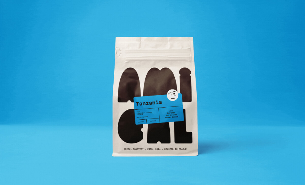
Amical Roastery’s packaging system, a design by Melvin-Kevin Methe, showcases an expressively charming visual identity. Featuring bold typography and a friendly visual personality, Amical’s packaging is crafted to be welcoming, easily recalled, and notably unique in any retail environment.
The brand’s packaging prominently features the name “Amical” in thick, black abstract lettering designed as soft geometric shapes. Despite the deconstruction and large scale, the name is still readable, and the spacing between letters creates a visual cadence that echoes mid-century modern graphic design, resulting in a memorable typographic logo.
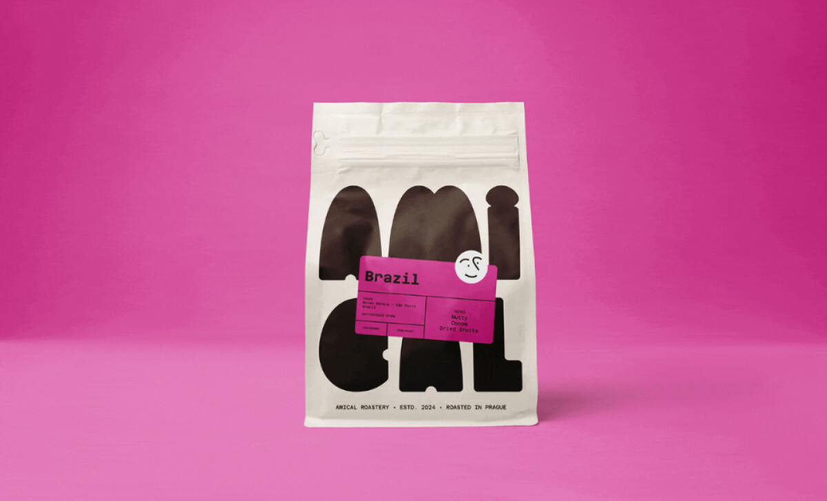
For each coffee type, Amical employs a brightly colored rectangular label placed diagonally. Mustard yellow, magenta, and cyan distinguish Ethiopian, Brazilian, and Tanzanian origins. Each label’s text is set in a relaxed, monospaced typewriter font, contributing to the brand’s approachable and human-centered aesthetic.
Adding to the packaging's friendly appeal is a small, circular smiling face that is consistently positioned on top of the diagonal origin label. This simple, doodle-like element, with its arched eyebrow and soft smile, serves as a recurring visual motif that personifies the brand and fosters a sense of approachability and warmth.
The inclusion of such a brand character is insightful, as findings from a 2023 study suggest that in the food industry, mascots can significantly boost a brand's appeal and help it stick in consumers' minds.
Amical’s food and beverage packaging offers valuable insights into building a brand that is striking and emotionally resonant. The abstract typography as a central logo, combined with a vibrant color-coded system for product information and a playful, personified icon, allows Amical to present itself as a friendly and memorable coffee choice.
-preview.jpg)
