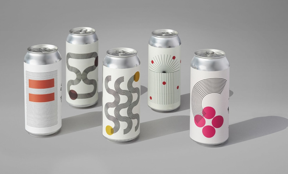
Standout features:
- Block painting-inspired
- Minimal
- Negative space
The Annex Ale Project is devoted to great beer and good conversation — and with good reason. Just one glance at the packaging created by Daughter Creative is enough to spark a conversation in an instant.
Annex needed to have a scalable, easy-to-produce system that could make an impact while still speaking to the individual characteristics of each beer.
These labels follow a distinct visual style that feels fleeting and reflective of the “once it’s gone, it’s gone” nature of the beer. Flavor characteristics come through in individual design elements with specific palette choices, line styles, and placement.
The so-called “negative space” is not something often talked about in packaging design, but the ample whiteness in Annex Ale containers has a special role. It represents a breather — a pause to cut through the ever-growing saturation of the craft beer market. Minimal line work with a rough, hand-done style inspired by Mondrian’s block printing is used to represent the experience of drinking the beer — from a deep base flavor to pops of sour, to a refreshingly easy-drinking NEPA.

-preview.jpg)
