Standout Features:
- Dark and vibrant design
- Artistic alchemy symbols
- Luxurious copper finish
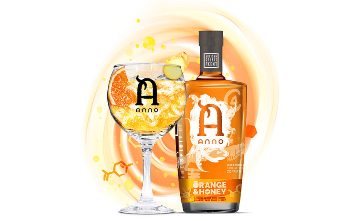
The Anno Orange & Honey packaging design, created by Rob Cursons, perfectly blends whimsy, charisma, and luxury. It encapsulates the brand’s innovative spirit and dedication to crafting an exceptional beverage.
The bottle’s stocky shape houses multiple design elements that showcase the product’s top-notch quality. The logo is placed front and center, while transparency labels and informative details communicate the gin’s natural ingredients and flavors.
In addition, the street art-like alchemy symbols balance modernity and timelessness with their urban appeal and gothic essence. They reflect the company’s mission to fuse seemingly incompatible elements into a harmonious whole, like alchemists concocting an elixir. These icons evoke wonder and curiosity, inviting consumers to explore the gin’s unique blend.
To top it off, the copper finish beautifully complements the beverage color visible through its transparent bottles. This style reinforces the product's premium quality and makes it stand out on the shelves.


-preview.jpg)
