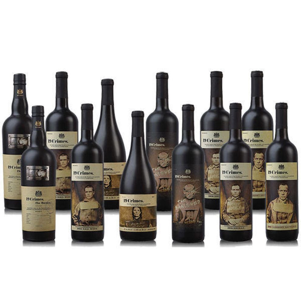
The 19 Crimes Packaging Gives Each Bottle Its Own Unique Personality
19 Crimes is a wine brand created to honor Australia’s criminal foundation. And to celebrate this dark and mysterious legacy, the brand unveiled a line of wines each equipped with its own persona in the form of a past convict.
English criminals were deported to Australia for a period of time, so it makes sense that a number of these wines were given the image of a past criminal to represent it.
These images are dirty, peeling and yellow. And the images harken to a dark past that the country as a whole can never forget. Some of these individuals go unnamed, but their impact and their persona are still tangible.
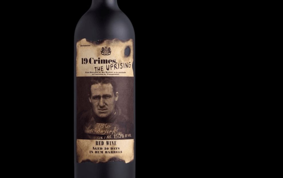
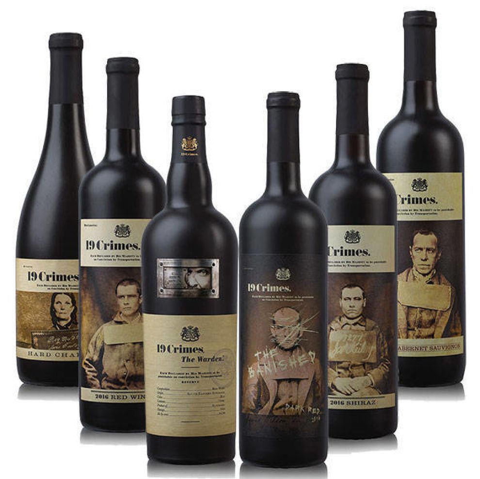
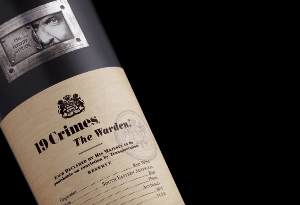
In other bottles, the wines are named for specific figures or given specific nicknames to embody the different types of criminals and the dark underbelly of the system as a whole. With names like “The Warden,” “The Punisher” and “The Banished,” you get a feel for what these criminals were known for.
Similarly, some of these bottles get actual names and personalities — like “Hard Chard.” In this instance, the brand continues its sensational theme and furthers its impactful branding to make a visceral effect on its audience.
By personifying these wines, 19 Crimes is giving its brand more depth and making it more difficult for consumers to forget. We fell victim to this powerful branding, seeing the bottle on the shelf and feeling compelled to make a purchase.
But it was obvious that what really pushed us to buy was the playful and intuitive personification of these bottles that made us feel like we were drinking a wine that had a purpose.
Minimal Text And Antique Coloring Adds A Layer Of Mystery To These 19 Crimes Wine Bottles
There’s no denying these wine bottles give off a dark, enigmatic and elusive vibe. This comes, of course, from the personality of the brand as a whole and the devilish persona each of these wines captures.
But more specifically, what is it that makes these bottles so mysterious?
For starters, the minimal text offers little to no information about the wines, the individuals and the flavors within. You’re left guessing as to what lies inside, and the matte nature of the bottles even hides what’s beneath the surface.
In most of these designs, you see the name of the brand, the kind of wine that sits within and, if you’re lucky, a few comments on its flavor notes.
But for the most part, there’s a minimal quality here that forces you to fill in the blanks on your own. And it adds to the experience.
Additionally, these labels are dark, dirty and antique. They are an off-white, almost yellow and the faded images on the label fill you with questions instantly. It’s definitely old-world and that itself is full of mysterious intrigue all on its own.
Some labels look like they’re burnt; some look like an official document. But they all look like they belong in a museum that’s full of curiosity and wonder — not on a wine bottle. But their presence here makes it innately compelling and worth your while.
Textured Elements Dare Consumers To Reach Out And Pick Up These Enchanting Wine Bottles
Not only do these bottles look the part, but they feel the part too — and you’re probably wondering what that means.
But the textured quality of these designs, in the matte black coating that lines the bottle and the gritty, scratched and chipped elements of the label make these bottles jump off of the shelves and into consumer grocery baskets.
And that’s because texture has a way of making consumers want to reach out and touch. And if they can touch it, they can retain a tangible memory of the wine and the brand overall — and that’s exactly what brands want. They want to leave a lasting, visceral reaction that stays with consumers.
And thanks to the textured elements of these bottles, they are even harder to ignore when consumers are walking down their local wine aisle.
The Powerful Design Elements In Wine Packaging Design
Wine is a fun product to package — there’s a lot of creative freedom on the part of the brand and the designer to create a bottle that flies off of the shelves due to a variety of different elements.
In this instance, the brand decided to tell a story — one of a powerful and impactful history that shaped the future of a country. The storytelling here, matched with intuitive and seamless design elements make for a wine bottle that demands to be bought — I’m just one example of that.
But other brands can play with equally creative designs to help their wines sell. From creative names to colorful imagery to cleanliness and mystery — if your design can grab attention, it has a better chance of shining.
There are thousands of wine brands that exist today. If you've ever walked down a grocery store wine aisle, you know how true that is.
And more often than not, people aren’t going to the store to buy a specific brand — especially not younger, millennial audiences. They’re just looking for an affordable wine that looks good so they can use the empty bottle as a decor piece.
Yes, we're guilty of that as well.
Minimal, monochromatic and enigmatic design trends are a great place to start because they make consumers ask questions.
But at the same time, colorful and crafty illustrations that tell a story and grab attention are equally compelling.
To create a successful wine packaging, you need to understand your brand and understand your audience. That’s truly the most important step. And once you do, you’ll be on the path to a showstopping design.

The History Behind The 19 Crimes Brand
19 Crimes is a new and creative wine brand in the industry, offering affordable, quality wines for a global community of alcohol and history lovers.
The wines come in a variety of red and white blends, each coming with its own personality that comes from the 19 crimes that English criminals would be deported to Australia for.
Between 1788 and 1868, more than 150,000 convicts from England were sent to Australia for committing one of 19 specific crimes. These were petty crimes, most of which included larceny, destruction of property, fraud and other similar acts.
These criminals were sent to these colonies to do their time, but more often than not, these ex-convicts would stay. And that’s how Australia as a country was born.
Fast forward to the 21st century, and the creatives behind the 19 Crimes brand decided it would be fun to play with this fascinating history to create a persona and an identity that was full of that same legacy, prestige and mysterious darkness.
These wines have a strong history as their backbone:
Nineteen crimes turned criminals into colonists. Upon conviction British rogues guilty of a least one of the 19 crimes were sentenced to live in Australia, rather than death. This punishment by "transportation" began in 1783 and many of the lawless died at sea. For the rough-hewn prisoners who made it to shore, a new world awaited. As pioneers in a frontier penal colony, they forged a new country and new lives, brick by brick. This wine celebrates the rules they broke and the culture they built.But the brand couldn’t just slap a name on the bottles and call it a day. They had to take this heritage and build it up at every step of the way — and that includes its web presence and package design.
Just by looking at these designs, you know they exude luxury, sophistication and a subtle, taboo nature that instantly intrigues.
And that’s what the best packaging design is supposed to do.
What Makes The 19 Crimes Packaging Designs So Effective?
The 19 Crimes packaging is so impactful because of the rich history and persona that's embodied throughout the design — from the label to the physical bottle itself.
The brand was named in honor of the country’s shady past. It’s a country made up of ex-convicts, all who were deported for committing one of 19 petty crimes as decreed by the English government.
These 19 crimes include larceny, theft and property damage. And they resulted in the creation of an entirely new country years later.
To honor this past, the brand gave their wines that same grungy, dirtied personality, with each of the seven wines taking on a character from those times — from "The Warden" to "The Punisher" to "The Banished." Even the bottles without a signature name come with the image of a criminal to give it a depth and an integrity.
But it’s not just the personification of these wines that is so effective, nor is it just the powerful history that stands as a solid and sensational foundation. It’s the thought and passion that went into these physical designs that really brings branding full circle. Check out some of the best branding companies that can help you with your projects.
From the matte black coating on the entire bottle to the dirtied, yellowing labels that look like antique letters and decrees — these designs embody that moody and mysterious past.
These labels are scratched off in an almost horror-esque way. And the minimal text is written in a scratched-out font that is equally creepy. There’s a darkness here that is instantly compelling and reels you in.
And the photographs included in a number of these designs are equally powerful — these are images of real people, real criminals and they hit home.
These designs look like they belonged to these criminals themselves — and they stand out from the shelf like no other.