- Article by
- Rafi Lim

#FFAF2C #FCAC15 #F76A1E #832B27
- Agency: The Collaborators
- Client: Applewood
- Category: Packaging Design - Food
- Location: Bristol, United Kingdom
- Project Brief: Reposition Applewood’s packaging to appeal to younger audiences by enhancing shelf impact, modernity, and premium cues while retaining strong brand recognition.
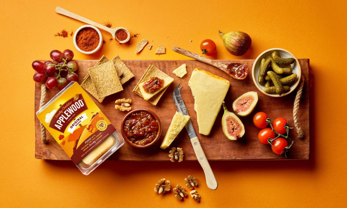
Food packaging balances appetite appeal with brand recognition. Applewood leans into sensory storytelling to refresh its presence, using color, illustration, and structured labeling to communicate flavor while staying familiar to existing customers.
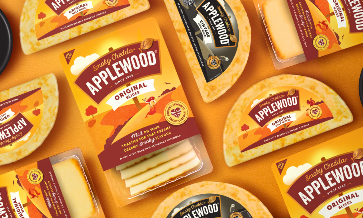
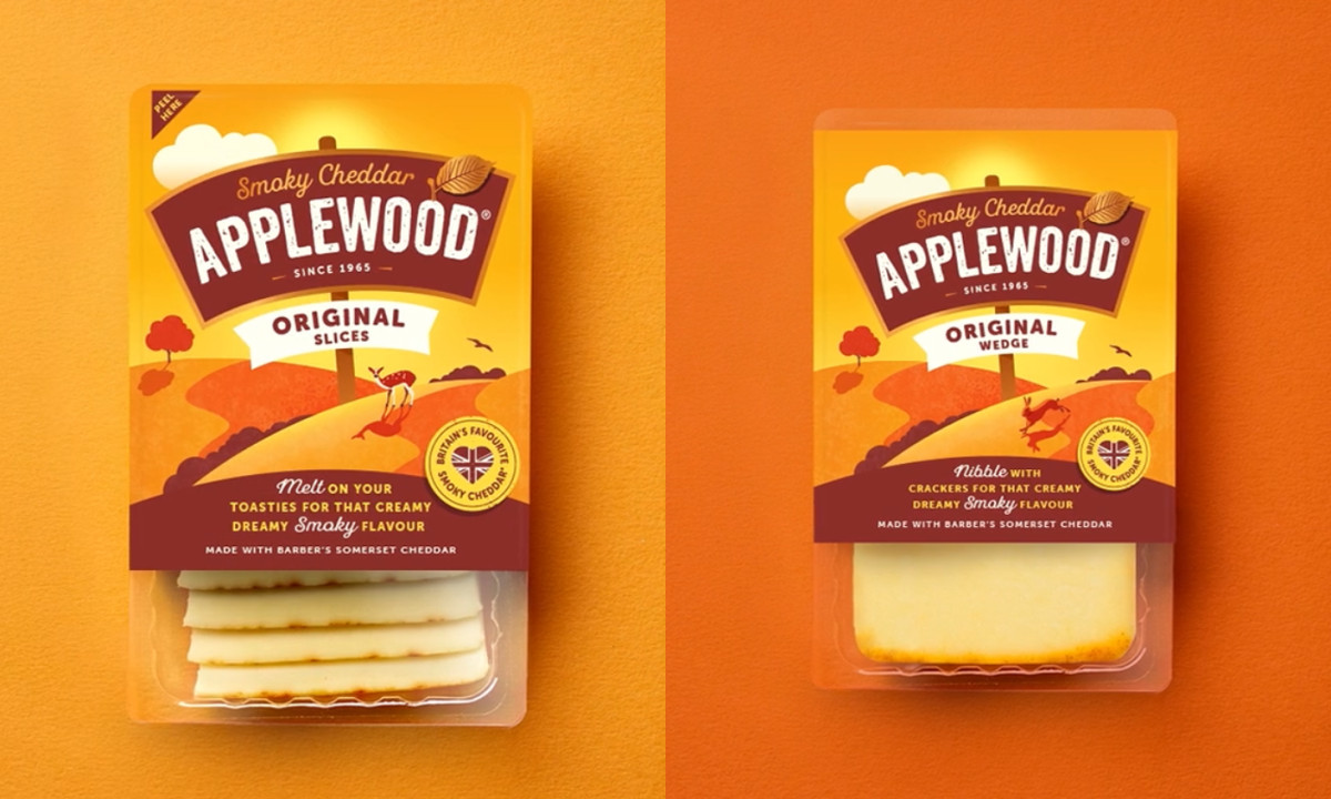
Color leads the experience. Warm, golden-hour-inspired gradients translate smokiness and richness into a visual experience, creating an inviting, indulgent tone.
Typography maintains recognition. The bold, arched logotype carries heritage cues while improving clarity and visibility across formats.
Illustration introduces narrative. Stylized countryside scenes suggest origin and craft without relying on photography, keeping the system modern and approachable.
Layering adds structure. Labels and ribbons organize information clearly, helping distinguish variants while reinforcing a crafted, premium feel.
Discover more from The Collaborators

Filey Bay
Coca-Cola FIFA World Cup 26 Collectible Country Cans
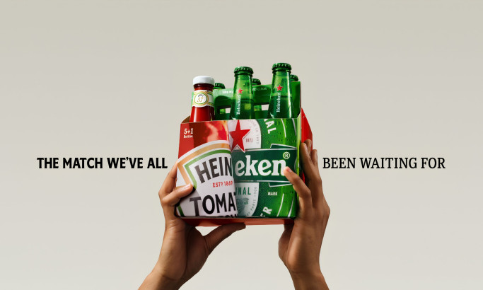
HEINZ x Heineken® Limited Edition Six-Pack

Coors Light Tallerboy
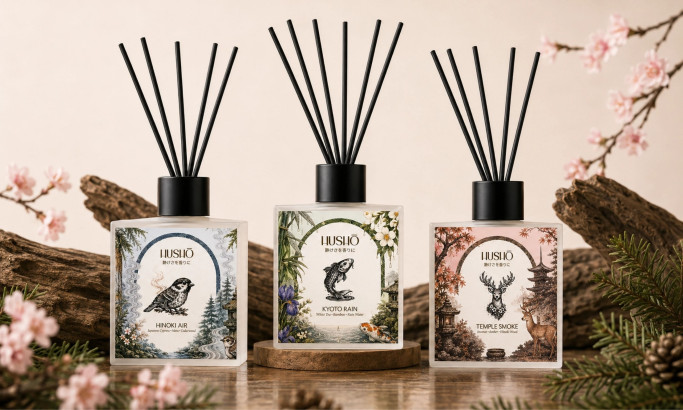
Hushō

Mật Mã Gift Set

I AM ITALIANO