Standout Features:
- Nordic-inspired tin and pouch packaging
- Monoline logo with symbolic duality
- Premium unboxing experience
Mark Hale Design Studio developed the packaging for Ballstad Omega-3, a brand that embodies premium wellness and the purity of its Norwegian fishing village origins. The design approach skillfully blends minimalist maritime aesthetics with an air of clinical refinement, effectively repositioning fish oil as a luxury product.
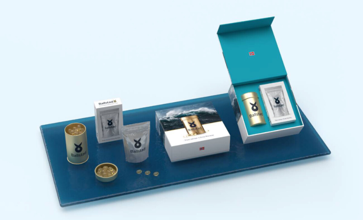
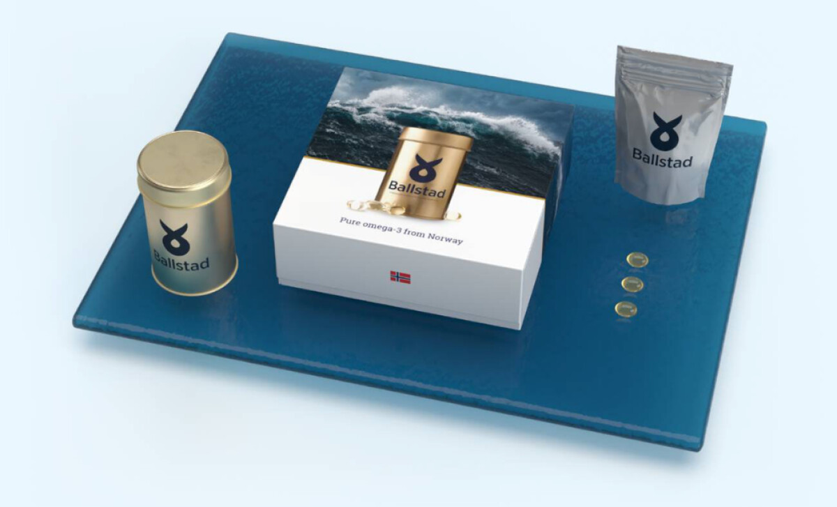
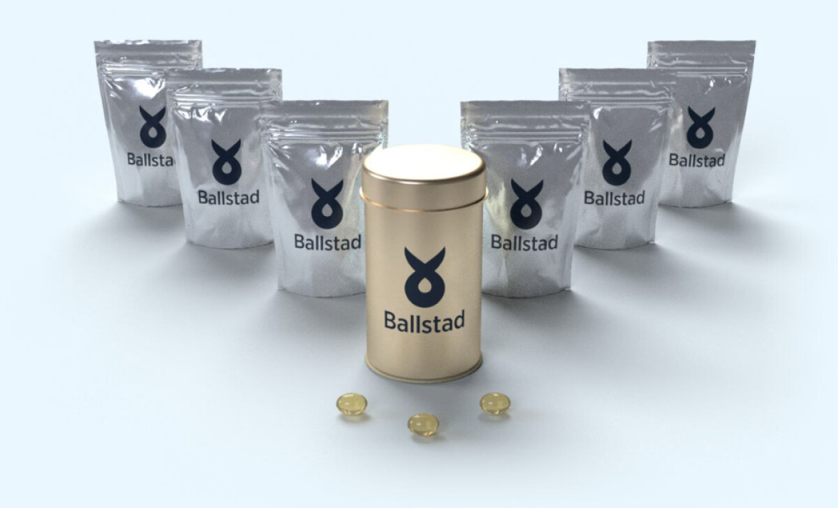
The health and wellness packaging system centers on a sophisticated brushed metallic gold tin. Its minimalist labeling features the brand name and a fish icon. This is complemented by silver foil pouches, also bearing the navy logo, which fit inside or can be used for refills. This industrial finish evokes medical-grade quality.
The Ballstad logo employs a monoline technique, where a single-weight line forms a stylized fish that loops into an abstract shape akin to an infinity symbol or a drop. This deep navy design appears across all packaging. This symbol lends credibility and trust.
Attention to detail is evident in the unboxing process. The product is housed in a white box with ocean imagery and the Norwegian flag. The interior provides a vibrant contrast with its bright turquoise lining. The precise nesting of the tin and pouch in die-cut foam conveys care and premium sourcing.
Studies reveal that for 72% of American consumers, a product's packaging design significantly influences their purchasing decisions. Ultimately, Mark Hale Design Studio's work for Ballstad Omega-3 illustrates how a multi-layered packaging system — from outer box to inner pouch — can reinforce a narrative of quality and purity.


-preview.jpg)
