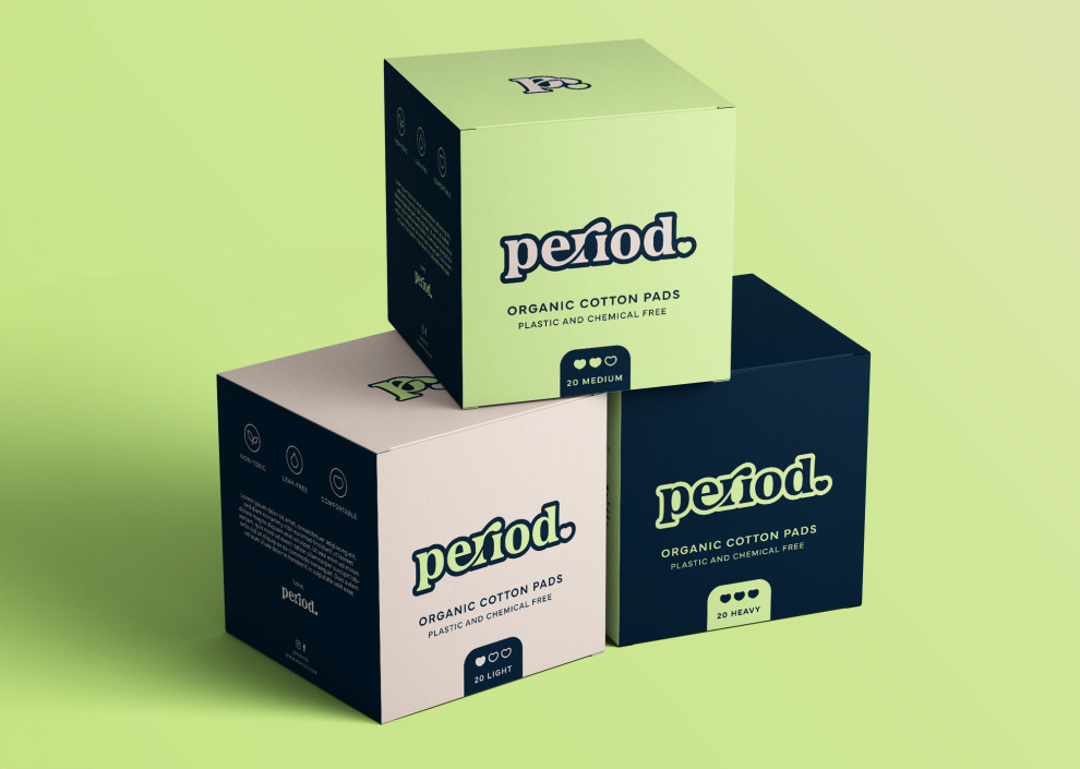
Standout Features:
- Limited color packaging design
- Different colors per variant
- Prominent logo placement
The packaging design for Period, crafted by Jen L Design, focuses on clean and simple layout. This straightforward approach helps communicate the product's quality and the brand's values effectively.
The design uses a limited color palette to convey simplicity and sustainability, resonating with a consumer base that values eco-conscious products. The blues, whites, and greens also emphasize the brand's focus on natural and organic materials.
The packaging is also designed in a practical box shape, which helps store and stack on shelves and in consumers' homes more conveniently.
Get a chance to become the next Design Award winner.
SUBMIT YOUR DESIGN

-preview.jpg)