Witch Packaging Design Manifests Brand Values That Radiate from the Shelves
Witch, a skincare company for over half a century, offers a wide array of products that alleviate blemishes at every stage of their development.
Since the recent introduction of four clear segments to their already impressive portfolio that addresses all the skincare needs, Witch launched a brand-new packaging.
In order to reinvigorate the Witch packaging design, the iconic brand sought the help of a London-based studio, Slice Design. Tasked with designing the packaging and creating a robust architecture that spans a wide range of products, Slice crafted an exciting branding that jumps off the shelves spreading the positive Witch message: embrace your individuality even with skin imperfections, “the Witch way!”
To refresh the visual representation of the brand’s nature and philosophy, the studio scored the bullseye with an ingenious, albeit crystal-clear solution – emphasizing the products’ mission (Refresh) and origin (Nature).
Based on a creative brief of “Mother Nature’s Best Kept Secret” Slice rooted the brand as experts in skincare who combine science with nature’s intrinsic essence.

Witch Packaging Design Recontextualizes the Brand’s Iconic Color Scheme
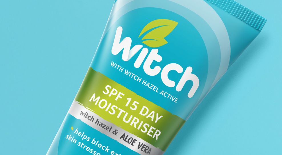
When drafting the Witch packaging design, Slice retained the iconic colors to ensure customer recognition. In their fresh take on the package, new segments were introduced onto the front to help navigate the range.
The role of this specific color palette isn’t only worthy of something as simple as brand recognition. The psychology behind these colors can be a tricky subject. Some companies take months to truly create the right “color communication.” And some brands, like Witch, take it very seriously.
Witch packaging design’s chosen color scheme is evocative and associative. It induces subconscious emotional response and attitude even before the consumer learns more about the product.
The calming blue instills trust, serenity, fluidity and efficiency, while the green accents, usually associated with Earth, bring balance, harmony and restoration to mind. Creative packaging designers go beyond simply mixing and matching colors; they strategically select colors based on their psychological and emotional impact.
Rather than using a fancy, reflective or chromed material, the gradient highlights and amorphous shapes create a pseudo-shine that complements the shape of the packaging perfectly, no matter the perspective.

Witch Exemplifies the Commitment to Recycling That All Cosmetic Brands Should Strive for
“Going green” transcends the actual color scheme and the Witch brand is aware that the need for that specific “shade” is becoming saturated, so to say — especially today. Not only do the younger demographics push brands to be more environmentally responsible, but it’s also clear that the term “eco-friendly packaging” is becoming more than a fad — it’s a necessity.
Environment and skin protection are essentially intertwined as the latter largely depends on the well-being of Mother Nature.
For this reason, you won’t find Witch products packed in cumbersome glossy boxes with expansive monograms customers never actually read through. Everything you need to know is neatly placed on the packaging itself.
The packs feature new iconography to promote sustainability and explanations on how to use the product for clear communication and expert advice.
The Logo Plays a Major Part in the Witch Packaging Design’s Appeal
Along with the packaging, the Witch logo had also gone through meticulous treatment or facelift if you will.
The Witch logo is straightforward and salient. It’s simple enough to not overwhelm, while it simultaneously dominates the metaphorical center stage in customer subconsciousness, as it easily stands out against competitors’ products.
Its bold custom typography (similar to Arista font) is soft and round. It almost looks as if it was written (applied) directly with the content of one of Witch’s tubes.
Meanwhile, the minimalist illustration of witch-hazel leaves marks the brand’s link to nature, symbolizing growth and renewal.
Although derived from the aptly named plant, and the product both content-wise or visually, has nothing to do with the traditional depictions of anything “witch related”, its simplistic design leaves (pun intended) space for interpretation.
Besides the magical undertones, we’re all too familiar with, witches were also known to be master herbalists, prolonging life drawing from the power of Nature.
This skincare brand is definitely extracting the strength of Mother Nature and their packaging reflects exactly that.

Witch Packaging Design Is a Perfect Example That a Small Change Can Move Mountains
When it comes to revitalizing their brand, businesses go to extreme lengths to change their outlook, brick by brick, making the rebranding efforts a stressful experience, to say the least.
Meanwhile, Witch chose another route – making a slight but meaningful adjustment to an already stellar standard. It reflects how branding experts perfectly execute the principle of "less is more."
Archimedes, the ancient inventor and philosopher allegedly said: “Give me a lever long enough and a fulcrum on which to place it and I shall move the world.” Proper leverage is all it takes to impact the market as well.
Luckily, Witch already owns a quality product as its foundation. A subtle pivot was all it took to be laureled with our Best Design Award for February 2022.