Standout features:
- Excellent use of color
- Merger of traditional and modern
- Bold typography
When it comes to beer packaging, especially since the boom of craft beer and micro-brewing popularity, each brand opts for an unmissable, eye-catching design. Most entries on this list are perfect examples of that trend.
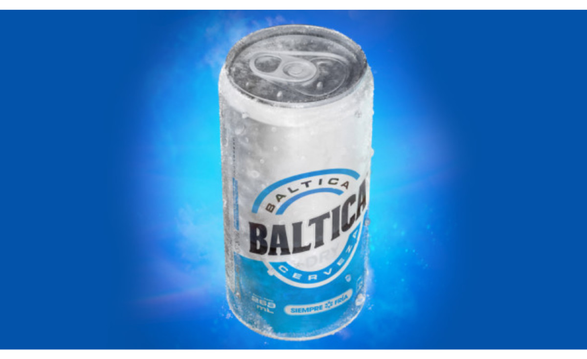
However, there's measurable inflation of overdesigning present in the industry. To stand out many go so far that they're not recognizable as beer anymore. When crafting (pun intended) Baltica beer cans, Zoomix Online Design aimed to rectify that and grab attention with streamlined, ice-cold simplicity.
The result? The beer packaging always seems cold & ready to drink. Its color and individual elements satiate your basic beer desire before you even hear that recognizable hiss of opening it.
Get a chance to become the next Design Award winner.
SUBMIT YOUR DESIGN


-preview.jpg)