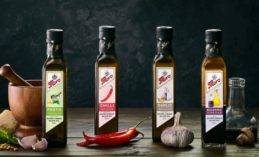
Standout Features:
- Intricate illustrations
- Golden details on the bottle's neck label
- Sans-serif font
Olga Stergiou's packaging design for Moro Infusions combines traditional artistry with modern aesthetics.
The packaging design features detailed ingredient illustrations. These visuals convey the product's rustic charm and authenticity and capture the flavors. Examining these drawings closely, you'll appreciate the attention to detail and care put into developing them, reflecting the brand's dedication to their craft.
The strategic use of golden detailing on the neck label adds a touch of opulence to the packaging. This luxurious element is a testament to the product's exquisite nature, enticing consumers with promises of indulgence and refinement.
The modern sans-serif typeface, with its clean lines, makes the design more approachable and straightforward. This way, Olga Stergiou ensures the packaging remains captivating and friendly to today's consumers.