Standout Features:
- Custom iconography
- Clean, sharp design
- Harmonious blend of color
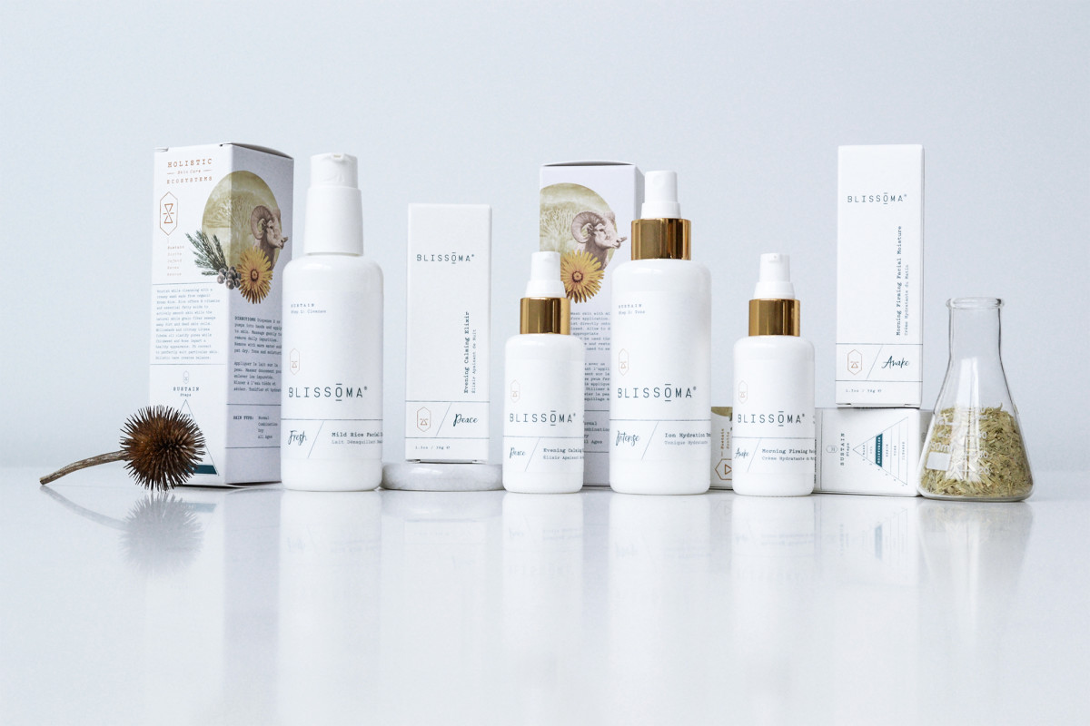
Annie Martineau collaborated with Blissoma, a skincare company rooted in plant science and earth-consciousness, to design packaging that reflects the brand's ethos. The challenge was to marry scientific integrity with a touch of mystique. This approach appeals to the discerning spa market while retaining a sense of playfulness and functionality.
The resulting design shines with alchemy-inspired symbols. Reflecting the brand’s five holistic skincare ecosystems, they add depth and meaning to each product. They represent the brand’s blend of science and mysticism, pique curiosity, and invite further exploration.
Additionally, the design maintains a clean, minimalist aesthetic — crucial for appealing to an affluent market. The sharp lines and uncluttered layout give the packaging a modern, sophisticated look that resonates with consumers seeking premium skincare solutions.
While the look is restrained, pops of color are thoughtfully employed through the product labels and supporting graphics. These vibrant touches liven up the design. Plus, they provide a subtle nod to the diverse botanical ingredients that form the heart of Blissoma’s formulations.